
In this article I am going to show how to create radial bump chart in Tableau.
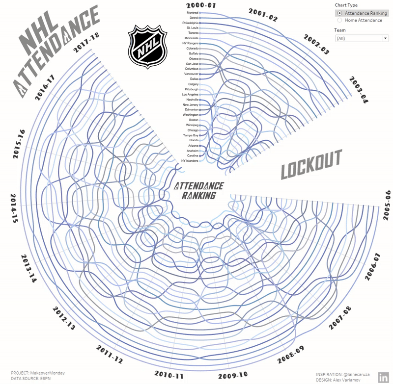
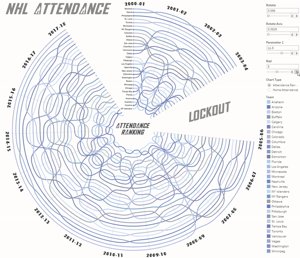
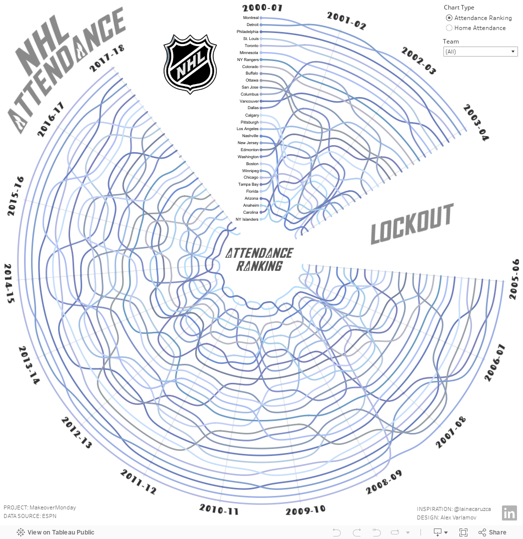
For the #MakeoverMonday 2019 week 1 ‘NHL Attendance’ I’ve made a viz in which you can see ranking of the NHL matches by attendance. The data were collected from the 2000-2001 season up to 2017-18 one. This viz has been selected as “Visualization of the day”. You can click on an animated GIF below to go to the visualization itself.
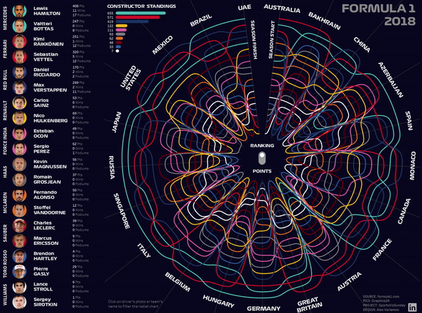
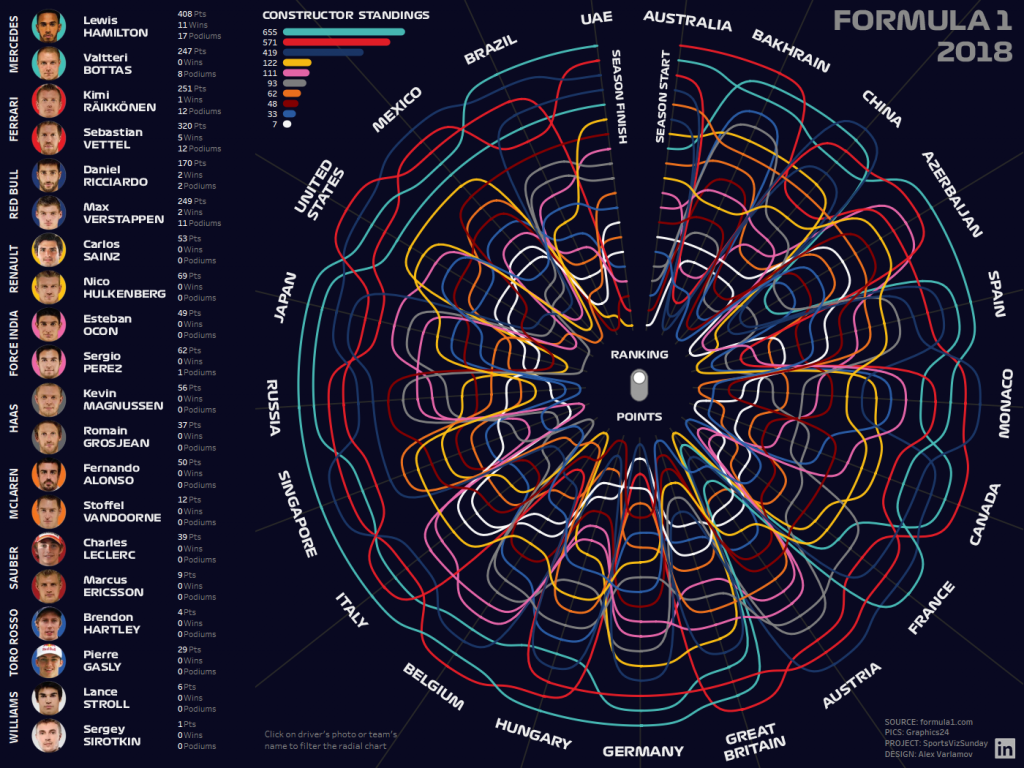
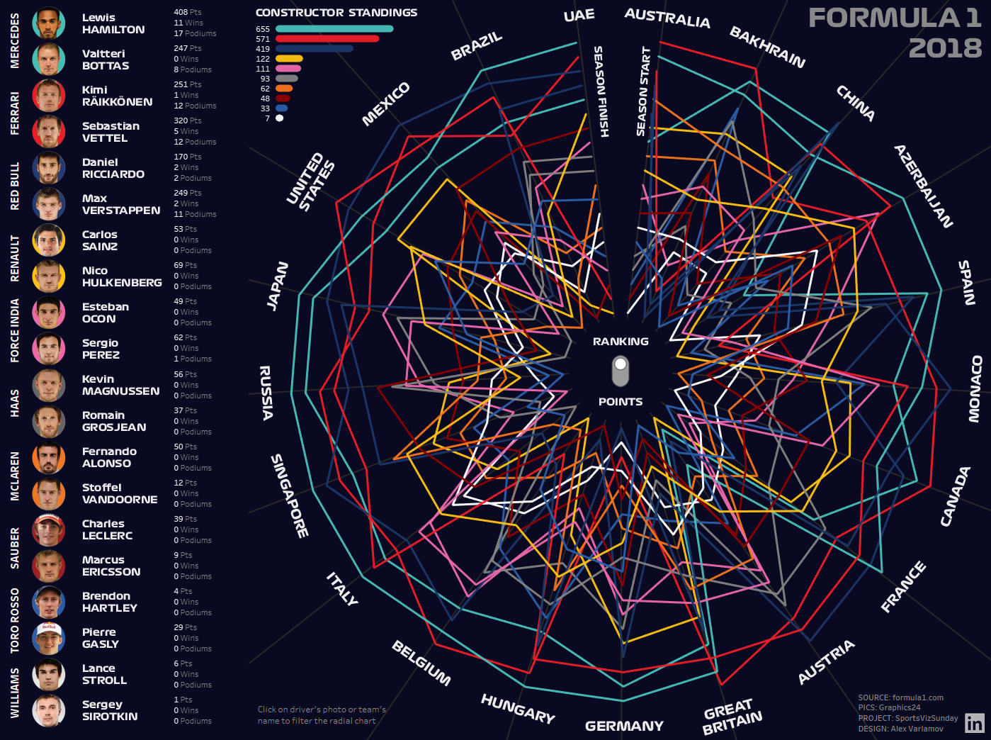
The following visualization was created for the #SportsVizSunday project. It shows the results of the Grand Prix of Formula 1 season of 2018 with a breakdown by circuits and pilots. This GIS is also clickable.
1. Bump Charts
What are the bump charts and how it works?
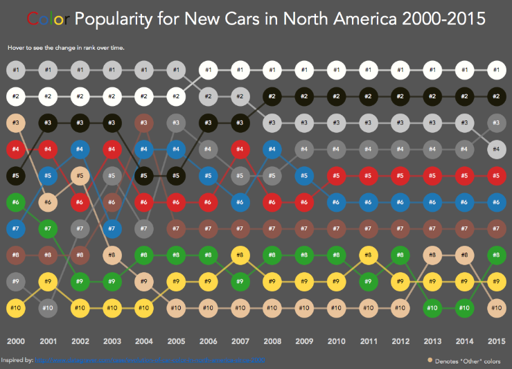
I think you have seen some types of Bump Charts. Usually the charts show different metrics by rank during the time. For instance:
- Matt Chambers and his blog post:
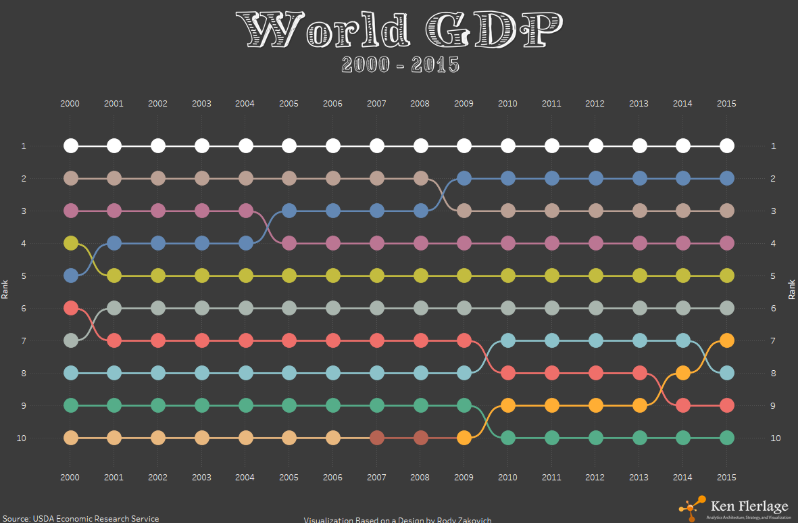
2. Ken Flerlage with his blog post.
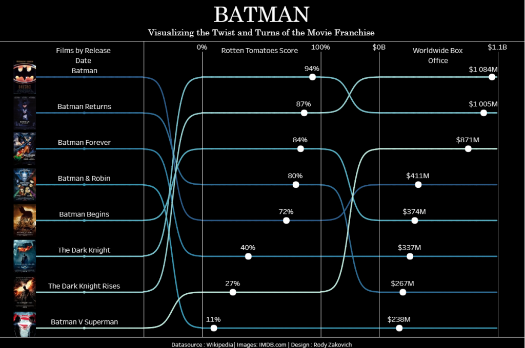
3. Rody Zakovich and his blog post.
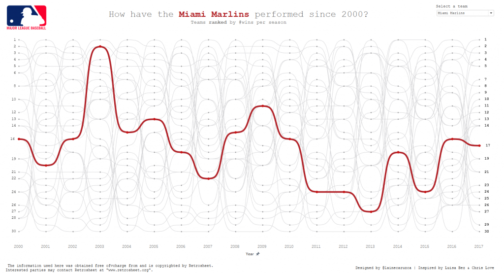
4. Laine Caruzca who inspired me to make my viz for the #MakeoverMonday project.
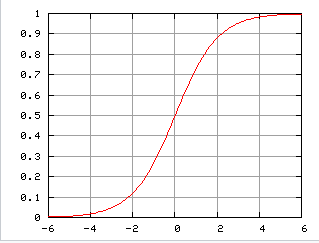
You can see that 1st viz in the list above made with stright lines and other vizzes use smooth curves. I find smooth curves more aesthetical. The smooth curves connecting the points are called ‘sigmoid functions’.
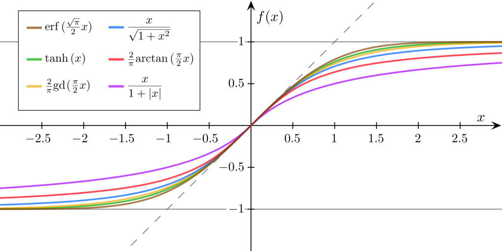
The Sigmoid Functions are S-shape curves which are described by different math functions. I use a function y=1/(1+e^-x). This is a logistic function which we will use further in the blog post.
2. Making Sigmoids in MS Excel
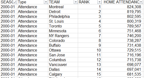
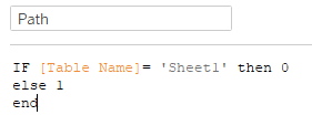
#MakeoverMonday 2019 week1 dealt with ‘NHL Attendance’ Data which contain ‘RANK’ column:
To start we should make a linear bump chart and the main task is to find all points for all sigmoids connecting their neighbour points.
t is possible with Tableau as Rody Zakovich explained in his blog post or it can be calculated in Excel too. See a formula below which uses VLOOKUP function to find next season and team to get next rank. So we have two edge points for a sigmoid. The columns F,G,H etc determine each point in a sigmoid where X=(-6; 6) with step = 0.5. The number ’31’ in this formula is the total number of teams.
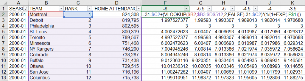
So we have 13 points for each sigmoid function . That is enough for the viz. The interval between x=-6 and x=6 caused by the shape of logistic curve (below)
You can find the dataset with the calculations here.
The next step is creating of a linear bump chart in Tableau:
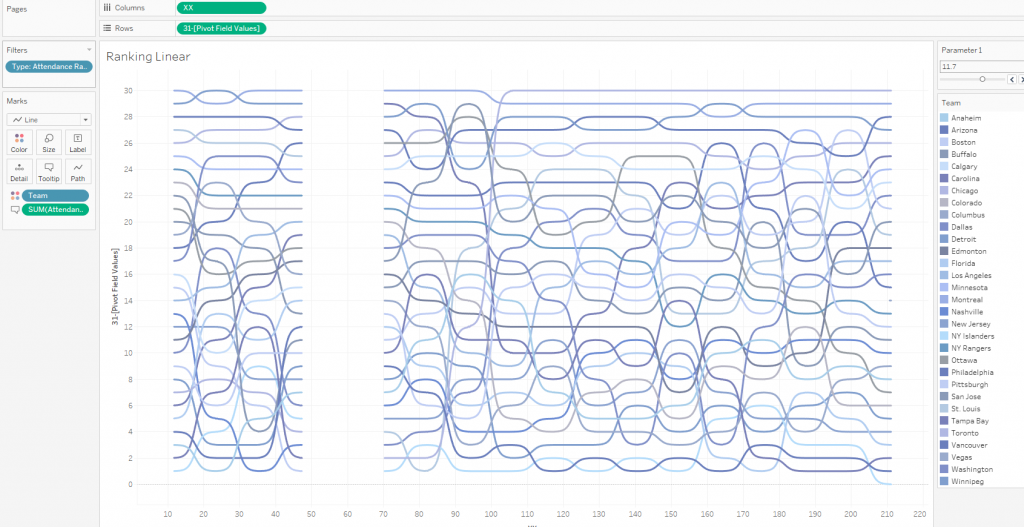
1. We need to load data to Tableau and pivot the columns -6, -5.5 … 6.
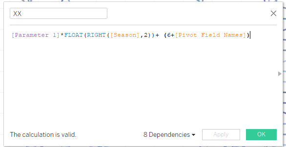
2. Creating XX calculated field to shift each sigmoid function according to a season number:
The Parameter 1 here uses to find acceptable form of the sigmoid functions.
Note: The empty values on the chart highlight ‘Lockout’ season when all of the NHL games were cancelled in 2004-05.
So we have a linear bump chart where the edge points of sigmoid functions determine seasons
3. Go radial
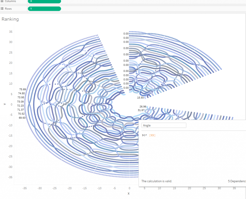
The next step is to turn the linear bump chart into a radial bump chart. Now we need to rotate each point of the linear chart at a certain angle. We need to create an Angle calculation as an XX function. You can see the constant part – it determines a started angle and a part with XX which determines an angle for each point.
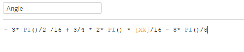
Note: don’t pay attention on a lot of addends – you need to find only ratio(xx)+constant where ratio determines the rotation angle for a point and constant determines a shift between origin and starting point of the visualization (See ‘How to find correct angles’ below).
The calculated fields X and Y uses rotation formulas (common geometric turn):
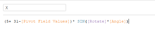
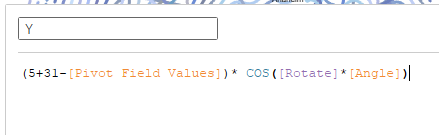
Number 5 in the formulas is the shift between a center of the visualization and the last team i.e the empty space in the viz centre.
4. How to find correct Angles?
In the wokkbook all angles were calculated with not normalized values than means that I use sin or cos of big values. It is not so clear for understanding and now I am going to explain how to find correct angle values for all points of the visualization.
1st step. Normalizing the linear chart
Normalizing here means that all points are located inside an area with limits XX=(0; 1) . Hence we can change XX calculation to:
([Parameter 1]*FLOAT(RIGHT([Season],2))+ (6+[Pivot Field Names]) –[Parameter 1]) /210
Parameter 1 is –12.28 (in this case) in the end of the calculation is a shift to the zero point, so now the curves start from X=0. The 210 ratio is the span of the chart so dividing XX to 210 we have new limits from 0 to 1 (see XX axis below)
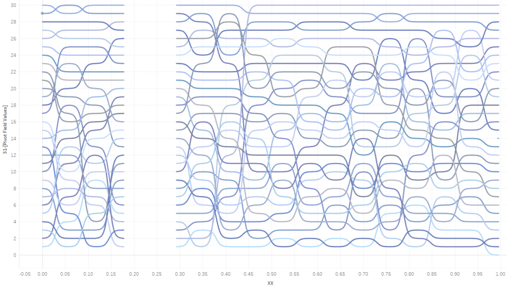
Ta-da! We have normalized the chart!
2nd step. Angle Calculation
In this case the radial bump chart will be started from 0 and go clockwize. Than means we do not need to put an angle shift to the Calculation – it is enough to add only a coefficient determining the angle. In the picture below I get 90 as the coefficient. You can choose another one.
5. Finalizing the Radial Bump Chart
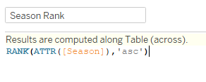
Finally we will have the viz where Season Rank determines a path for each sigmoid function.
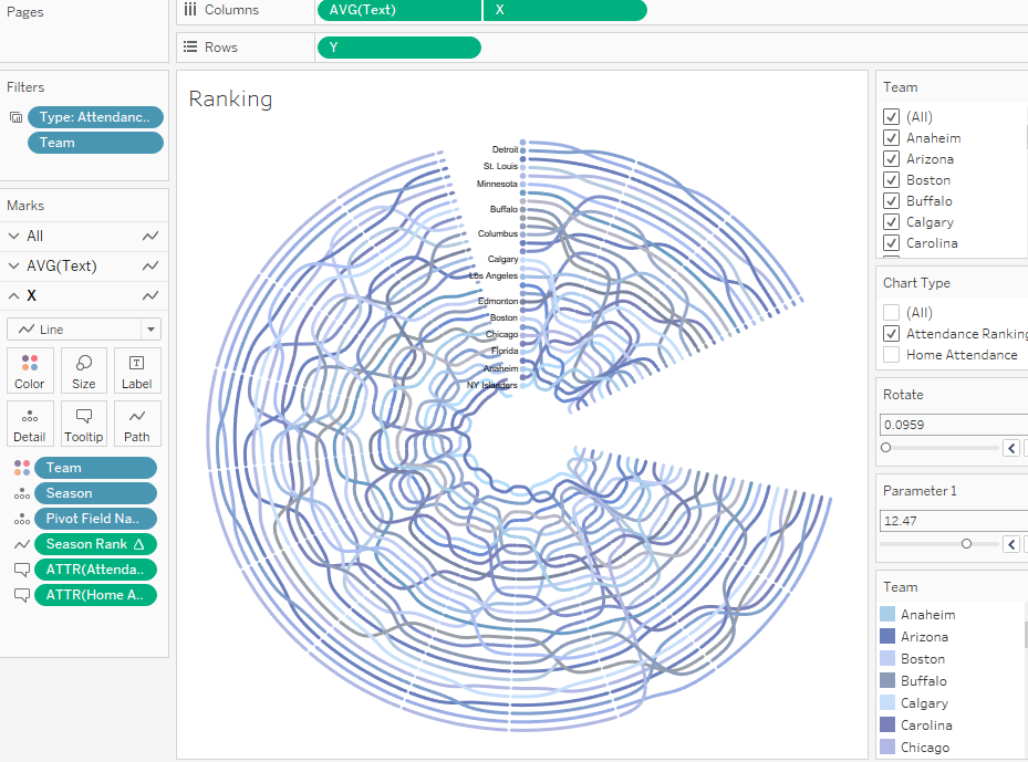
The calculation field ‘Text’ uses for Name Position . Add filters.
6. Making Axes
To create axis that are shown each season we need to create three calculations: X axis, Y axis, Angle Axis.
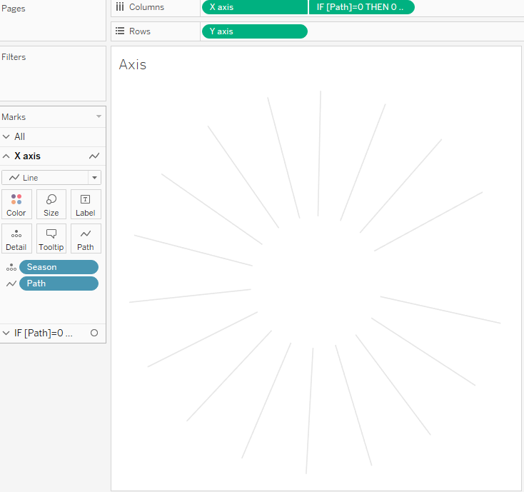
That is a common radial chart which can be created using union for dataset and making a path for each line:
The similar radial charts the Tableau community uses very often so I will not describe all process here.
Conclusion
I like flexibility so I use some parameters in the workbook for rotating and scaling on a dashboard. The transparent background was used for the chart and the axes – is a sheet behing it. :
There are a couple of filters and actions added and the viz is done!
I used the same technique for the next viz ‘Formula 1 2018. Results’. Now you can evaluate which viz looks more attractive, with sigmoid functions or without it.
I prefer sigmoids.
For more information on visualizing Formula 1 data and creating race tracks on Mapbox maps, you may read my article “Using Mapbox GL JS custom Maps with Tableau and Power BI“.
Note: I should mention the radial bump chart is not acceptable for business visualizations, it rather fit for presentation and data-art.
P.S. I have described only RANK type of the vizzes although both of my visualizations have other mode with continious measures. The algorythm for any measures for radial charts with sigmoid functions is the same.