Transparent sheets were presented by Tableau Software in 2018.3 release. This feature opened new opportunities for dashboard designing. Now it is possible to change the opacity of sheets.
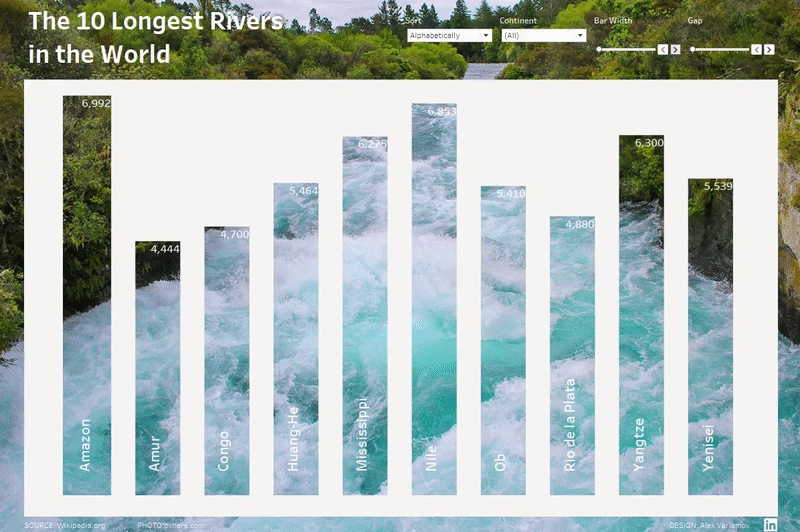
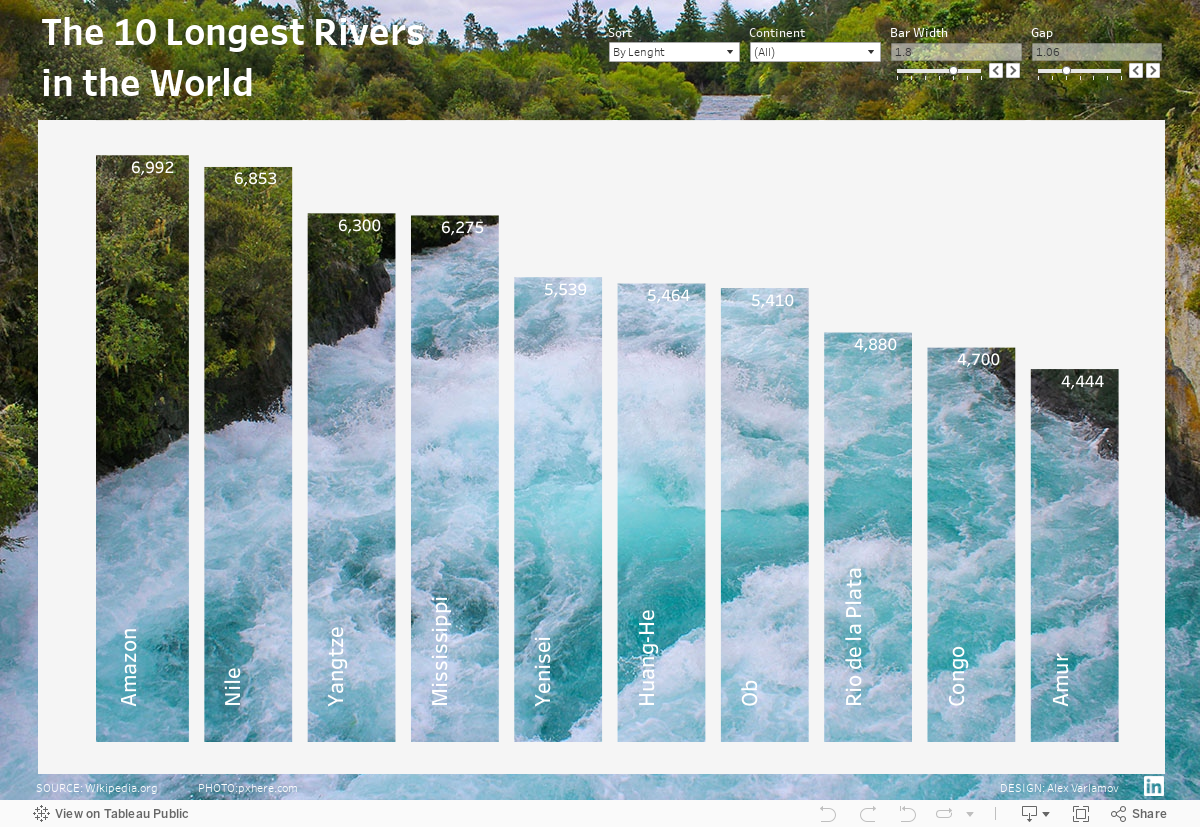
I have made a visualization below where bars on an interactive bar charts are transparent. The name of the viz is ‘The 10 Longest Rivers on the World

The dataset I use for the viz is very simple – I have prepared it using Wikipedia’s article ‘List of rivers by length’. My goal now is to explain the idea of transparent bar charts making so I did not get complex data sets.
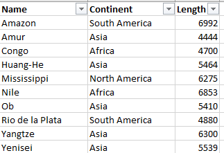
The data set in MS Excel looks simple:
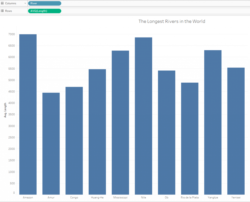
We can prepare a standard bar chart based on the data in Tableau:
Неочевидная задача дальше – как сделать прозрачные бары и белый фон? Когда вы выбираете опцию “Format Shading” для заливки листа, бары тоже закрашиваются. Можно уменьшить прозрачность (opacity) до 0%, подложить вниз какую-то картинку и получить следующий виз:
A problem we can will be solving further is how to show thansparent bars and fill the sheet. When you use ‘Format Shading’ option to fill your sheet, the bar charts will be filling too. You can decrease opacity of the bar charts and opacity of the sheet up to 0% and you will have fully transparency viz like below
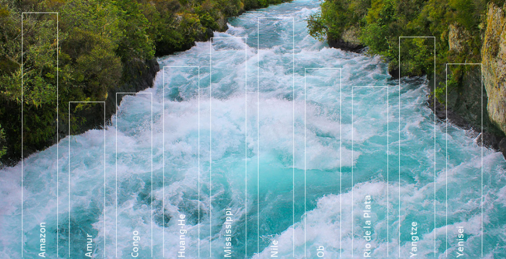
This viz is not I an lookinfg or – I would like to have transparent bars and filled background with filtering and sorting, i.e. fully interactive visualization like this:
To make the viz we can ‘invert’ the bar chart. It means we can draw white polygons on a sheet as a background, hence the background will be an area which can be controlled by filters and parameters. In other words we will create an algorythm that allows changing white area geometry sizes. Let’s look at the idea.
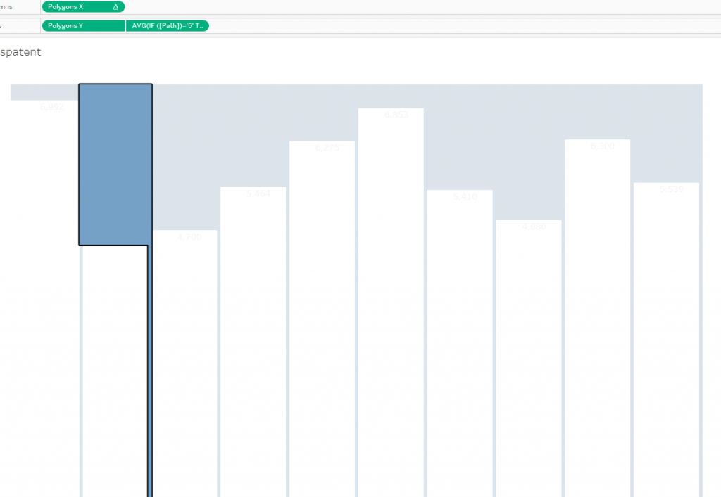
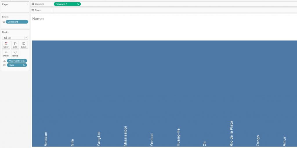
The blue highlighted polygon on a picture below has 6 vertices and if we create similar polygons for each bar we will have the ‘inverted’ bar chart.
To make 6 vertices for each polygon I have made a union with the dataset (It can work with blending and an additional dataset too) . The entire data set in Tableau is increased by 6 times.
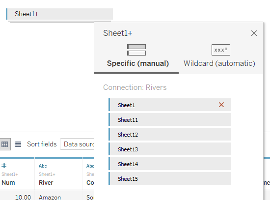
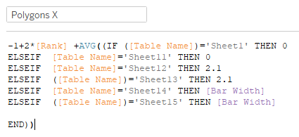
The union consists 6 same sheets. Each sheet represents a vertex. The calculation for X coordinates of the polygons is:
And for Y :
The calculation Polygon X contains another calculation Rank, which equals RANK_UNIQUE([Sort Field]) , determines the order of polygon drawing along the X axis i.e. ranking. The ranking depends on Sort Field where a parameter Sort sorts bars By Length or Alphabetically.
Parameters Bars Width and Gap need for changing spaces on the bar chart: Gap changes the distance between upper chart border and the highest value in the data set. Bars Width parameter changes bar widths (see below).
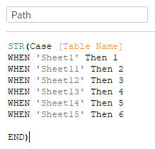
Calculation field Path determines the order of polygon drawing
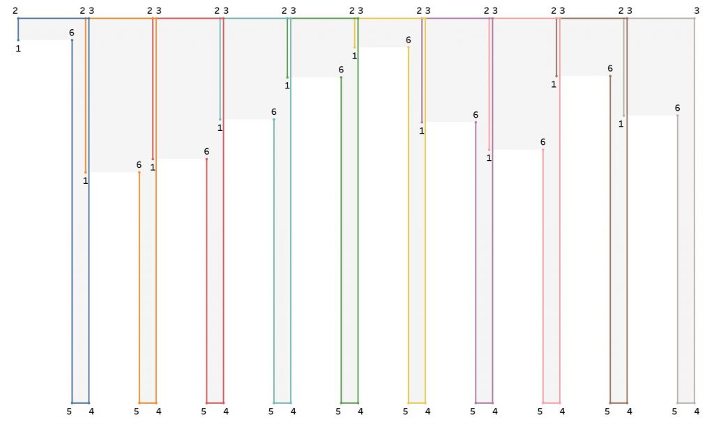
You can see the paths for each polygon on a pic below. The path color denotes a polygon number, and each polygon draws a bar. The numbers on the picture are vertex numbers of each polygon.
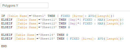
If we pay attention to the Polygon Y calculation, then it uses the calculation for vertices 1 and 6:
{ FIXED [River]: AVG([Length])}
It determines a height of a bar. In our case, it was also fair to leave just the Length field instead of this calculation.
For vertices 2 and 3, a calculation is used that determines the upper boundary of the chart. This calculation finds the maximum river length in the data and adds the Gap indent to it:
[Gap]*{ FIXED : MAX([Length])}
The final calculations on a sheet:
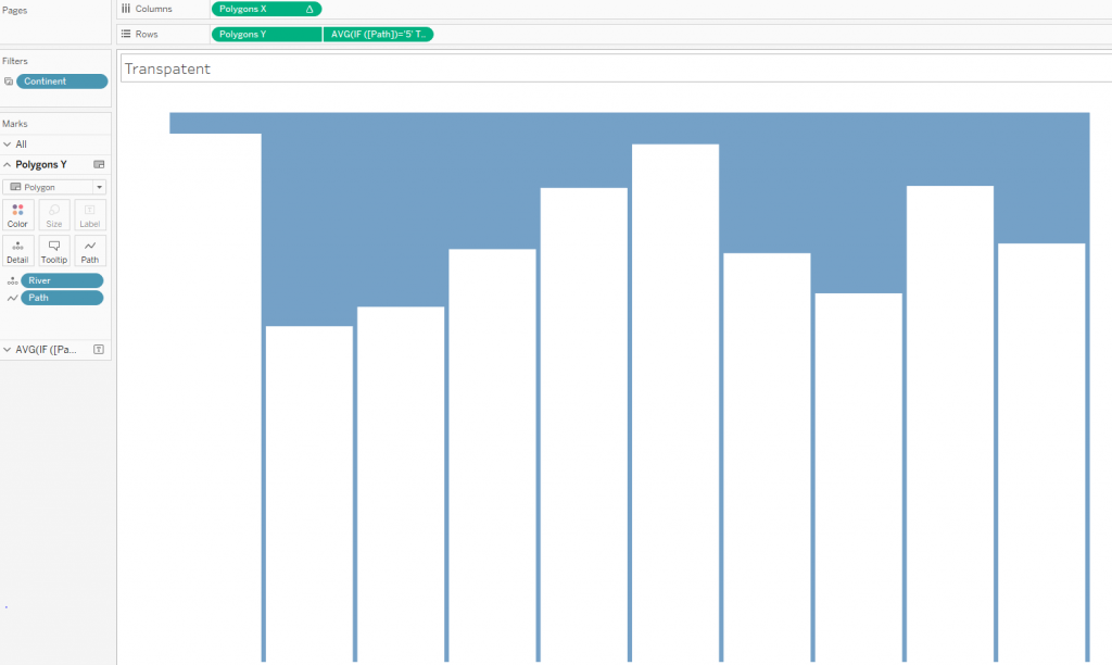
The River field was added to the granulation. The field contains the names of the rivers. Each river forms several polygons, the Path calculation in the granulation determines the order of vertices for each polygon. The Polygon X field on the Column shelf contains a table calculation of Rank and distributes all the polygons along the X axis. The Polygon Y field on the Rows shelf determines the length of the rivers.
That is, the blue area on top consists of polygons, and we will control it. Fill it with white color.
The second axis on the sheet is used here for the text inside bars.
We need to make another sheet for writing the rivers names inside the bar chart:
Set the opacity of these bars to 0, and you can go to the dashboard itself.
Next, insert a photo of the river as a background on the dashboard, overlay on top a sheet with the river names as a floating object. After that, add the sheet with the polygons created above as a floating object, superposing the borders and sizes of two sheets. If you need tooltips you may use a transparent native bar charts as a second layer on the viz. Now we can put the title, remove the filters and parameters and get such an interactive visualization:
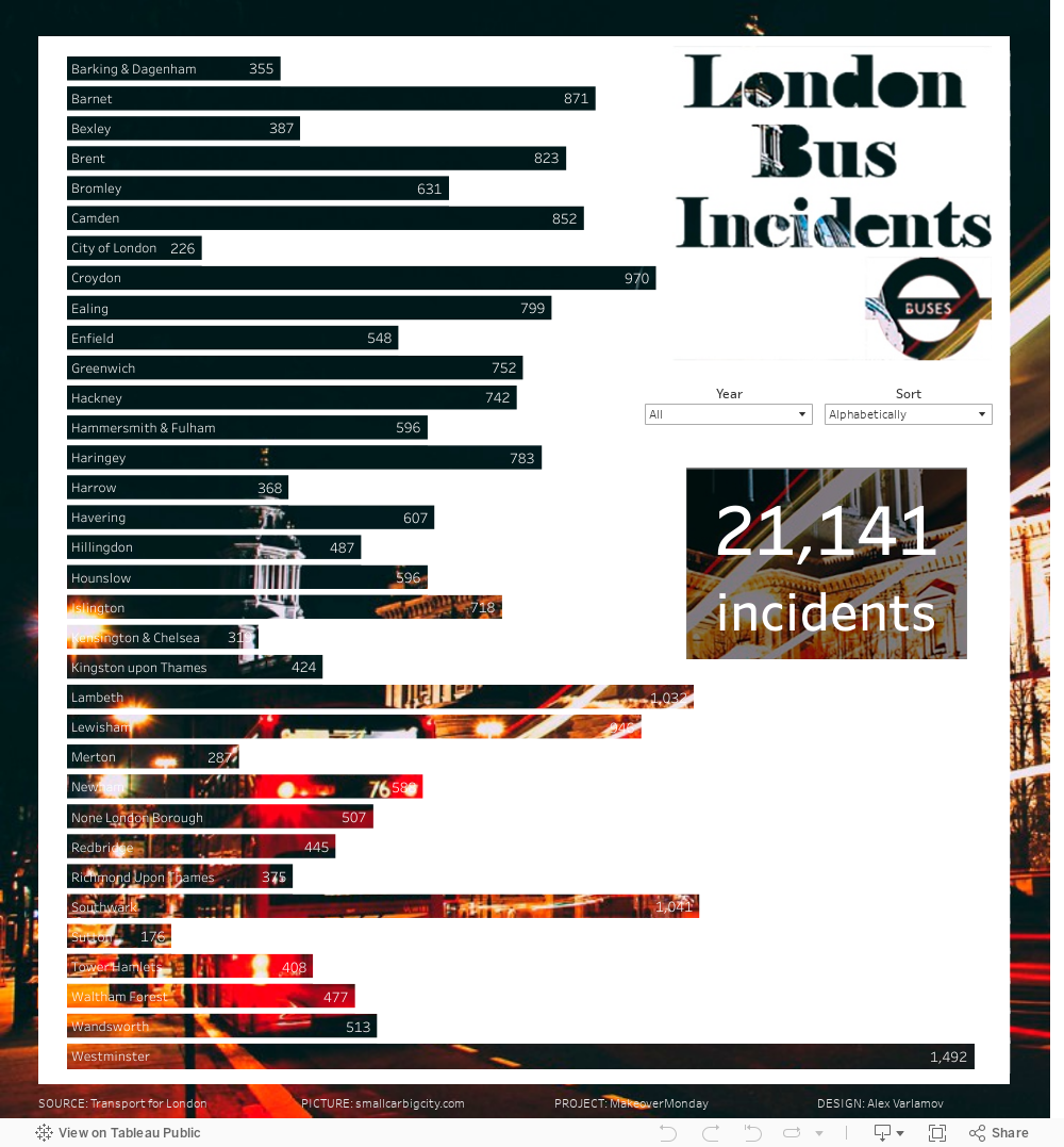
Also I did not mention text inside the bars so you can use your approach. You can evaluate my other viz I have prepared for the #MakeoverMonday W51_2018. I used the same idea – to create polygons for empty spaces.
Instead of a static image, in Tableau you can use an html page with a video or an animated GIF image as a background:

Conclusion
It should be noted that such transparent bar charts are not appropriate for deep data analysis and using in business dashboards. Such kind of visualizations are more likely created for presentations or media. The examples above uses a popular data denormalization technique (multiple union) for drawing each vertex of the polygons. The polygons are a fairly powerful Tableau feature for custom visualizations, but not everyone can use it. Here is just such a case when denormalization, table calculations, sorting in a Cartesian coordinate system and polygon marts are combined in one viz. By analyzing and repeating similar non-trivial examples, you can come closer to the answer to the question “How does Tableau actually work”?