Contour Plot and its special case Tanaka Contours in Tableau are quite exotic thing. You can find this type of visualization in sports analysis and geo-analytics. In sports analytics, such visualizations are found at a fairly well-known data journalist Kirk Goldsberry. For example, you can find it in ESPN articles:
Seven ways the NBA has changed since Michael Jordan’s Bulls
Why Michael Jordan’s scoring prowess still can’t be touched
And a couple of geo vizzes in QGIS:
How to create illuminated contours, Tanaka-style
Tanaka method or how to make shaded contour lines
There are Contour Plot examples on Tableau Public:
Anthony Bourdain’s most visited places in the world, by Sebastián Soto Vera
Game of Thrones: a study of the main characters, by Nico Cirone
You may see Contour plots on synoptic maps, where isobars and isochores show pressure and temperature. Also such contours can be found on relief maps, where it display the height of the terrain or the depth of water bodies.
In this article, with the help of contours, we will show the density of any events on a site, or the probability distribution of events. Our next task will be to visualize the successful throws of different NBA players in such a way as to understand from which points one or another player throws more. That is, based on the primary coordinates of the shots on the court, we will describe the probability distribution function that a player will shoot the ball from a specific point.
This article would not exist without the project SportsVizSunday and Zak Geis, who collected all the statistics of NBA players’ throws with coordinates on the court into one dataset, and also made an excellent vizualization, which has a lot of interesting features, and it is interesting to watch not only for NBA fans.
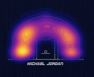
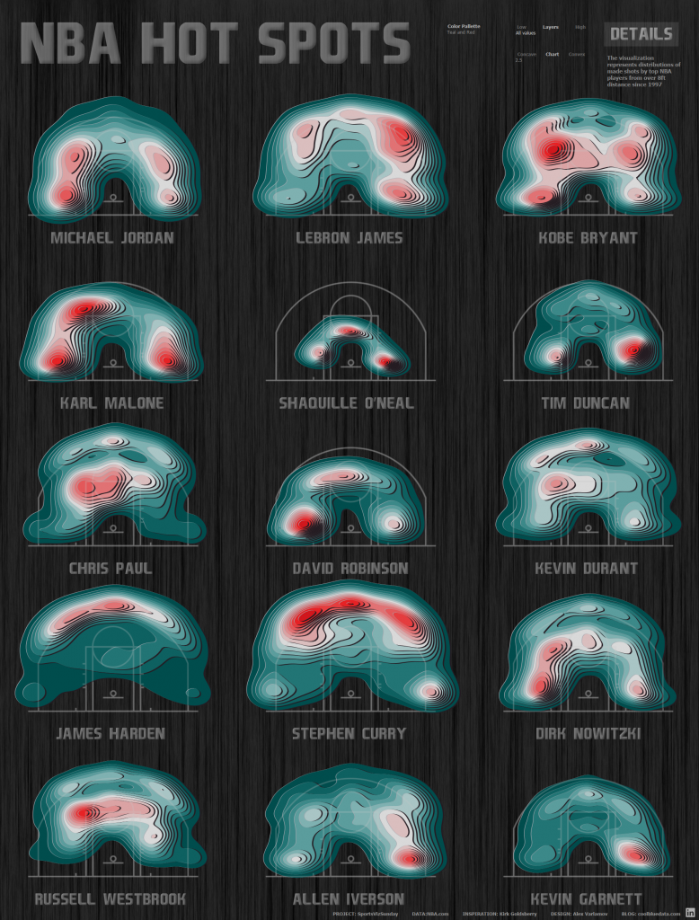
My two vizzes: ‘NBA Hot Spots’ for SportsVizSunday, JUNE 2020 – NBA SHOT LOCATIONS show ‘hot spots’ on the basketball court of famous NBA basketball players:
In this article, we will consider how to build such visualizations, we will use the same data set.
1. Density map in Tableau
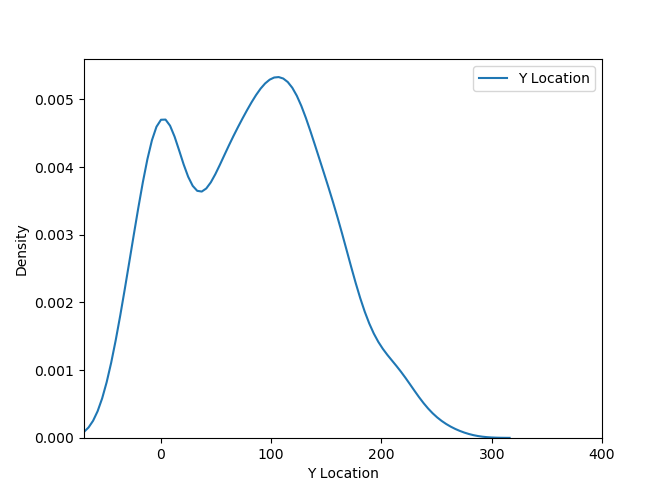
To get a better understanding of how Contour Plots work, let’s look at how native Density Marks in Tableau show the density of throws on the court. Most of the successful throws are from under the rim, but we will look at the patterns of players with throws from 8 feet and above, and at the same time we exclude throws from the other half of the court – there are very few of them, and they do not reflect the game in the opponent’s half of the court. To do this, let’s filter the shots by the Shot Zone Range, discarding the Less Than 8 ft categories. and Back Court Shot. Also we’ll filter out only successful rolls – Shot Made Flag = 1. Let’s take the most famous NBA player, number 1 by various versions, Michael Jordan (Player Name field – Michael Jordan). Let’s build a scatter plot using a court image as a background: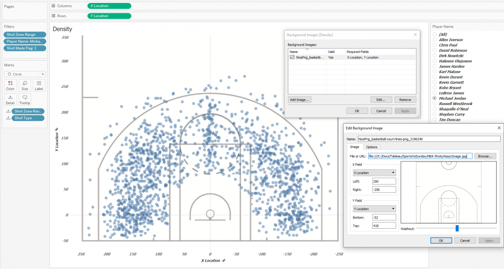 This diagram gives an insight of where Michael Jordan most often threw from, but the problem is that there can be many points on one pair of coordinates, and it is difficult to imagine how densely the points lie, even if you make them semi-transparent. For a better understanding of the distribution, let’s plot the distributions of the throws along the X-axis and Y-axis of the court. Let’s make bins of size 5 for X and Y to smooth out uneven distributions a little. For the X axis it looks like this:
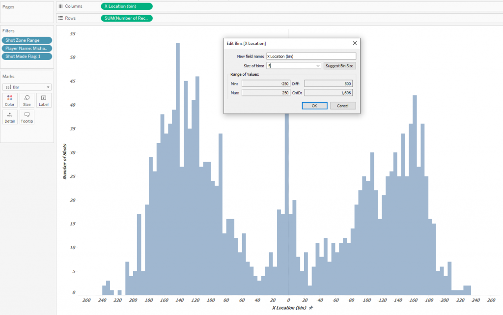 Now we represent the distributions along the X axis and Y axis on one dashboard, and also change the labels to Density on the scatter plot:
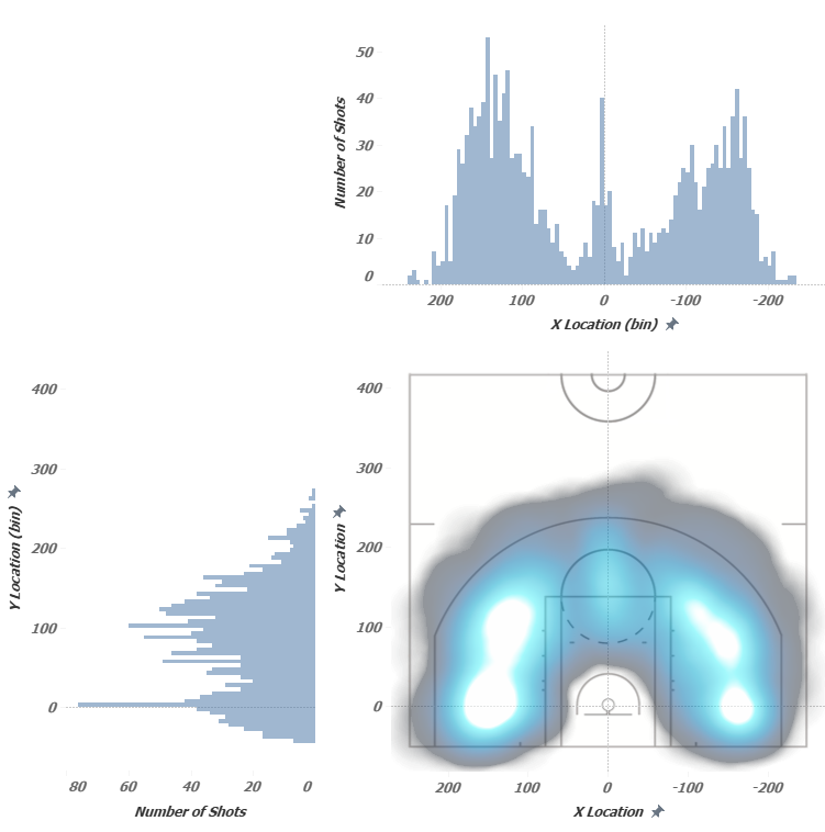 This picture gives a much better insight about the density of the throws – the places of their accumulation are immediately visible. It should also be noted that when using the Density Map, not all the throw points themselves are shown, but some three-dimensional function fills the space between the points, showing the concentration of these throws with color along the Z axis, that is, the density map does not show data points. In Contour Plots, the data points themselves are not shown either – there are only contours showing the equivalent values of quantities, that is, the continuous distribution function is break into levels. To find the contours and the points describing them, we will use the Python script
2. Kernel Density Estimation in Python
Python has the ability to calculate and visualize contours. The script below in the section 3 allows you to generate a set of coordinates for the points of the contours based on tour data. The scrips shows the contour plot, prints the contour coordinates and saves the coordinates in a .csv file. It is possible to estimate the distribution density in two coordinates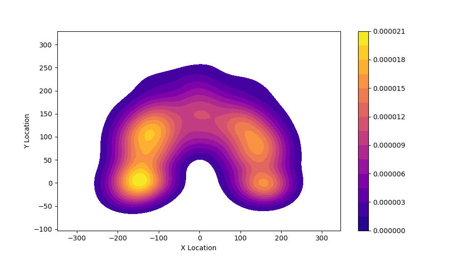 And also for each of the coordinates separately:
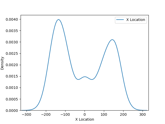
If we put these charts on one picture, we can see the distribution of the density of events (successful throws)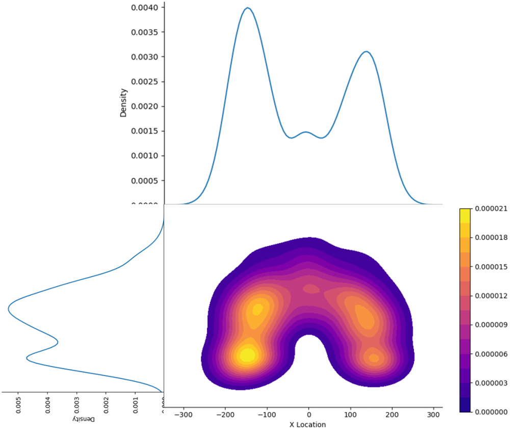 Let’s find out what these charts mean. Here, a kernel density estimation algorithm is used, or Kernel Density Estimation, KDE.
You can compare the distributions (bar chats) plotted in Tableau (already partially smoothed by grouping in bins) and the curves obtained using Python. The method itself makes it possible to estimate the distribution of events by describing the available data sample. In our case, the data sample is Jordan’s throws. But the throwing points do not cover the entire area of the court, and the KDE method completes the distribution surface at all points on the court. This distribution surface is divided into levels by equal values along the Z axis. Levels are color-coded and displayed in the legend.
Now let’s see what the numbers in the Contour Plot legend and the density values on the line graphs mean. These numbers indicate the probabilities of an event occurring at a particular point. They can be expressed as a percentage. The areas under the curves and the 3D surface under the distribution surface are 1 or 100%. The probability of occurrence of known events can be regarded as the density of the events – the mort the density of the events, the more the probability of occurrence of an event in the future. Thus, for a large number of events, the KDE method allows you to construct a probability distribution surface that describes the density of events occurrence.
3. Data preparing with Python
In this section, we will figure out how to load a specific part of data in Python, plot contours and save the contours coordinates in a .csv file. The following code calculates and displays the contours, their coordinates and saves the coordinates to a file.
For creating contours and visualizaing data in Python we will use seaborn library based on matplotlib. See seaborn.kdeplot to find more about KDE plots in seaborn.
import numpy as np
import pandas as pd
import seaborn as sns
import matplotlib.pylab as plt
from matplotlib.colors import rgb2hex
import sys
np.set_printoptions(threshold=sys.maxsize)

# Read data from file
data = pd.read_csv ('C:/Docs/Tableau/SportsVizSunday/NBA Shots/Output.csv')

# Data selection by criteria
data = data.loc[(data['Shot Zone Range'] != "Less Than 8 ft.") &
                (data['Shot Zone Range'] != "Back Court Shot") &
                (data['Player Name'] == "Michael Jordan")]

# Create variables for X, Y coordinates
x = -data['X Location']
y = data['Y Location']

# Set parameters for plotting Contour Plot
cs = sns.kdeplot(x, y, legend=True, shade=False, shade_lowest=False, cbar=True, gridsize=200, n_levels=15, cmap='plasma')

#Set the limits of drawing the diagram on the coordinate plane and build the diagram
plt.xlim(-330, 330)
plt.ylim(-70, 400)
plt.axis('on')

plt.show()

# Create a list of all vertices, their color and belonging to the contours
lines = []

vertice_id=0
path_id=0
for collection in cs.collections:
    color = collection.get_edgecolor()
    for path in collection.get_paths():
        for vertice in path.to_polygons():
            path_id = path_id + 1
            for i in vertice:
                vertice_id = vertice_id + 1
                aa = rgb2hex(color[0]), path_id, vertice_id, i[0],i[1]
                lines.append(aa)
                print (rgb2hex(color[0]), path_id, vertice_id, i[0],i[1])

# Save values to file
np.savetxt("C:/Docs/Tableau/SportsVizSunday/NBA Shots/Michael_Jordan_Shots.csv", lines, header='color,contour_id,vertice_id,x,y', fmt='%s',  delimiter=",")
Note: in the row x = -data[‘X Location’] we use ‘-‘ sign because the initial data is reverted about the axis X. If you have correct data you should remove the minus sign
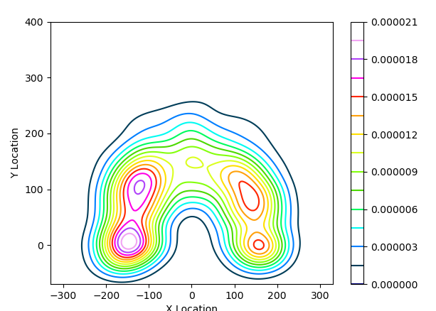
As a result of executing the code, you get the following diagram: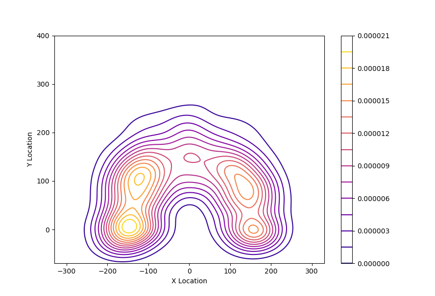 In this code, pay special attention to the line:
cs = sns.kdeplot(x, y, legend=True, shade=False, shade_lowest=False, cbar=True, gridsize=200, n_levels=15, cmap='plasma')
This line defines the parameters for the calculation and type of Contour Plot:
legend = True – displays the legend on the chart, it does not affect data
shade = False – displays contours without filling. A value of True returns filled paths and, in this case, the external and internal points of the filled contours will be saved into the data. To reduce the total number of points on the chart in Tableau, set the value of this parameter to False
shade_lowest = True – shows the low or zero level when shade = True. It makes no sense to show the level of zero probability – it will take up the entire remaining space of the diagram, so we use False
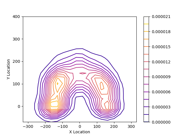
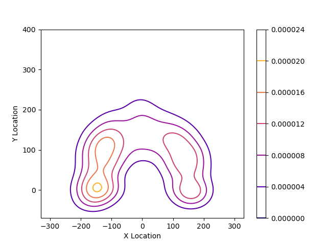
gridsize = 200 – sets the grid for plotting the chart. The larger this number, the more detailed the diagram will be, and more points will be uploaded to the file. With gridsize = 20, we get the following:
n_levels=15 – sets the number of levels in the diagram. In our case, there are 15 levels. With n_levels = 5, we get the following diagram:
cbar=True – shows legend, does not affect data
cmap=‘plasma’ – sets the color palette of the chart, the colors of which in HEX format are exported to the file. Other palettes can be selected too. You can view all seaborn palettes here: Here is the colors for cmap= ‘gist_ncar’
The resulting .csv file looks like this:
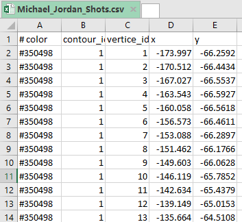
color – contour color
contour_id – contour identifier
vertice_id – vertice identifier
x,y – vertice coordinates
4. Drawing contours in Tableau
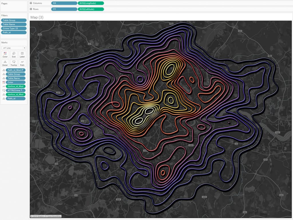
Let’s connect the .csv file to Tableau and draw the contours:
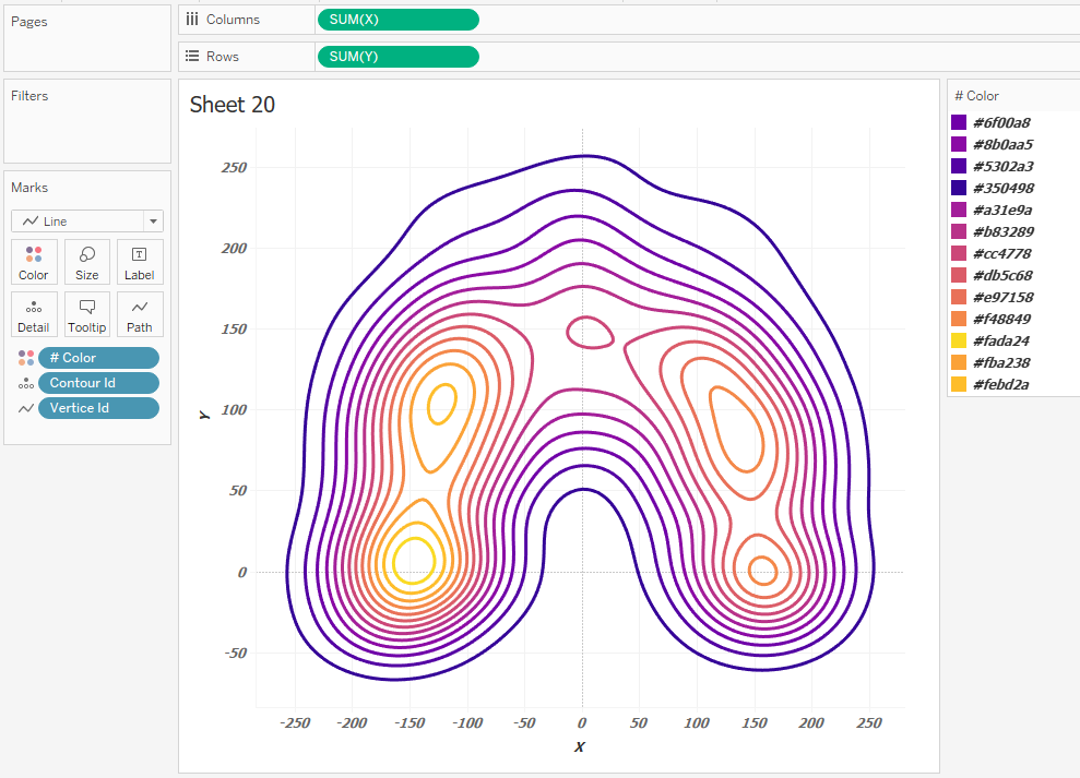
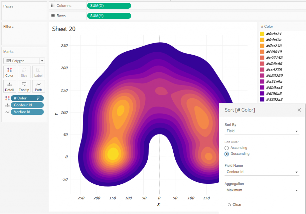
The color of these contours is determined by the HEX format. Enter the colors in the color settings # Color on the Marks shelf. Switch Marks from Lines to Polygons and set the drawing order of the contours, that is, Z-order. To do this, set up the sorting of contours by contour id:
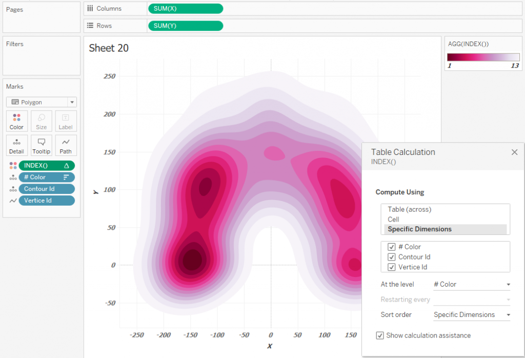
If you need to use the palette from the Tableau Preferences, you can define the color using the Continious INDEX () calculation and set the direction of calculations as on the picture below:
This is how simple Contour Plots can be built.
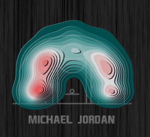
5. Tanaka Contours in Tableau
In order to get Tanaka contours, you need to add a pseudo 3D effect to make the contours with high probability of events appear taller. To do this, let’s make UNION in the data:
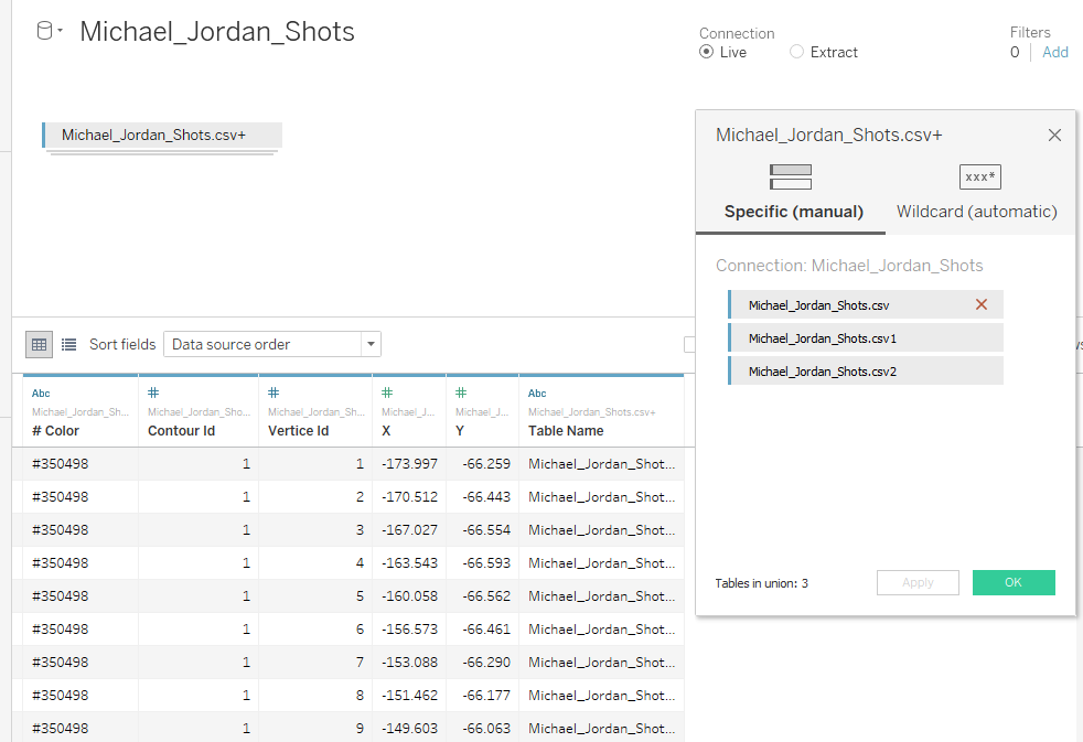
This will triple the data.
Table Michael_Jordan_Shots.csv – will describe original contours,
Table Michael_Jordan_Shots.csv1 – will describe the light areas of the contours,
Table Michael_Jordan_Shots.csv2 – will describe the shadows of the contours.
Let’s make the 3D Color calculation:
CASE [Table Name]
WHEN ‘Michael_Jordan_Shots.csv’ THEN [# Color]
WHEN ‘Michael_Jordan_Shots.csv’ THEN ‘#ffffff’
WHEN ‘Michael_Jordan_Shots.csv’ THEN ‘#000000’
END
‘#ffffff’ – this is the HEX code in white, and ‘#000000’ – is for black color.
Next, let’s make calculations for the new coordinates. Calculation XX:
CASE [3D color]
WHEN ‘#ffffff’ THEN [X]-1
WHEN ‘#000000’ THEN [X]+2
ELSE [X] END
Calculation YY:
CASE [3D color]
WHEN ‘#ffffff’ THEN [Y]+1
WHEN ‘#000000’ THEN [Y]-2
ELSE [Y]
END
From the calculations, you can see that the highlights are shifted by 1 along the X and Y axes, and the shadows are shifted by 2 along the X and Y. Now you can draw the Tanaka Contours:
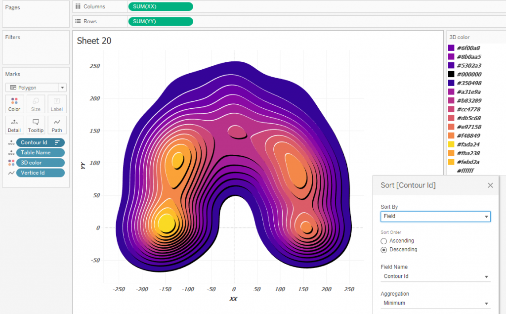
Here you can clearly see that the light contours are visually higher than the dark ones – this the mentioned pseudo 3D effect. The direction of the shadows and their width can be set by changing the offset values of the black and white polygons in the calculations XX and YY.
You need to pay attention to how the layers are sorted. Contour_id is sorted in descending order by id, that is, there will be contours above that describe a higher density. Since there is also a Table Name calculation in granulation, the layers are sorted by id and by Table Name inside each contour_id. Thus, the Z-order will be like this: id_10 with data, id_10 white, id_10 black … id_1 with data, id_1 white, id_1 black. This sorting allows you to perceive the diagram as three-dimensional with shadows.
For better understanding of the sorting of the contours, look at the figure below, which shows a 3D view and an illustrative order of sorting along the Z axis.
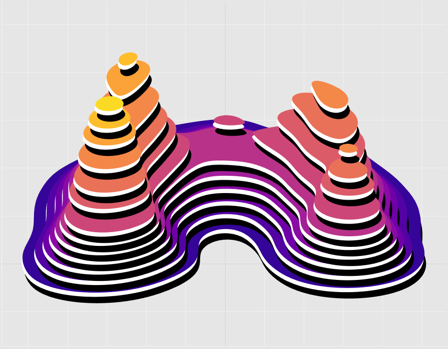
Note: Z-order is an ordering of overlapping two-dimensional objects. I told about this measure in an article ‘3D Models in Tableau‘.
We’ve learned how to build simple Contour Plots and Tanaka Contours. Let’s consider the problem of multipolygons next.
6. Working with multipolygons
Contour Plot levels are not always defined by a single polygon – a level can contain multiple polygons, as well as polygons with holes. The contour plot that shows Michael Jordan’s throws has levels that contain multiple polygons, but they are drawn independently since there is a Contour_id in granulation. Such cases do not distort the picture. If the path contains holes, then it may not be drawn correctly, and you need to fix it.
Have a look at Chris Paul’s successful throws and the Tanaka contours:
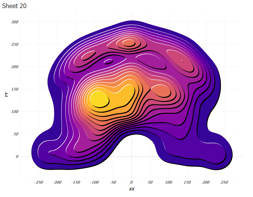 Above the middle of the diagram there are two contours (Contour Id 5 and 7) of the same color as the contours above which they are. For them, you need to take the color one level lower in the 3D Color calculation:
CASE [Table Name]
WHEN ‘Michael_Jordan_Shots.csv’ THEN IF [Contour Id]=5 THEN ‘#6f00a8’ ELSEIF [Contour Id]=7 THEN ‘#8b0aa5’ ELSE [# Color] END
WHEN ‘Michael_Jordan_Shots.csv1’ THEN ‘#ffffff’ WHEN ‘Michael_Jordan_Shots.csv2’ THEN ‘#000000’
END
And also offset the black and white layers in the opposite direction to the main offset:
XX
CASE [3D color]
WHEN ‘#ffffff’ THEN IF [Contour Id]=5 OR [Contour Id]=7 THEN [X]+1 ELSE [X]-1 END
WHEN ‘#000000’ THEN IF [Contour Id]=5 OR [Contour Id]=7 THEN [X]-2 ELSE [X]+1 END
ELSE [X]
END
YY
CASE [3D color]
WHEN ‘#ffffff’ THEN IF [Contour Id]=5 OR [Contour Id]=7 THEN [Y]-1 ELSE [Y]+1 END
WHEN ‘#000000’ THEN IF [Contour Id]=5 OR [Contour Id]=7 THEN [Y]+2 ELSE [Y]-2 END
ELSE [Y]
END
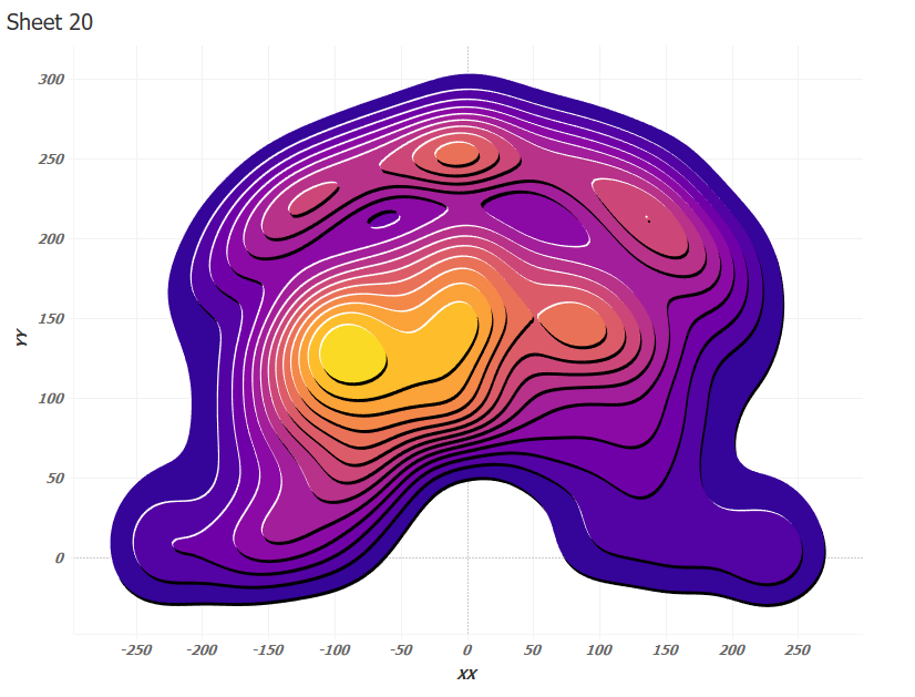
Everything is correct now:
The final viz containins 15 plots for 15 NBA players. You can analyze the patterns to compare players to find indsights:
7. Tanaka Contours example on the map
A visualization showing the density of crimes in London by type on the map can be viewed by link.
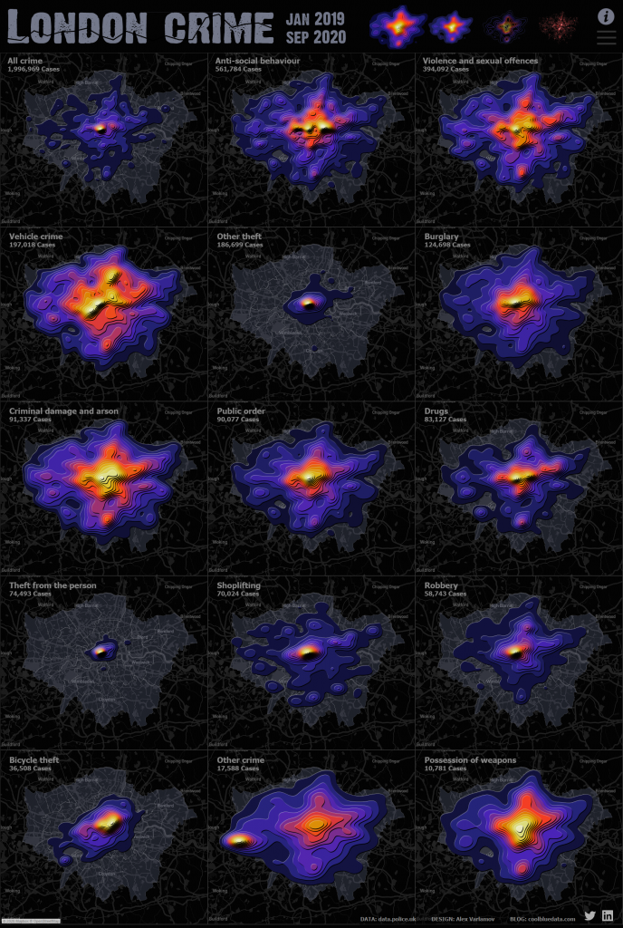
In a cell more than half a million facts of anti-social behavior are described by the Tanaka Contours diagram and it allows to rapidly estimate crime scene concentrations:
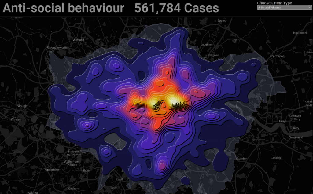
Quite an interesting effect is obtained if you add volume to the contour lines:
These visualizations help you quickly find the concentration of crime
Conclusion
Contour Plots can be used as a visualization of the concentration of some events, or an estimate of the probability of an event occurring at a certain point. Such visualizations work well on maps and sports analytics, but it can be used on scatter plots with many points as well.