
Sometimes it seems to us that the processes that surround us are chaotic, but this is far from always the case, and in random events one can find certain patterns of process behavior, collecting data from this process and analyzing it. Complex business tasks sometimes seem insurmountable, but by collecting data from business processes, processing and visualizing it, you can find valuable insights that gradually lead to the solution of such tasks in one form or another. Saying ‘ordering chaos’ i mean ‘getting insights from chaotic data’.
In this blog post I’d like to talk about how you can see certain patterns in events that at first glance seem chaotic. Having collected a small amount of data, after both preparation and visualization, one may not find any interesting results of the behavior of the systems under study. But the wider the sample becomes, as the dataset grows, the visualization can acquire noticeable behavioral features of the system, which can be described in words, and which will give you some insight into the work of the system. On the other hand, when you have a lot of data, displaying all events at once may also be confusing, so the data will have to be aggregated. To illustrate such an example, in this article, consider football passes.
Note: saying ‘Football’ in this blog post i mean ‘Soccer’ for american readers
Football is probably the most popular sport in the world. I am not a football fan, but I was always interested to see the basic patterns of this game, exploring a large amount of data in different matches. That is, it was interesting to build some kind of averaged picture of football. It should be noted that football has its own rules of the game, so game patterns must exist.
Try to mentally divide the entire football pitch into square meters and estimate in which directions and at what distances the players pass, as well as from which areas of the pitch the most passes are made. It is clear that you can estimate, but how much the correct picture you get is not clear. Therefore, we will continue to find, transform and work in Tableau with the football pass data.
Once I stumbled upon 2 articles by accident:
– Football Winds Map
– Advanced sports visualization with Python, Matplotlib and Seaborn
The articles dealt with the analysis and visualization of the events of football matches, and the first article gave an interesting analogy of football passes with the wind and made a map of the “football wind”.
In general, the description of seemingly chaotic systems by known physical equations for a gas or liquid is practiced, for example, in the analysis of traffic flows, where traffic flows are described by the Navier-Stokes equations for a Newtonian fluid (Article ‘Traffic Management Model’). Therefore, the visualization of football passes in the form of a wind map is also quite interesting, and it became interesting for me to do something similar in Tableau.
1. Data Collecting and Preparing
Data on actions on the field during matches was collected by StatsBomb – some of it is publicly available on GitHub. The data is presented in the form of 890 JSON files, each file contains the data of one match. The data contains information about the following leagues / cups:
– Champion League 1999
– 2019 – FA Women’s Super League 2018
– 2020 – FIFA World Cup 2018
– La Liga 2004 – 2020
– NWSL 2018
– Premier League 2003 – 2004
– Women’s World Cup 2019
Tableau can read JSON format, but not 890 files at once, so next we convert all 890 JSON files into one CSV file. First you need to download a zip archive from GitHub and unpack all 890 files into a local directory. The python script below reads all JSON files in the specified folder on the local computer and converts each file to a CSV file:
import json
import pandas as pd
from pandas.io.json import json_normalize
import os

#set working directory
path="C:\Docs\Tableau\SportsVizSunday\Foolball 2018\open-data-master\data\matches"

for filename in os.listdir(path):
    if filename.endswith(".json"):
        bb=os.path.join(path, filename)
        print(bb)
        with open(bb, encoding="utf8") as data_file:
            data = json.load(data_file)
        df = json_normalize(data, sep="_")

        a = df.to_csv(path + filename + '.csv', encoding="utf8", index=None)

        df1 = pd.read_csv(path + filename + '.csv')
        df1.to_csv(path + filename + '.csv', index=False)

        continue
    else:
        continue
After completion of this script, you will receive 890 .csv files in the directory specified in the script. Next, merge all the files into one .csv file. The following script makes a UNION of all files in the specified folder and saves them as one CSV file:
import os
import glob
import pandas as pd
#set working directory
os.chdir('C:/Docs/Tableau/SportsVizSunday/Foolball 2018/open-data-master/data')

#find all csv files in the folder
#use glob pattern matching -> extension = 'csv'
#save result in list -> all_filenames
extension = 'csv'
all_filenames = [i for i in glob.glob('*.{}'.format(extension))]
#print(all_filenames)

#combine all files in the list
combined_csv = pd.concat([pd.read_csv(f) for f in all_filenames ])
#export to csv
combined_csv.to_csv( "combined_ccs.csv", index=False, encoding='utf-8-sig')
We now have one CSV file containing event information for each of the 890 matches. I made further data cleansing and removal of unnecessary fields in Tableau Prep. Only the information about the passes remained in the data. The coordinates of the pass points in the final dataset are determined by the pass start and end points in a Cartesian coordinate system, and can be displayed on a football pitch. Pitch sizes may vary for different football matches; in the initial data, such deviations were compensated so that each match could be displayed on the pitch with the following coordinates:
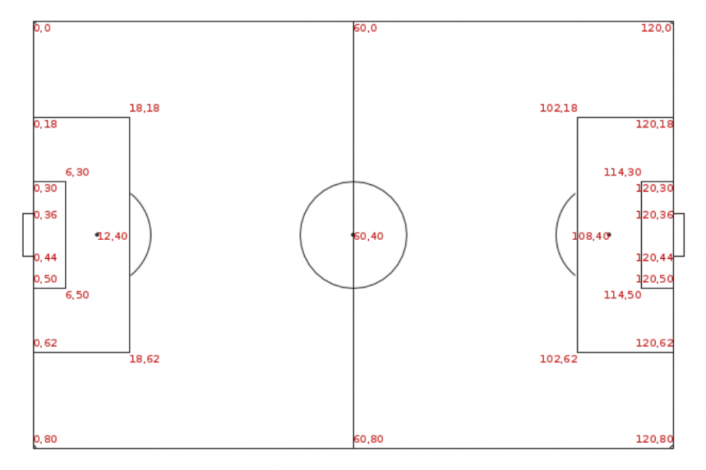
In the dataset itself, the data of all coordinates of game events are prepared as if for any team the right side of the field is the opponent’s side.
2. Evaluating Data with Tableau
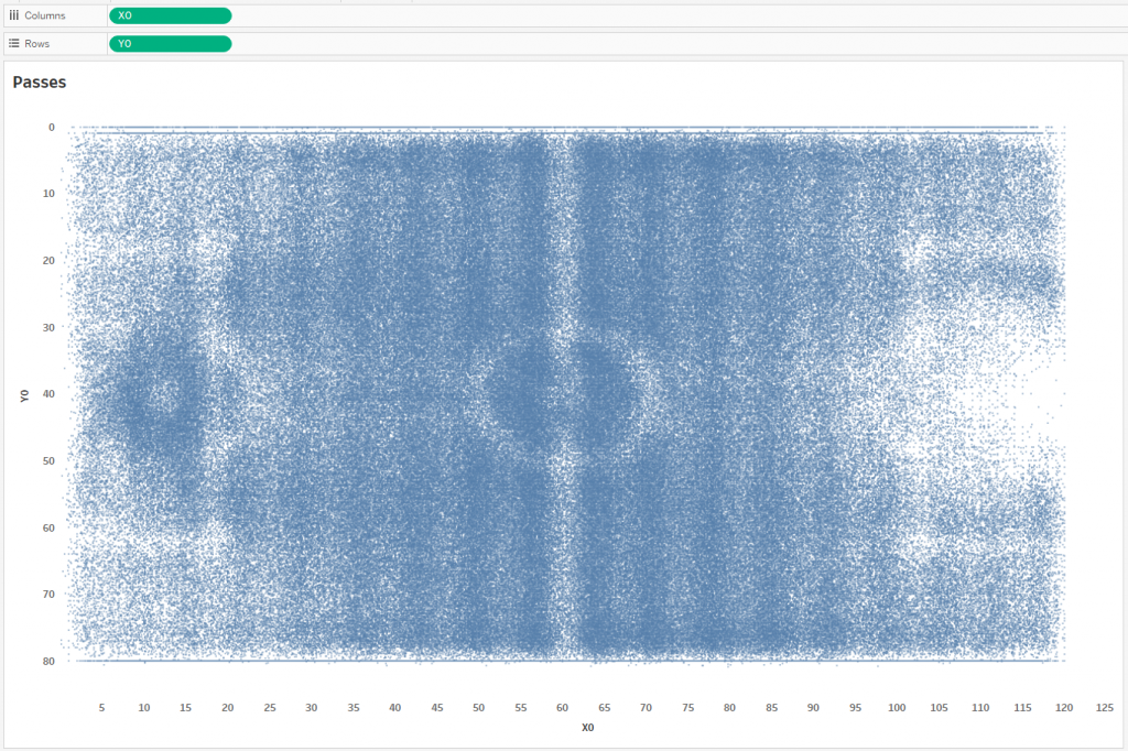
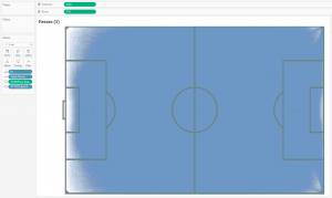
Tableau is ideal tool for ad-hoc data analysis, so let’s just try to display all passes using line marks and estimate their number. Connect the resulting CSV file to Tableau and display the start and end points of the passes.
Start points:
End points:
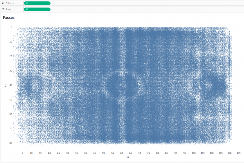
We got pictures from which nothing is clear, since the number of points on each is a little less than 900,000 pieces, which is almost a million. To build the passing lines, let’s make a UNION in Tableau:
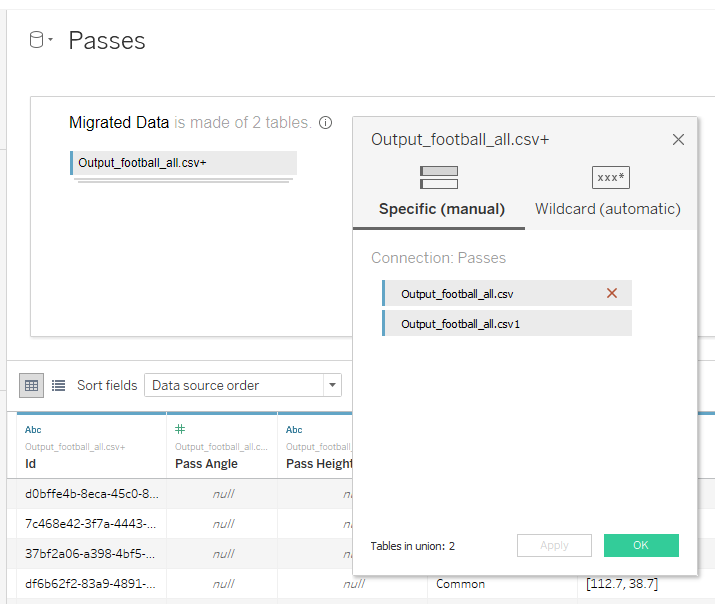
The Output_football_all.csv table will be responsible for the coordinates of the start points of the passes, and Output_football_all.csv1 will draw the coordinates of the ends of the passes. If we connect all the dots, that is, each pass is represented by a line, we get the following at an opacity level of 1%:
The id pill in granulation here is the pass id. That is, Tableau draws about 890,000 lines at the minimum opacity level, and they all merge into one blue rectangle – this does not give us anything either. But we can understand that in one match, on average, about 1000 passes are made, that is, each team makes about 500 passes. This is roughly in line with official football statistics.
The XXX and YYY calculations look like this:
XXX
CASE RIGHT([Table Name],1)
WHEN ‘1’ THEN [X0] ELSE [X1]
END
YYY
CASE RIGHT([Table Name],1)
WHEN ‘1’ THEN [Y0]
ELSE [Y1]
END
3. Data Aggregating
This picture doesn’t tell us anything, because there are about 890,000 lines here, and they all overlap. Therefore, the next step I decided to group the lines at the start, rounding X0 and Y0:
X0
ROUND(FLOAT(MID(SPLIT([Location],’,’,1),2,10)))
Y0
ROUND(FLOAT(SPLIT(SPLIT([Location],’,’,2),’]’,1)))
If we place the rounded coordinates on the football pitch, we get the following:
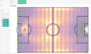
That is, the football pitch was divided into squares of about one meter by one meter, and all the coordinates of the passes within each square meter were pulled into one point. The calculation of COUNT in color here determines the number of passes at each point:
COUNT { FIXED [X0],[Y0]: SUM(1)} / 2
That is, by calculations with rounding, we divided the football field into squares with a side of 1 meter (approximately), and then we will visualize passes from each square. We need 2 in the denominator in order to return the correct number of passes, since the data was doubled by the UNION operation. For each such square, we average the coordinates of the end of the pass:
XXX
CASE RIGHT([Table Name],1)
WHEN ‘1’ THEN [X0]
ELSE { FIXED [X0], [Y0], [Table Name]: AVG([X1])}
END
YYY
CASE RIGHT([Table Name],1)
WHEN ‘1’ THEN [Y0]
ELSE { FIXED [X0], [Y0], [Table Name]: AVG([Y1])}
END
That is, averaging the coordinates of the end of the pass, we replace all passes from one square meter with only one line – this greatly reduces the total number of lines on the visualization. This way we get rid of the problem of overlapping a large number of lines with each other. It turns out the following picture:
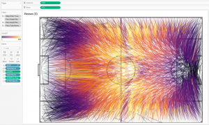
Pass directions are shown by adding Table Name field to Size on the Mark shelve, getting a thickening of the line at the end of the pass. This creates the feeling of a flying ball.
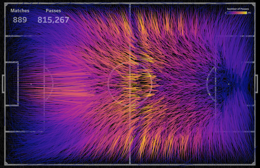
And the final viz in Tableau that was created as a submission for the awesome SportsVizSunday project:
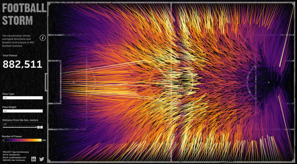
In this viz, the low number of passes is marked in black specially so that on a dark background such lines as insignificant are practically invisible. If we change the palette, strengthening the lines with a low number of passes, we get:
It is interesting to build a dynamic picture of passes, starting with one match and adding passes from another match at each next step. This dynamic picture just shows the transition from seeming chaos on a small amount of data to the ordering of lines on a large amount of data:
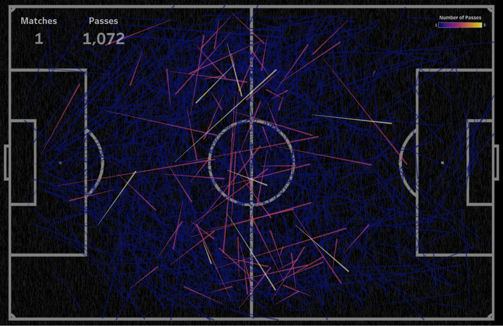
In this video, the data on goalkeeper passes, corners, kick-offs and throws-in have been removed from the visualization, so that only the passes of the players during the game, which determine the picture of the attack, are left. Compare the visualization of data from one match, where there is no pattern in the passes and gives a sense of random data, and the visualization of data of passes in 889 matches, where there is a clear symmetrical pattern of attack.
Note: I’ve written an article ‘Creating video with Tableau and software robots‘ that describes such video creating process
For the passes of one match, it is generally not clear what is happening on the pitch, it is almost impossible to highlight the priority areas of passes:
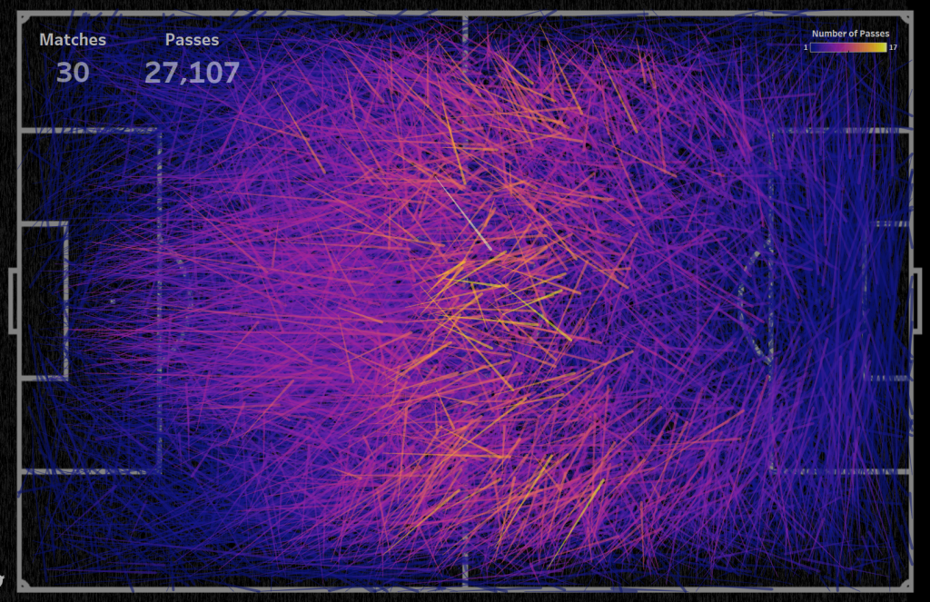
For 30 matches, semi-transparent lines cover the pitch markings in the center of the pitch, but there are some areas where passes are most often made:
For 889 matches, you can see the priority passing directions on each section of the football pitch:
It should be noted that after 300 matches the picture does not change much.
Conclusion
The data we have visualized includes information on passes in various types of competitions, games in various leagues, and women’s and men’s football. We got an overall average picture that can give an understanding of how attack is played in football. On the Reddit site, in the r/dataisbeautiful community, this visualization was commented 600 times, the viz collected more than 35,000 upvotes, so everyone found their insights in this visualization.
The purpose of the visualization was not an accurate analysis of football matches – in this visualization, an orderly and logical picture was created from the chaos of numbers, which in itself is a pretty good picture. The given example also shows how much the picture of passes changes from one match to the several hundred matches, that is, we can see the transition from a seemingly chaotic system to an ordered one.
Also above, we could make sure that a small amount of data and too many points do not work on visualization, but a certain average amount works.