
Math is beautiful!
The goal of the article is to show to Tableau users that math it is not only boring numbers and it is possible to describe anything by math equations and draw it. See a link below for a visualization of portraits of well known people. It’s hard to imagine the dataset for this visualization contains only 2 values: 0 and 500. The portrait’s curves draw by using parametric equations for X and Y axes.
Here is a link to my visualization:

Ken Flerlage wrote a nice blog post about parametric equation.
You should read it if you would like more about parametric equations and how it visualise in Tableau. He also made a parametric parrot visualization (and others) and wrote a blog post about it.
Usually we work with function like y=f(x) but there is an another type of function representation where x=f(t) and y=f(t).
Having t as a parameter and increasing it you can obtain x and y values for any t. So you can prepare a dataset with 101 rows increasing t from zero to 1 with a step=0.01 for instance. Tableau can visualize it as a scatterplot with 101 dots.
Parametric equations for all curves visualized in my viz were found earlier (I don’t know who found it) and kept in WolframAlpha system. You can find other curves too requesting ‘person curves’, ‘popular curves’ or even ‘marvel curves’.
There are links to Wolfram Research blog for those who want to know how the curves create in ‘Mathematica’ system by Wolfram Research (1, 2, 3)
1. Describing Person Curves
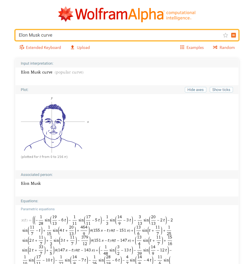
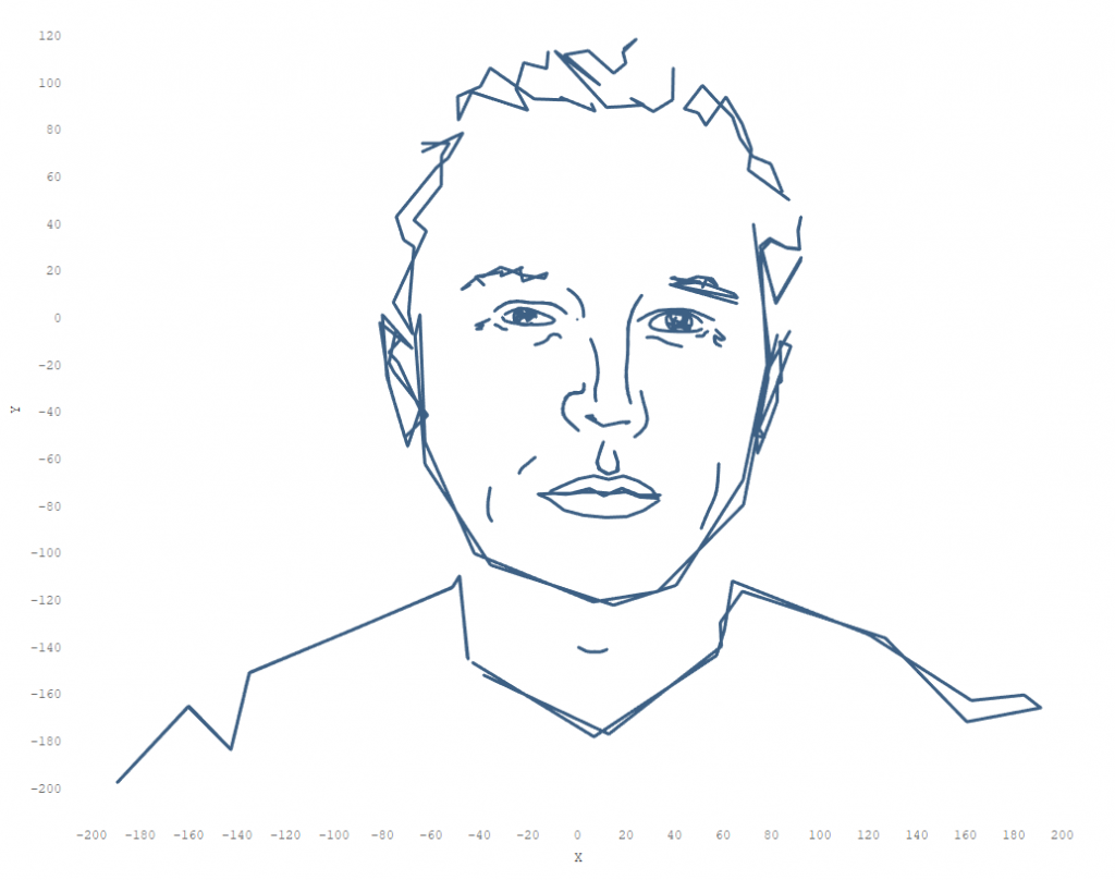
As an example we can choose any curve. I will work with ‘Elon Musk Curve’ in this article. When you found a curve you can see a preview of the curve, a mathematical view of both of parametric equations.
Click on ‘plain text’ as on a picture below
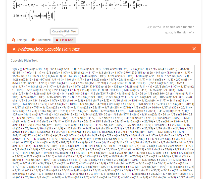
The plain text represents math formulas as 2 strings: one string is for x(t) and another one is for y(t). You should copy it clicking on the plain text.
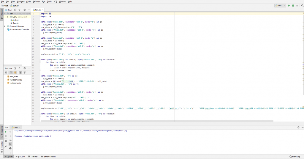
The next steps I will be describing below include work with Python 3 code. It means you should have installed the Python language on your computer if you want to recreate the equations for Tableau. Also I will show the code in PyCharm is an integrated development environment (IDE) for the Python language.
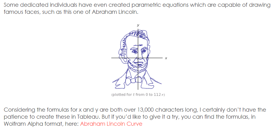
Ok. Now we should find out what kind of functions contain the parametric equations. The equations are long (over 17000 symbols) but we can break it into 3 type of functions (the coefficients can by any):
1. 1/25 sin(12 t + 11/7)
2. θ (139 π – t)
3. θ(sqrt(sgn(sin(t/2)))) where
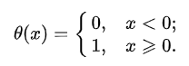
where θ (x) is Heaviside step function and sgn(x) – Signum function
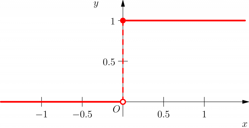
Here are two charts for the functions where arguments =0
Heaviside step function
Signum Function
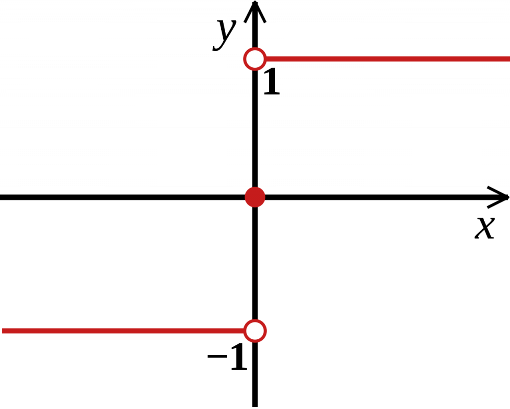
* the pictures is taken from Wikipedia
2. Converting parametric equations into Tableau Calculations
We need to represent the terms in Tableau format. So we should add ‘*’ signs and use IIF and IF/THEN calculations for converting Signum and Heaviside functions to Tableau format. The terms below are represented in Tableau format:
1. 1/25 *sin(12*[t] + 11/7)
2. *IIF(139*PI() –[t]<0,0,1)
3. *IIF((sqrt(IF sin([t]/2)<0 THEN -1 ELSEIF sin([t]/2)>0 THEN 1 ELSE 0 END))<0,0,1)
Also there were added multiplication signs because the calculations in Tableau don’t work without it.
Now we need to substitute the terms in parametric equations.
Start it with Python
The python script converts initial parametric equations substituting terms.
Here is a link to the code and the code is:
'''
The code allows converting parametric equations from https://www.wolframalpha.com/
1. Find a person curve on the site
2. Click on 'plain text' below a snippet with equations and copy the text
3. Create an empty file 'Text.txt' on your local computer in a Python project folder where  and paste the text. Close the file
4. Run the script on your computer
5. Open the 'Text.txt' file and copy the text
6. Open a new project in Tableau, create a calculation X and paste the text. There will be 2 strings pasted.
7. Cut a lower string ad click 'Ok'
8. Create a new calculation 'Y' and paste it, click 'Ok'
Now we have parametric equation for X and Y where t is a variable
'''

import re
import os

with open('Text.txt', encoding='utf-8', mode='r') as g:
  old_data = g.read()
new_data = old_data.replace('θ', 'O')
with open ('Text.txt', encoding='utf-8', mode='w') as g:
  g.write(new_data)

with open('Text.txt', encoding='utf-8', mode='r') as g:
  old_data = g.read()
new_data = old_data.replace(' π', '*PI')
with open ('Text.txt', encoding='utf-8', mode='w') as g:
  g.write(new_data)

replacements2 = {' t': '*t', ' sin': '*sin'}

with open('Text.txt') as infile, open('Text1.txt', 'w') as outfile:
    for line in infile:
        for src, target in replacements2.items():
            line = line.replace(src, target)
        outfile.write(line)

with open('Text1.txt', 'r') as x:
  old_data = x.read()
new_data = re.sub('O\((.*?)\)', r'*IIF(\1<0,0,1)', old_data)
with open ('Text1.txt', 'w') as y:
  y.write(new_data)

with open('Text1.txt', encoding='utf-8', mode='r') as g:
  old_data = g.read()
new_data = old_data.replace('*PI', '*PI()')
with open ('Text1.txt', encoding='utf-8', mode='w') as g:
  g.write(new_data)

replacements = {'-*t' :'-t', '+*t' :'+t', '-*sin' :'-sin', '+*sin' :'+sin', '+*PI()' :'+PI()' , '-*PI()' :'-PI()', 'x(t) =':'', 'y(t) =':'',  '*IIF(sqrt(sgn(sin(t/2<0,0,1))))': '*IIF((sqrt(IF sin([t]/2)<0 THEN -1 ELSEIF sin([t]/2)>0 THEN 1 ELSE 0 END))<0,0,1)'}

with open('Text1.txt') as infile, open('Text.txt', 'w') as outfile:
    for line in infile:
        for src, target in replacements.items():
            line = line.replace(src, target)
        outfile.write(line)

os.remove('Text1.txt')
Steps which the python script makes:
1.Changing greek letters θ and π to 'O' and '*PI' respectively to make further transformation easily (special kudos to Egor Larin and Konstantin Brudar for help with encoding in UTF-8)
with open('Text.txt', encoding='utf-8', mode='r') as g:
  old_data = g.read()
new_data = old_data.replace('θ', 'O')
with open ('Text.txt', encoding='utf-8', mode='w') as g:
  g.write(new_data)

with open('Text.txt', encoding='utf-8', mode='r') as g:
  old_data = g.read()
new_data = old_data.replace(' π', '*PI')
with open ('Text.txt', encoding='utf-8', mode='w') as g:
  g.write(new_data)
2. Putting '*' signs before 't' and 'sin'
replacements2 = {' t': '*t', ' sin': '*sin'}

with open('Text.txt') as infile, open('Text1.txt', 'w') as outfile:
    for line in infile:
        for src, target in replacements2.items():
            line = line.replace(src, target)
        outfile.write(line)
3. Using regular expression, recreating Heaviside function to Tableau format
with open('Text1.txt', 'r') as x:
  old_data = x.read()
new_data = re.sub('O\((.*?)\)', r'*IIF(\1<0,0,1)', old_data)
with open ('Text1.txt', 'w') as y:
  y.write(new_data)
4. Replacing '*PI' to Tableau function '*PI()'
with open('Text1.txt', encoding='utf-8', mode='r') as g:
  old_data = g.read()
new_data = old_data.replace('*PI', '*PI()')
with open ('Text1.txt', encoding='utf-8', mode='w') as g:
  g.write(new_data)
5. Replacing '-*t' :'-t', '+*t' :'+t', '-*sin' :'-sin', '+*sin' :'+sin', '+*PI()' :'+PI()' , '-*PI()' :'-PI()' for cases when there is no coefficients before t,sin and PI(). Replacing Signum function expression. Deleting 'x(t) =', 'y(t) =' – we do not need it
replacements = {'-*t' :'-t', '+*t' :'+t', '-*sin' :'-sin', '+*sin' :'+sin', '+*PI()' :'+PI()' , '-*PI()' :'-PI()', 'x(t) =':'', 'y(t) =':'',  '*IIF(sqrt(sgn(sin(t/2<0,0,1))))': '*IIF((sqrt(IF sin([t]/2)<0 THEN -1 ELSEIF sin([t]/2)>0 THEN 1 ELSE 0 END))<0,0,1)'}

with open('Text1.txt') as infile, open('Text.txt', 'w') as outfile:
    for line in infile:
        for src, target in replacements.items():
            line = line.replace(src, target)
        outfile.write(line)
6. Removing ‘Text1.txt’ file
os.remove('Text1.txt')The script could be optimized but I think having a few steps it looks clearly.
After starting PyCharm, you should create a new project, make file ‘Text.txt’ in the project and make .py file (test.py in my case) you will work with.
Copy a code using the link: https://github.com/AlexVarlamoff/Paramertic-Equations-to-Tableau-Format-converter/blob/master/Converter.py and paste to PyCharm.
Run the code.
When you’ll see a message ‘Process finished with exit code 0’, open the file ‘Text.txt’ and copy all from it.
Make a dataset in Excel with column ‘Num’ and 2 values in the column
Num
0
500
3. Drawing parametrically in Tableau
Start Tableau Desktop and open the Excel file as a data source
Create a new calculation ‘X’ and paste copied parametric equations.
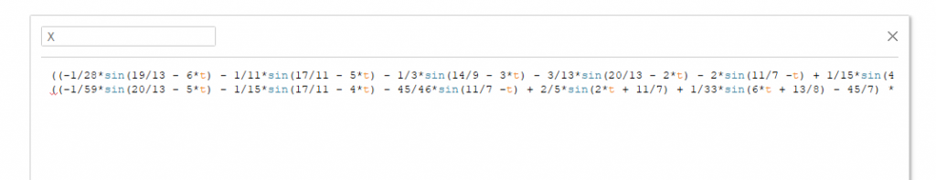
There will be 2 strings (upper string for X and lower string for Y), cut lower string, press ‘Ok’. We have X calculation
Create new calculation Y and paste a string to it. Press ‘Ok’. We have Y calculation
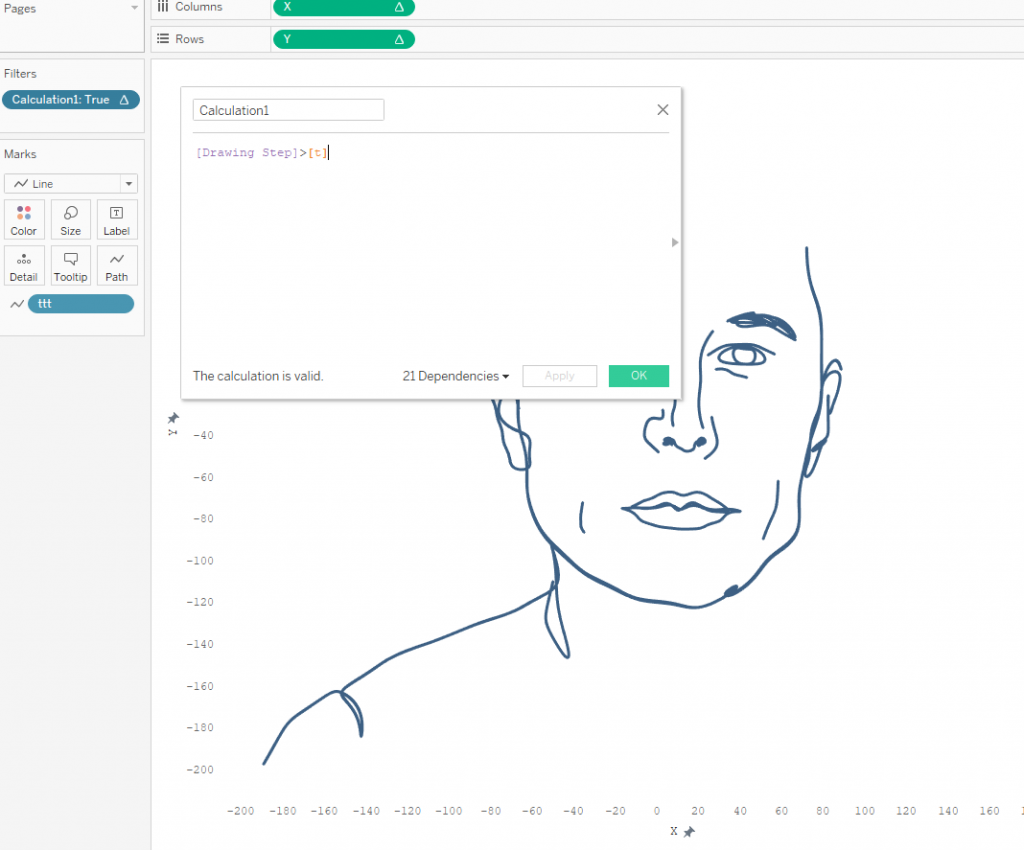
Create a bin (ttt in my case)
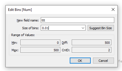
Create a calculation with INDEX() . A parameter Step in the calculation will be controlled manually, I'll talk about ot further. Actually you can paste 100 in denominator instead of it. The more denominator here the less a step between neighbours t values, hence the more detailed a picture.
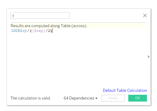
Drag and drop X, Y and ttt pills on a sheet in Tableau like on a screenshot below. X and Y are table calculation. Choose 'compute using' - ttt for both calculations. So you will have a person curve.
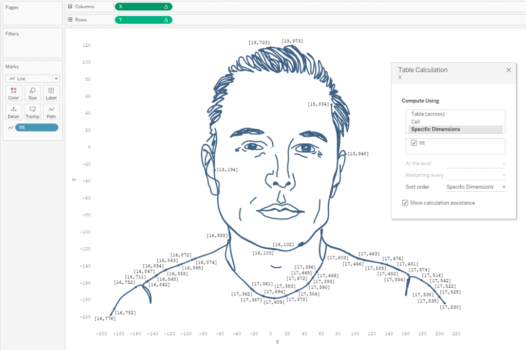
Note that on a WolframAlpha site below the Elon Musk curve was written 'plotted for t from 0 to 156π'. That means the function has X and Y = 0 outside the range. When t>156π X and Y =0 and you can see the dot on a Tableau sheet above.
It is possibly to filter it but table calculation filter decrease total performance of the dashboard. Also you can calculate a size of bin for ttt calculation more preciesly if you like. It is 0.0172 for our case when all dots will be in a range from 0 to 156π.
Curve settings
Wishing to have more interactivity I have created two parameters:
- Complexity Step
- Drawing Step
The step of complexity I already have mentioned above as a part of t calculation. The step can change an interval between neighbour values of t. There are a couple example below:
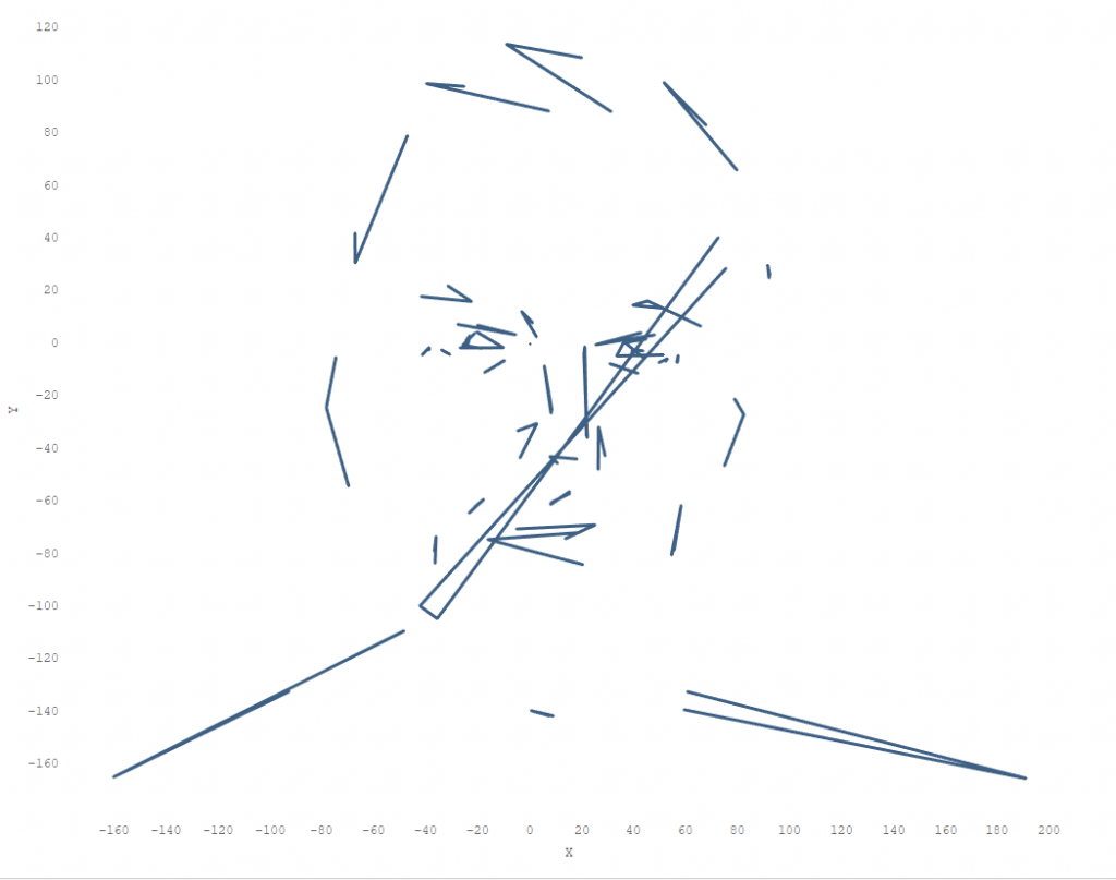
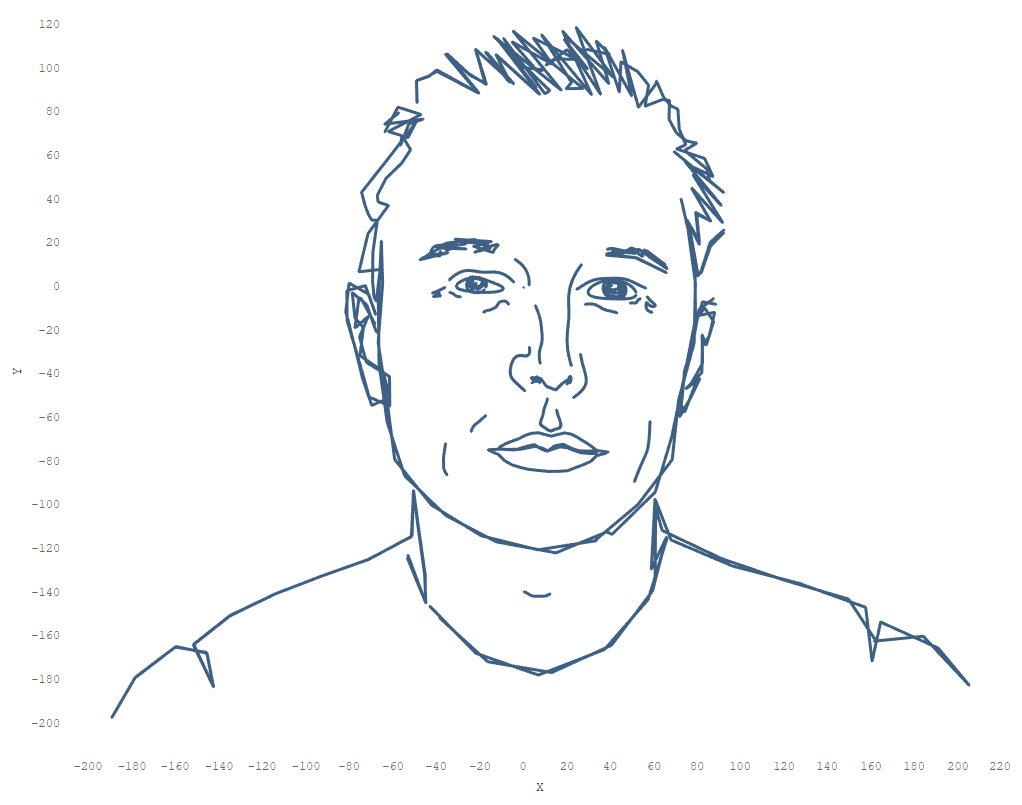
As you can see increasing the Step we decrease t- value, hence there are more dots gets into the range (from 0 to 156π)
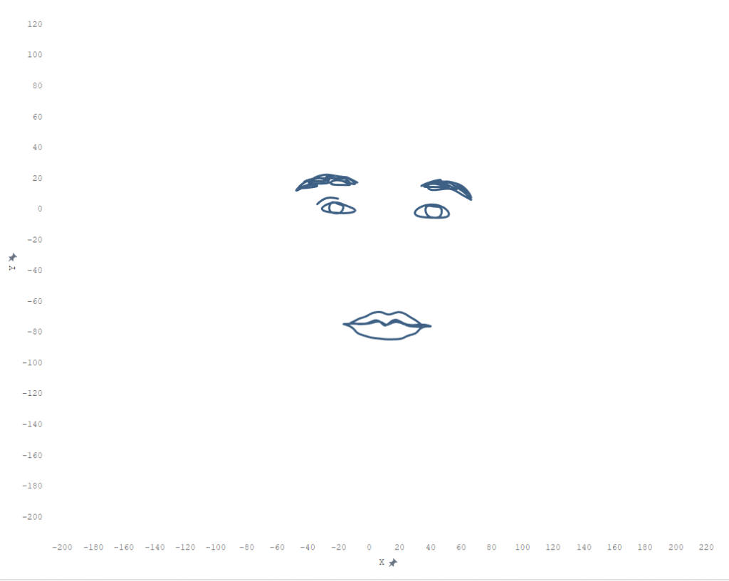
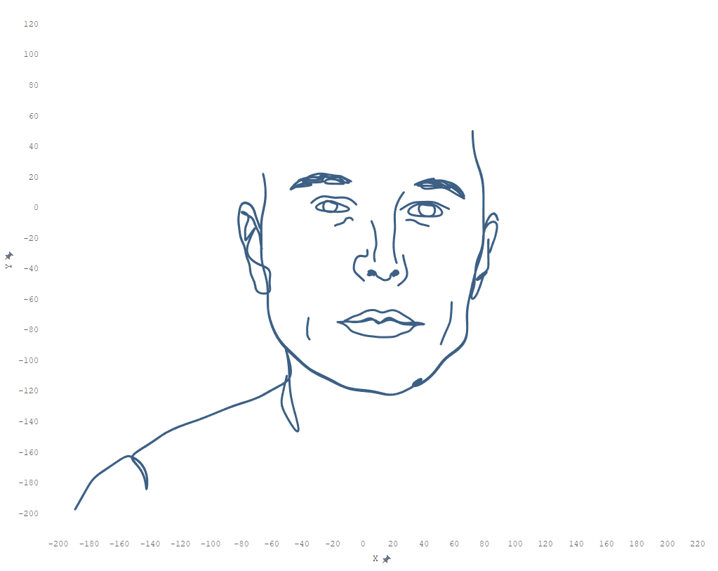
The Drawing Step defines the order of drawing of simple curves.
Complexity Step = 100
Complexity Step = 100
To make the steps I have created a calculation that uses as a filter remaining only t - values less than the Drawing Step value.
And there is the final result:

Drawing the portraits step by step with different values of complexity we can achieve very interesting results:
P.S. Preparing the article I found a hidden gem in a Ken Flerlage's blog post I've mentioned above:
There is no limits with Tableau
Conclusion
The parametric portraits in Tableau is not a common way to visualize data. But the idea that any picture can be described by parametric equations is stunning. Do you agree that The universe works on a math equation (thanks Adam Mico who has discovered the song for me)?