
The optimal transport problem or the Monge-Kantorovich transportation problem is a linear programming problem about the optimal transportation plan from departure points to destination points, with minimal transportation costs. In the classical problem, the plan of transportation of a uniform product from uniform points of availability in uniform conditions of use on uniform vehicles. Solving transport problems has a huge role in the economy. In this article I will show how to solve such problems using an example and describe how you can visualize the results of a solution. This article is about examples and solutions of the optimal transport problem with Python and Tableau.
1. Problem Statement
There are 392 hotels on Manhattan Island in New York City. One guest is checked out from each hotel, for each of which you need to send a taxi to take everyone to the airport. Guests check out at one time, 392 taxis are scattered across Manhattan. It is necessary to send each car to one hotel so that all routes are optimal, that is, the sum of all distances is minimal. To simplify the task, we will not take into account the geometry of the streets, but simply find the distances between hotels and the current taxi positions. I found data on hotels in the state of New York on kaggle, selected 392 hotels from there so that I got a compact picture on the map. I visualized the data on the map in Tableau – so the points are immediately visible, and you can quickly remove unnecessary ones either using filters or using ‘Exclude’ option right on the map. The result is the following picture:
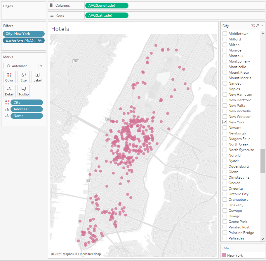
All these points with coordinates, names and addresses of hotels were uploaded to the Hotels.csv file
Now we need to somehow scatter a taxi around Manhattan. There are many car accidents datasets in the Internet, and for New York, such datasets are usually correct. There is a dataset for 2016 on kaggle. Traffic accidents occurred on the streets of Manhattan, so you can take 392 locations and consider them as the locations of taxis. I connected this dataset to Tableau and left 392 taxi start locations with filters so that these locations were approximately on the same part of the island as the hotels:
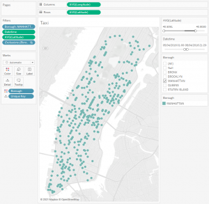
These points with coordinates were uploaded to the Taxi.csv file
Now we see start points (taxi) and finish points (hotels). Next, we will look for a set of optimal routes, that is, to solve the transportation problem.
2. Finding Optimal Routes
Let’s solve the problem in Python. We will use the library POT: Python Optimal Transport.
The library documentation contains an example of the optimal transport problem between two sets of points. This example suits for understanding how the library works.
I got the code from the example as a basis, added reading geo coordinates from the Hotels.csv and Taxi.csv files, as well as unloading the transition matrix:
import numpy as np
import pandas as pd
import csv
import matplotlib.pylab as pl
import ot.plot
n = 392 # nb samples
data1 = pd.read_csv ('C:/Docs/Tableau/Projects/Optimal Transport/New York Taxi/Final/Taxi.csv', encoding="ISO-8859-1", nrows=n)
data2 = pd.read_csv ('C:/Docs/Tableau/Projects/Optimal Transport/New York Taxi/Final/Hotels.csv', encoding="ISO-8859-1", nrows=n)
a1 =pd.DataFrame (data1, columns=["Longitude", "Latitude"])
a2 =pd.DataFrame (data2, columns=["Longitude", "Latitude"])
xs = np.array(a1)
xt = np.array(a2)
print(a1)
print(a2)
a, b = np.ones((n,)) / n, np.ones((n,)) / n # uniform distribution on samples
# loss matrix
M = ot.dist(xs, xt)
M /= M.max()
pl.figure(1)
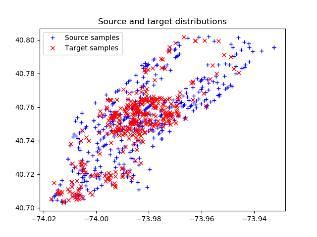
pl.plot(xs[:, 0], xs[:, 1], '+b', label='Source samples')
pl.plot(xt[:, 0], xt[:, 1], 'xr', label='Target samples')
pl.legend(loc=0)
pl.title('Source and target distributions')
pl.figure(2)
pl.imshow(M, interpolation='nearest')
pl.title('Cost matrix M')
G0 = ot.emd(a, b, M)
pl.figure(3)
pl.imshow(G0, interpolation='nearest')
pl.title('OT matrix G0')
pl.figure(4)
ot.plot.plot2D_samples_mat(xs, xt, G0, c=[.5, .5, 1])
pl.plot(xs[:, 0], xs[:, 1], '+b', label='Source samples')
pl.plot(xt[:, 0], xt[:, 1], 'xr', label='Target samples')
pl.legend(loc=0)
pl.title('OT matrix with samples')
table=[]table2=[]i = 0
j = 0
while j < n:
while i < n:
if G0[i,j]>0:
table.append([i,j])
i = i + 1
table2.append(table)
i = 0
j = j + 1
print(type(table2))
pl.show()
with open('C:/Docs/Tableau/Projects/Optimal Transport/New York Taxi/Final/transition_matrix.csv', "w", newline="") as f:
writer = csv.writer(f)
writer.writerows(table)
Let’s see how the code works.
n = 392 is the number of rows read from the Hotels.csv and Taxi.csv files. We write the rows into arrays xs, and xt, respectively, display the points of the arrays on a scatter plot. We get the start points (Source samples – taxi points) and finish points (Target samples – hotel points):
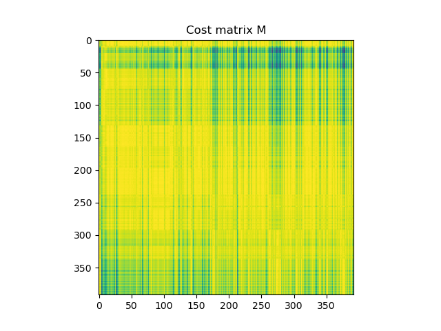
Next, the most interesting thing begins – all the distances between the Source and Target groups are calculated and a distance matrix (cost matrix) is built, in which the color encodes the distance between the points with Source id and Target id:
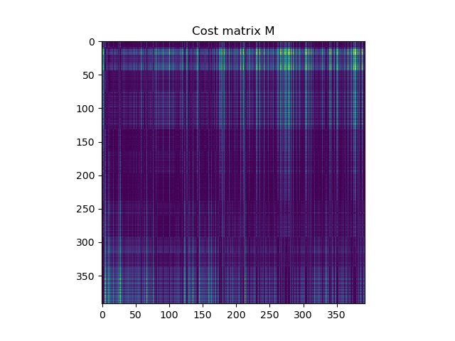
The lighter the point, the smaller the distance between hotel and taxi locations.
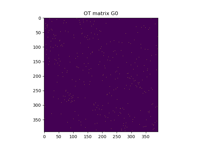
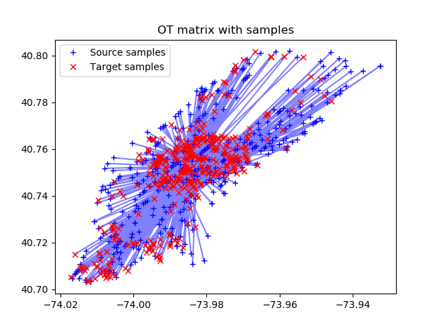
After that, on the basis of the cost matrix, the optimal transport matrix is constructed. In it, one point from the Source group is associated with one point of the Target group. All light points in the matrix below show such correspondences:
The following figure visualizes the found matches of the points, that is, the optimal distances between Source and Target are shown.
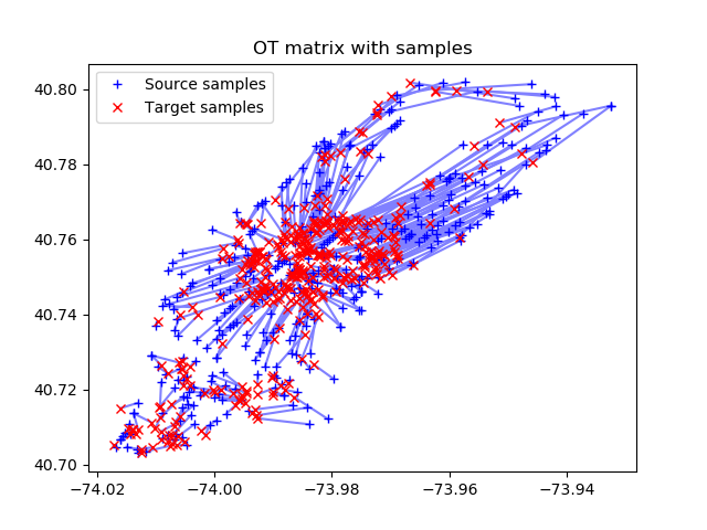
The last picture is exactly what we wanted to find – the optimal set of taxi routes to hotels.
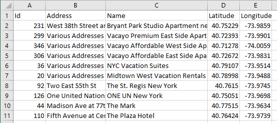
At the end, the code writes the Source id – Target id matches to a .csv file as two columns, and we get the transition_matrix.csv file that will help connect the Hotels.csv and Taxi.csv sources by optimal id.
The transition_matrix.csv file looks like this:
![]()
Here, the first column is the location id of the Taxi.csv file, and the second column is the hotel id in Hotels.csv.
Let’s add these columns to the files. For example, for Taxi.csv it will look like this:
Let’s do the same in the Hotels.csv file.
Note: In this example, for the simplicity, we are working with the Cartesian coordinate system and do not take into account the change in longitude. One degree of longitude corresponds to 111 km at the equator, and as you move to the poles, this distance decreases, and this must be taken into account when calculating distances on maps.
3. Routes Visualizing in Tableau
Let’s connect the .csv files to Tableau amd make a UNION:

In following visualization, you can:
- Use animations and show animated transitions between start and end points
- Build routes by connecting points with lines
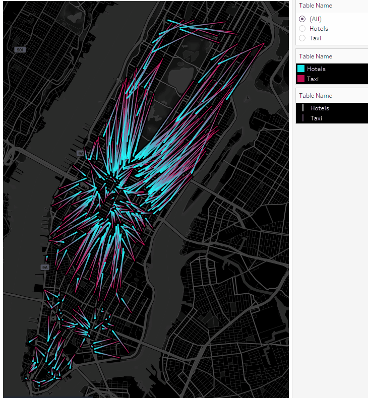
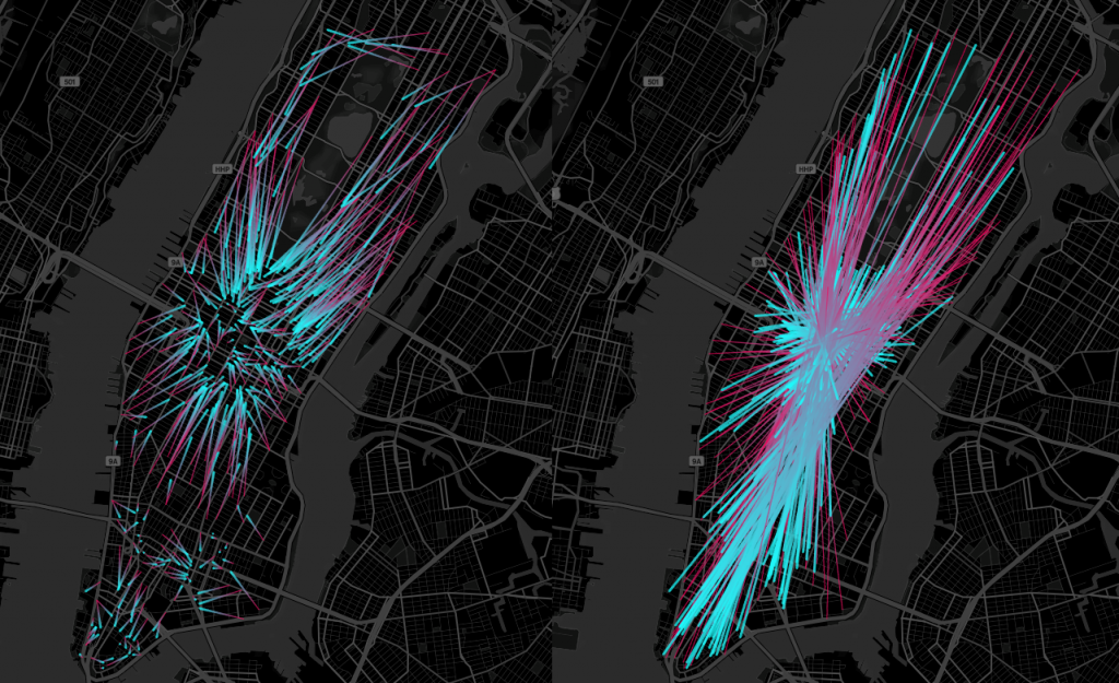
Let’s draw the taxi routes first. Taxis start from red points and move towards blue ones:
Using the Table Name filter, you can enable and disable taxi locations or hotel points:
We got animated routes. Now let’s plot the taxi movements as points on the map.
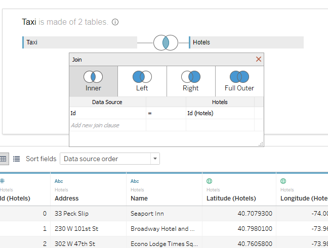
To do this, create a new source and join two .csv files by id:
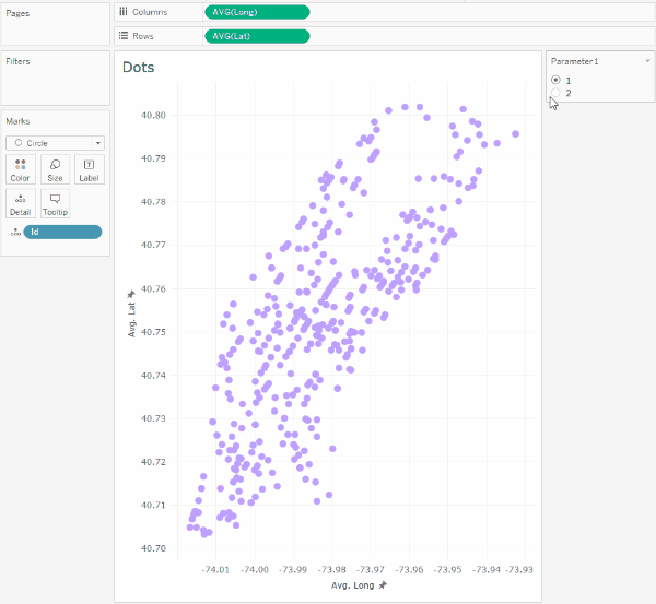
Let’s create a numeric parameter Parameter 1 with values 1 and 2, and two calculations, Lat and Long:
Lat
IF [Parameter 1]=1 THEN [Latitude (Taxi)] ELSE [Latitude (Hotels)] END
Long
IF [Parameter 1]=1 THEN [Longitude (Taxi)] ELSE [Longitude (Hotels)] END
This parameter will allow switching the coordinates of the taxi to the coordinates of the hotels, and with the animation turned on, we will see the following:
It should be noted that such transitions in Tableau are not animated on the map, so we will not assign latitude and longitude geographic types to the Lat and Long calculations.
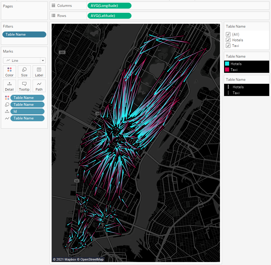
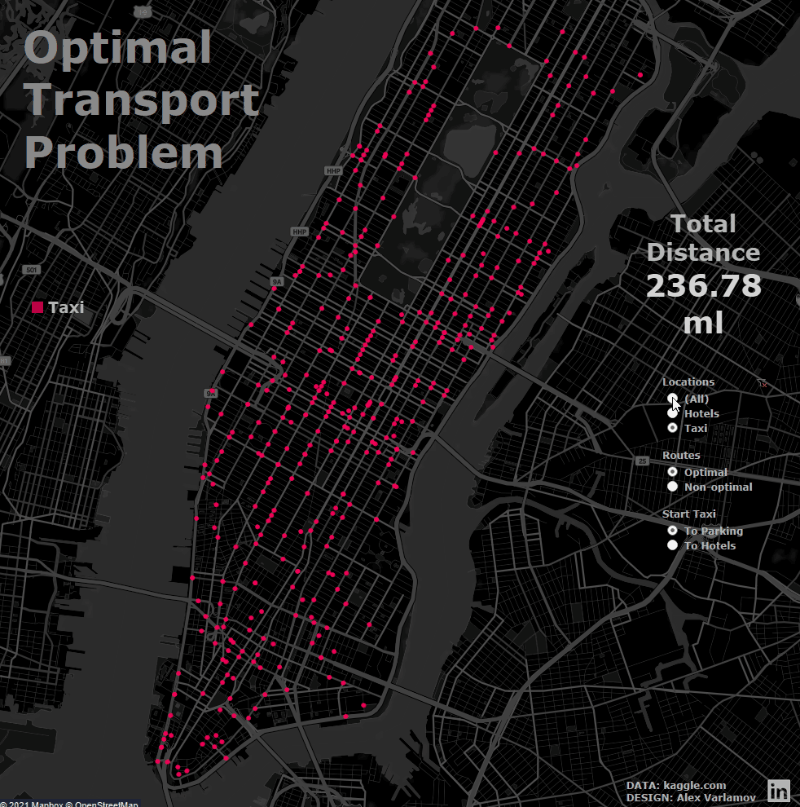
If on one dashboard we combine a sheet with route lines on the map and a sheet with points, after removing the background fill, grid and coordinate axes, we will get the following image, in which one Tiled layer with the map is switched by the Table Name filter, and the animation of points on the Floating sheet is switched parameter.
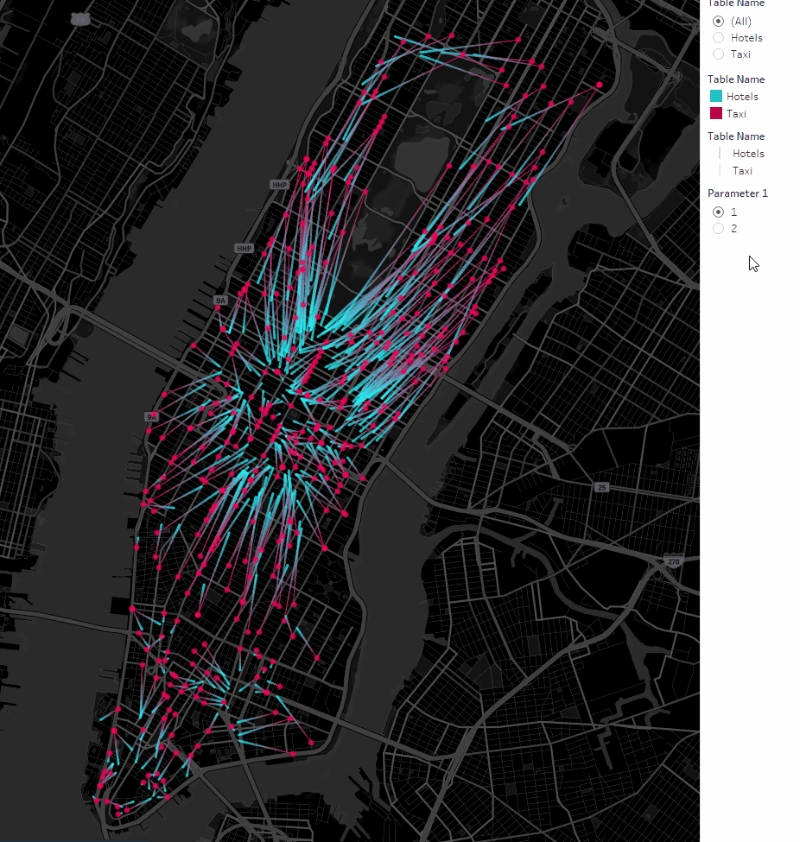
Thus, we showed the animated taxi routes with lines, and the taxis themselves – with points. This completes the task of finding optimal routes and the data visualization.
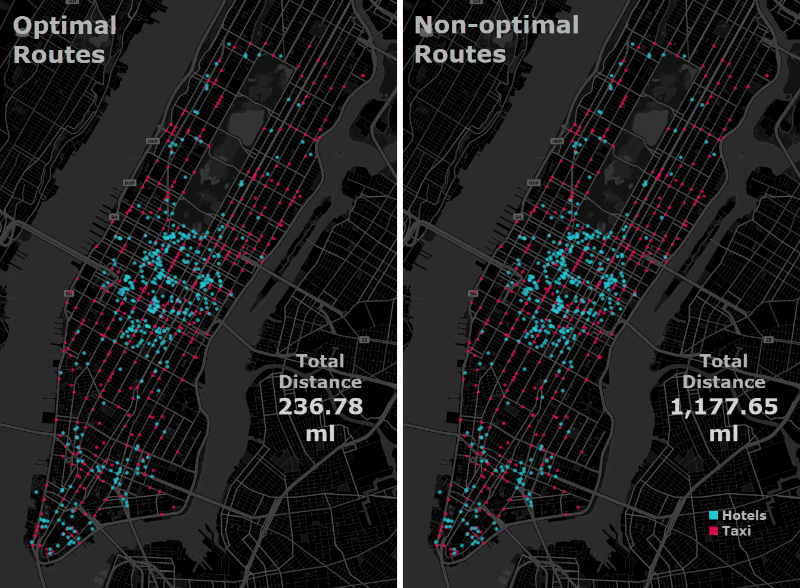
4. Non-optimal Routes
Previously, we considered only the optimal taxi routes, in which the total distance between cars and hotels would be minimal. However, it is interesting to see how the optimal picture differs from the most non-optimal one.
To do this, you need to transform the cost matrix so that the minimum numbers become minimum and vice versa. You can add the following line to the code after the line M / = M.max ():
M = - M
As a result, the distance matrix will look like this:
And the routes will be rearranged as follows:
You can compare the optimal and non-optimal routes. You just need to add id to the dataset for non-optimal routes, that is, by making a join with another Hotels dataset, but with different id.
The difference between the optimal and non-optimal picture will be like this:
To calculate the total distances of all routes, we use the formula for the geometric distance between two points:
IF [Non Optimal]=TRUE THEN
SQRT(([Latitude (Hotels)]–[Latitude])^2 + ([Longitude (Hotels)]–[Longitude])^2)
ELSE
SQRT(([Latitude (Hotels NonOptimal)]–[Latitude])^2 + ([Longitude (Hotels NonOptimal)]–[Longitude])^2)
END
To convert distances to miles, you can modify the Distance formula:
IF [Non Optimal]=true THEN
69*SQRT(([Latitude (Hotels)]–[Latitude])^2 +
([Longitude (Hotels)]*COS(RADIANS([Longitude (Hotels)]))-
[Longitude]*COS(RADIANS([Longitude])))^2)
ELSE
69*SQRT(([Latitude (Hotels NonOptimal)]–[Latitude])^2 +
([Longitude (Hotels NonOptimal)]*COS(RADIANS([Longitude (Hotels NonOptimal)]))-
[Longitude]*COS(RADIANS([Longitude])))^2)
END
69 miles in one degree – this is what the number 69 means. If kilometers are needed, then 69 must be replaced by 111. The cosine of the angle of longitude, by which longitude is multiplied, compensates for the approach of the meridians to the poles.
The picture below shows the total distance of optimal and non-optimal routes differs by 5 times:
And the final viz:
In this way, we have shown that with the Optimal Transport method significantly reduces transport costs.
5. Using Optimal Transport in Tableau Animation
Native animation in Tableau has been around for over a year, and there are examples of animated point transitions. For example, Extreme Weather Impacts on Health and Wellbeing by Gary Collins, Disney movies total gross 1937-2016 by yanming.guo, Titanic – Great loss of life from Simon Rowe, my viz about House of Representatives.
I wrote about how to create such visualizations in the article Data driven pictures in Tableau.
Transitions from one image to another one usually do not take into account the length of the trajectories between the transition points – it just take the ordinal numbers of the lines in the dataset and numbered in this order. However, you can use Optimal Transport to find minimum transition lengths.
I did this in the visualization ‘Valentine’s Day’, where each dot is one Tableau Public profile:

Here, the same Python script above was used to calculate the transitions. For two adjacent pictures, id points were calculated:
![]()
![]()
Such animation looks more elegant, and the effect of morphing is created. There are not just chaotic transitions from one point to another. It seems to me that using optimal transport in animation can lead to interesting visualizations.
Attention: as the number of points in your dataset increases, the size of the cost matrix increases dramatically. For example, if the number of points is 4500 in the Valentine’s Day rendering, this matrix contains 4500×4500 = 20250000 numbers. With a significant increase in points, the script will not be able to process them – there will not be enough RAM
Conclusion
The Optimal Transport calculation can be applied for business problems, in transport management systems, logistics, calculating the minimum distances, and, consequently, reducing travel time, energy, fuel costs, etc. This method is also used for image processing. In addition, this method can be used in animation, creating fundamentally different patterns of transitions between points.