
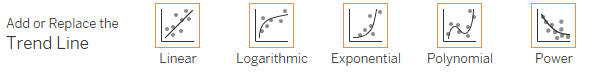
A linear regression model is used to describe the dependence of some dependent variable Y on variable X. Such models are often used to describe trends in quantities. Trends are tendencies of changes in quantities in mathematics, they can be described by linear, logarithmic, power and other equations. In addition, trends are also called charts that show the change in a certain value over time. This article will focus on linear trends and linear regression in Tableau.
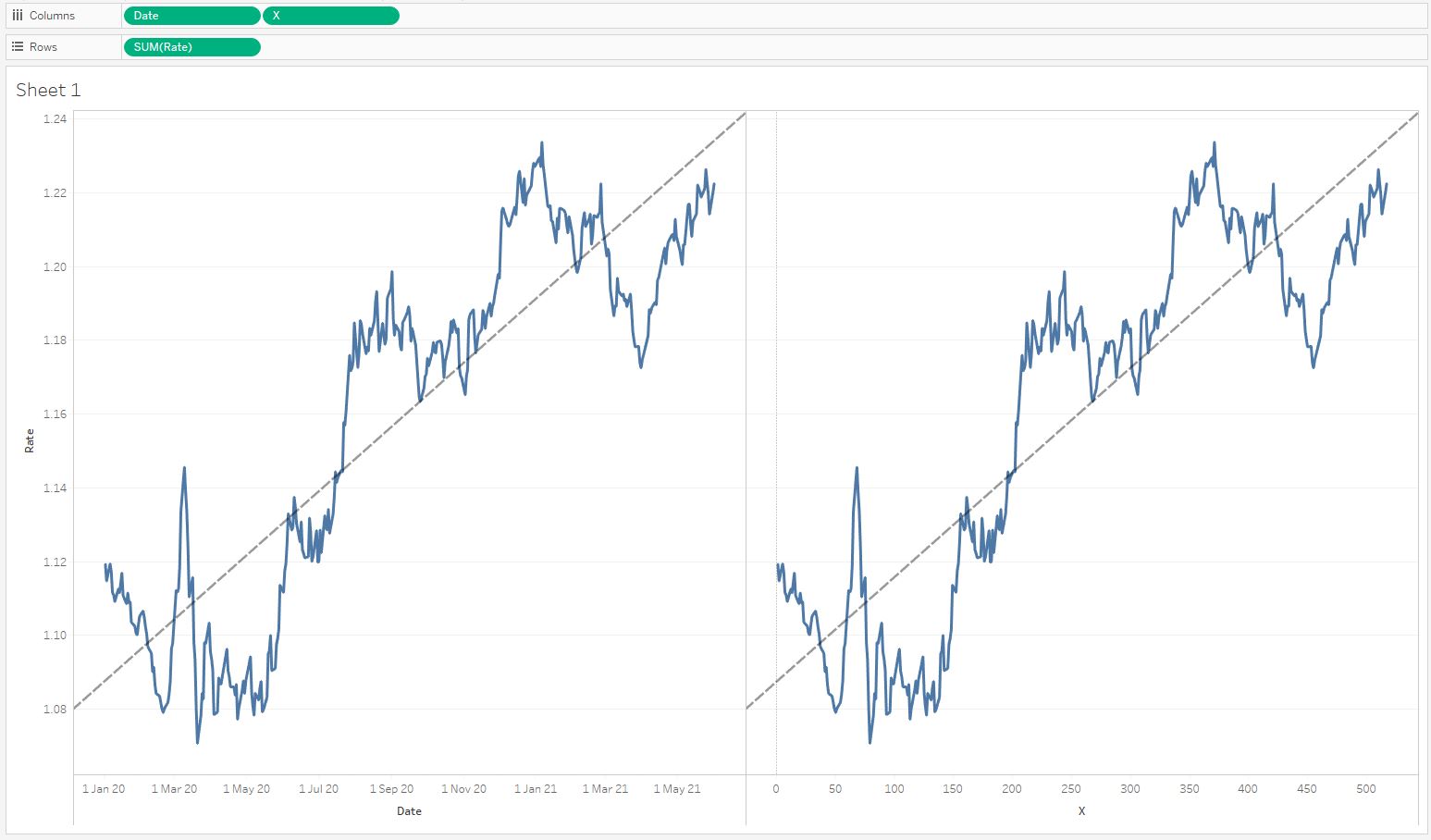
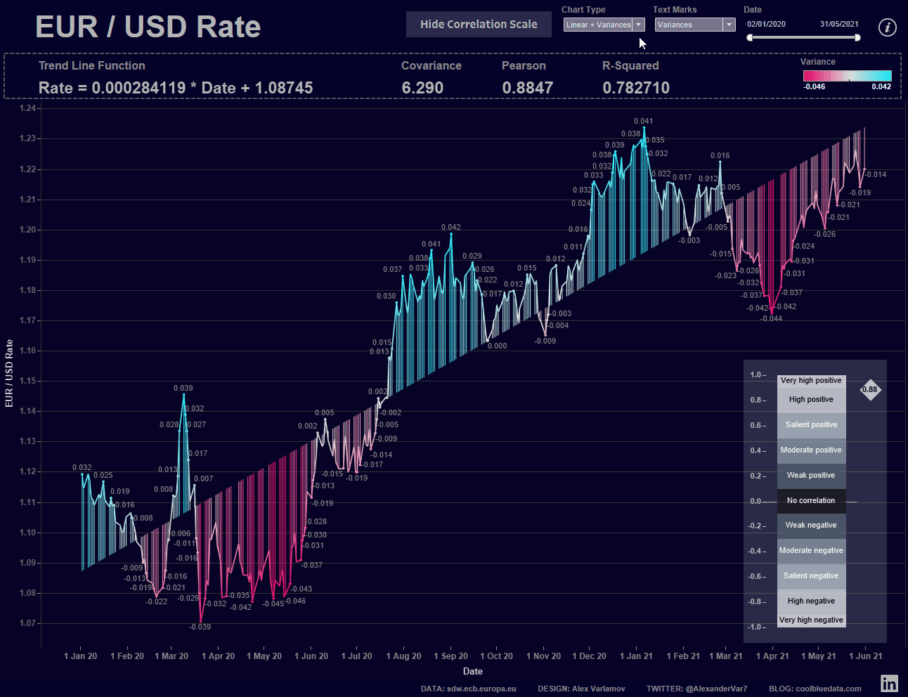
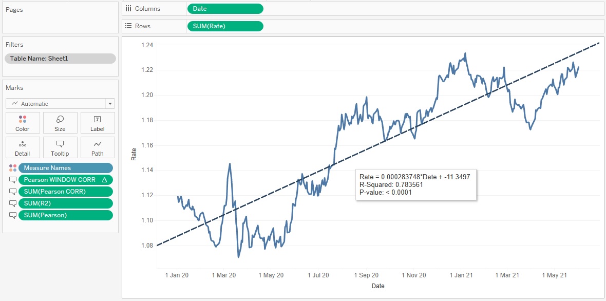
In the business environment, graphs of values that change over time are very popular, and you can find many interesting insights in them. As an example, consider a graph of the euro / dollar rate over time:
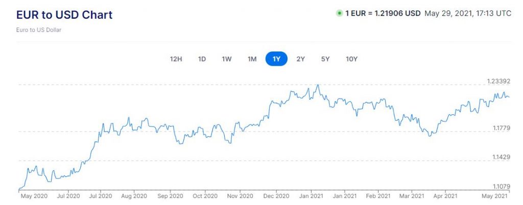
This graph shows the change in the exchange rate of the euro against the US dollar for each day throughout the year. We see that the rate was growing throughout the entire range of data, while falls in the rate are visible on the local ranges, that is, the exchange rate was changing in waves. The abscissa here is the independent variable – time, and the ordinate – the dependent function of the exchange rate.
In order to quantify the tendency in the exchange rate, we will consider one of the regression analysis methods. We’ll find a linear function that describes the tendency in the euro / dollar exchange rate over the past year and a half.
1. Trend Lines in Tableau
In Tableau, it is possible to build such a trend natively, for this you need to find Trend Line – Linear in the Analysis panel and transfer it to the sheet:
Let’s get the data on the EUR/USD rate for the last year and a half from the data source. Let’s build a line chart, as well as a linear trend:
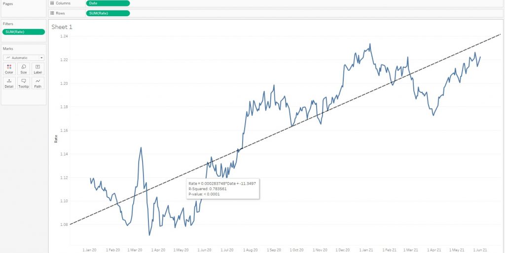
This is done in Tableau in just a couple of clicks. When you hover over a trend line, you can see the following information:
Rate = 0.000283748 * Date + -11.3497
R-Squared: 0.783561
P-value: < 0.0001
Next, we’ll look at what the first two lines stand for, and how these numbers are calculated.
2. The Least Squares Method
The expression Rate = 0.000283748 * Date + -11.3497 describes a straight line equation of the form y = ax + b. This line reflects a linear trend and is shown in the chart above with a dashed line.
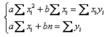
Let’s find the coefficients a (Slope) and b (Y Intercept) using calculations in Tableau. The least squares method is based on minimizing the sum of the squares of the residuals made in the results of every single equation. In other words, we need to find the function of the curve in general form (or the function of the straight line in the linear case) at which the sum of the squares of the deviations of all points from this curve is minimal. To find the coefficients of the equation of the straight line a and b, we need to solve the system of equations, where xi (date) and yi (exchange rate) are data from the dataset:
First, we convert the Date field to a numeric field using the DATEDIFF function:
DATEDIFF(‘day’, {MIN([Date])}, [Date])
This calculation will give us a field X. We have not changed the shape of the graph, we’ve changed only the dimension of the X axis, and the new graph now starts from zero:
Let’s solve the system of equations using Cramer’s Rule, where Y is the Rate field (exchange rate):
Delta
SUM([X]^2)*COUNT([X]) – SUM([X])*SUM([X])
Delta A
SUM([X]*[Rate])*COUNT([X]) – SUM([X])*SUM([Rate])
Delta B
SUM([X]^2)*SUM([Rate]) – SUM([X]*[Rate])*SUM([X])
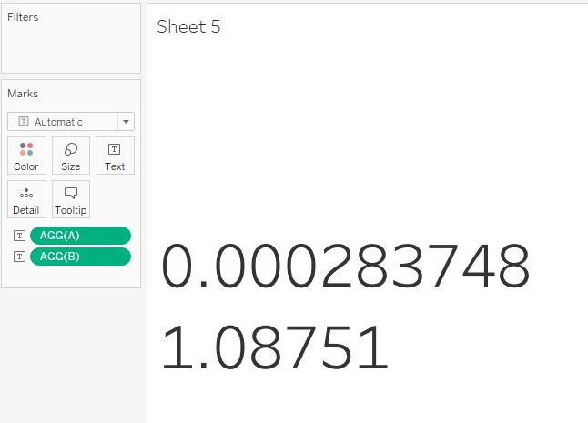
We find the coefficients A and B as follows:
[Delta A] / [Delta]
[Delta B] / [Delta]
The final equation of the straight line is the field Y Regression:
{[A]}*[X] + {[B]}
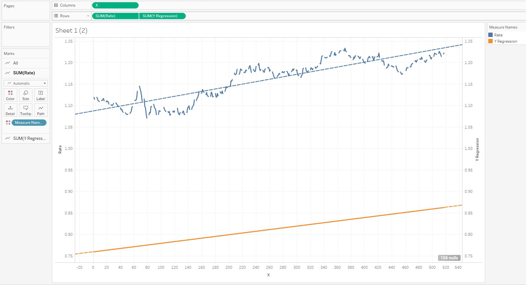
If we plot graphs for the Rate and Y Regression fields, we will get an incorrect trend line (orange line) since the data contains Null values for the Rate field. This is due to the fact that on Saturdays, Sundays and holidays the auctions do not take place, that is, there are dates, but there are no Y values.
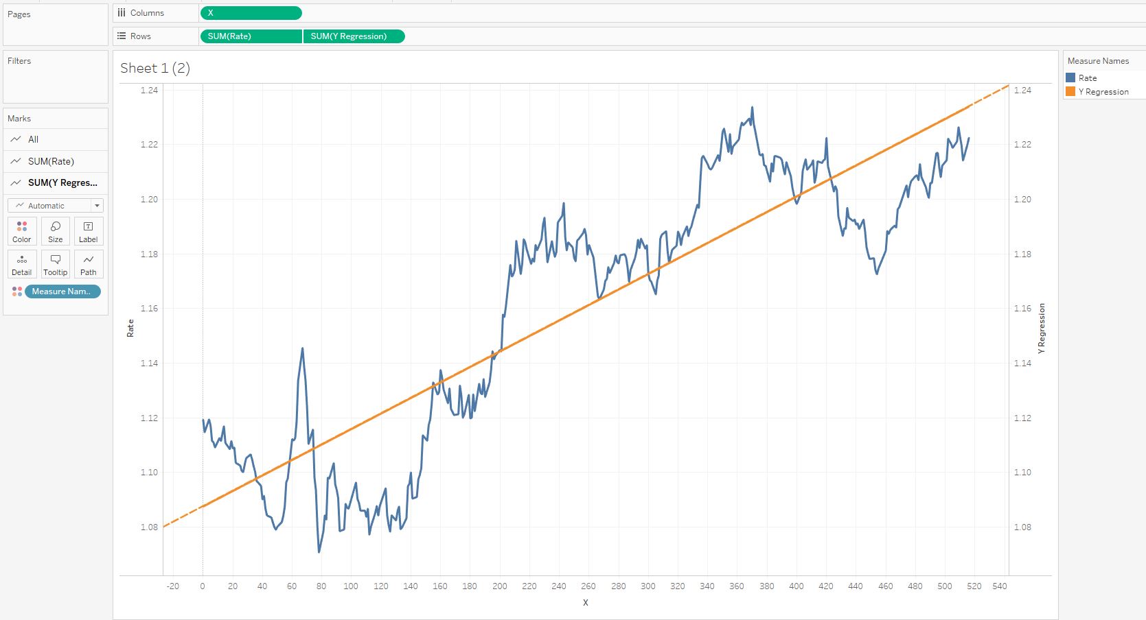
If we use the Tableau input filter for an extract, and leave only Non-Null Values for the Rate field, we get the correct picture:
The orange line here is the line of the trend, the equation for which we have found. Let’s return the Date field to the Columns shelve, and compare the blue dashed trend line from the Analysis Tableau menu and the orange bold line of the calculated trend. They are completely the same:
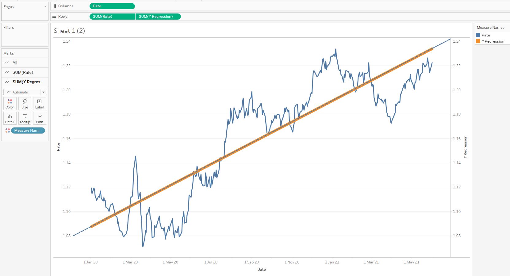
We found the trend equation y = ax + b. The coefficients a and b obtained using the least squares method are exactly the same as the coefficients of the native Tableau method. The coefficient a is determined by the tangent of the slope of the straight line, that is, it is responsible for the slope of the straight line. Coefficient b determines the shift of the straight line relative to the Y axis.
So, we got the following equation of the straight line:
Rate = 0.000283748 * Date + 1.08751
Let’s compare it with the native Tableau calculations:
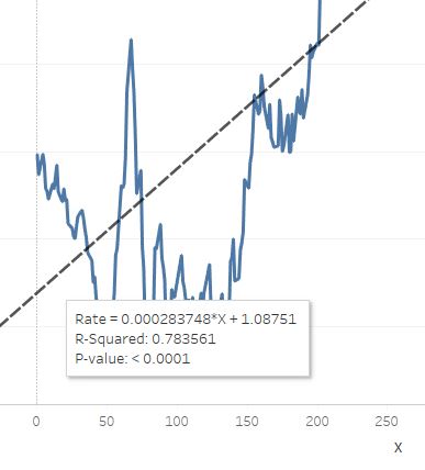
and the coefficients a and b calculated by us:
They are exactly the same. That is, we calculated the equation of the line in the same way as Tableau calculated it. Separately, you need to pay attention to the fact that the coefficients b of the equation of the straight line for the date axis and the X axis reduced to numbers are different.
For dates b = -11.3497
For numbers b = 1.08751
This is explained by the fact that when converting dates into numbers, we actually shifted the coordinate system, so the coefficient b has been changed. In this case, the slope of the straight line did not change because the coefficients a are the same in both cases, and the trend direction is preserved.
Note: on weekends and holidays, the exchanges are closed, so there are gaps in the data, they are clearly visible on the charts. So we’ve built a linear trend without taking into account weekends and holidays.
Another method for calculating trendline coefficients using table calculations was shown in the article ‘How to Calculate a Linear Regression Line in Tableau’ by Emily Dowling.
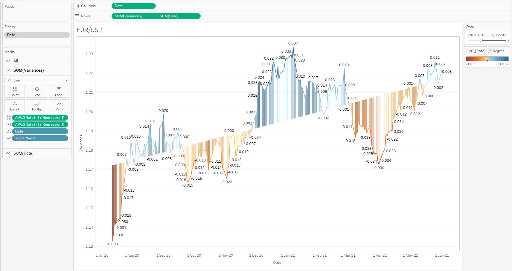
3. Calculation and Vizualization of Deviations
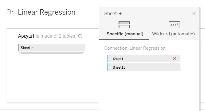
We have found the trend equation, now we will try to visually show the deviations of each point relative to the trend line. To do this, let’s make a UNION with the original table:
Let’s make a calculation Variances:
CASE [Table Name]
WHEN ‘Sheet1’ THEN [Rate]
ELSE [Y Regression]
END
And draw the deviations on the graph:
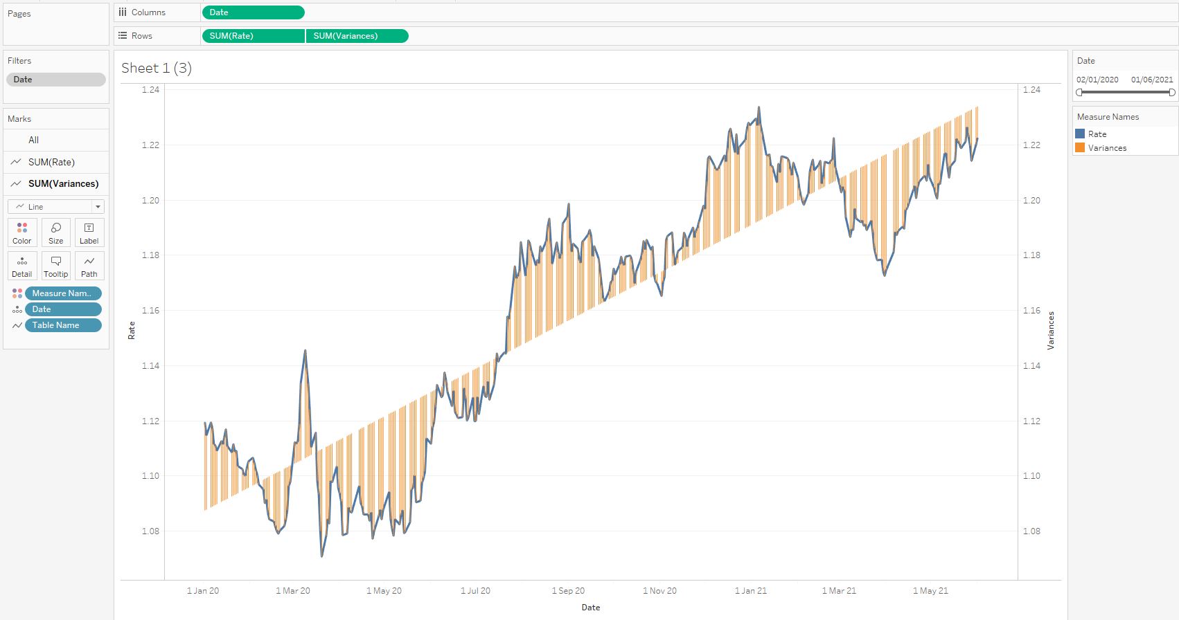
If we add the Date context filter, we can change the date range of the chart. When the filter changes, the a and b coefficients will be recalculated, and the trend lines on different date ranges will be different.
The vertical lines (deviations) help you understand where the data is missing, since this is not visible on a regular line graph. You can also visually assess the deviations of the EUR/USD rate relative to the trend line.
The deviation from the trend line is determined by the expression:
[Rate] – [Y Regression]
Adding this calculation to the text and color, we get the following picture with deviations, where it is quite easy to see the exchanging rate waves and deviations relative to the trend line:
4. Covariance
If there is a linear relationship between two variables, that is, when one quantity changes, the other changes linearly, then they say that there is a linear correlation between the variables. Next, consider the values for assessing the strength of the correlation.
Covariance is a measure of the joint variability of two variables. Here is the fomula for it:
The sample means are determined by the formulas:
Let’s calculate it in Tableau:
Mean X
{ FIXED: AVG([X])}
Mean Y
{ FIXED: AVG([Rate])}
Expression for the coefficient of covariance Covariance:
{FIXED: SUM(([X] – [X Mean])*([Rate] – [Y Mean]))}
/
({FIXED: COUNTD([X])} -1)
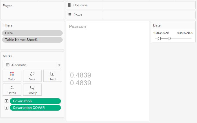
Tableau has a COVAR function to calculate the covariance. Let’s calculate the field Covariance COVAR using this function:
{CORR([X], [Rate])}
Now we can calculate the covariance for any date range. Let’s compare the values of the covatiances obtained in different ways:
The covariance reflects the correlation degree of variables; it can be either positive (reflects direct correlation) or negative (for inverse correlation).
The problem with this value is that it is impossible to estimate from its absolute value how strongly the variables are related. For this, the covariance value is normalized by dividing it by the product of standard deviations. The resulting value is called the Pearson correlation coefficient .
5. Pearson Correlation Coefficient
Pearson correlation coefficient is probably the best-known measure for assessing the magnitude of linear correlation.
Create a calculation Pearson CORR:
{CORR([X], [Rate])}
The CORR function in Tableau returns the Pearson coefficient. The curly braces here are due to the fact that we need to take all values along the date axis and count one coefficient value. The computation record is equivalent to the following:
{FIXED: CORR([X], [Rate])}
Since the CORR function only works with aggregations, it will aggregate values at the granularity levels selected in Tableau. That is, if you simply calculate CORR([X], [Rate]) for each point on the graph, it will give incorrect results, since there will be only one value in each aggregation. Therefore, we use the FIXED function.
Usually people have a poor understanding of how Pearson coefficient works and what calculations are used inside Tableau to calculate it. Therefore, now we will understand these calculations. The formula for calculating the Pearson coefficient is as follows:
The sample means are determined by the formulas:
we have already calculated it in the covariation section:
Mean X
{ FIXED: AVG([X])}
Mean Y
{ FIXED: AVG([Rate])}
The Pearson coefficient itself is calculated as follows:
Pearson
{FIXED: SUM(([X] – [X Mean])*([Rate] – [Y Mean]))}
/
{FIXED: SQRT(SUM(([X] – [X Mean])^2)*SUM(([Rate] – [Y Mean])^2))}
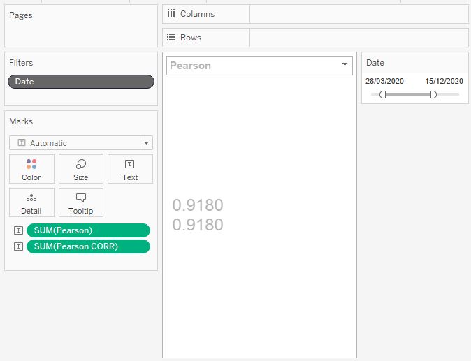
Now let’s compare the CORR calculations and the above calculations on different date ranges. Let’s make a context filter, select any range and make sure that the values are equivalent:
Pearson coefficient can take a value from -1 to 1. The minus sign means inverse (negative) correlation, a positive value of the coefficient means direct (positive correlation). The closer the values of the coefficients are to one in absolute value, the stronger the correlation degree.
The EUR/USD rate in the selected interval was growing steadily, so we have a strong direct correlation.
6. Quantitative Estimation of Correlation. The Chaddock Scale
We found out that Pearson correlation coefficient varies from -1 to 1, but it is rather difficult to tell offhand when the correlation is strong and when it is not. For this, some conventions are introduced for translating a numerical metric (continious measure) into categories (quantitative measure) for a more understandable human perception.
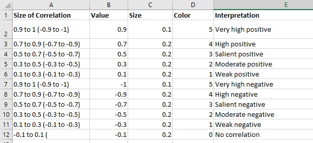
Consider the Chaddock scale, which breaks the 0 to 1 range for positive correlation and the -1 to 0 range for the nagative one into several categories:
| Size of Correlation | Interpretation |
| 0.9 to 1 (-0.9 to -1) | Very high positive (negative) correlation |
| 0.7 to 0.9 (-0.7 to -0.9) | High positive (nеgative) correlation |
| 0.5 to 0.7 (-0.5 to -0.7) | Salient positive (negative) correlation |
| 0.3 to 0.5 (-0.3 to -0.5) | Moderate positive (negative) correlation |
| 0.1 to 0.3 (-0.1 to -0.3) | Weak correlation |
Such a scale is found in various scientific works (1, 2) with minor differences.
For myself, I interpret the Pearson coefficient as follows: less than 0.25 – no correlation, more than 0.75 – high correlation, from 0.25 to 0.75 – average correlation. This is quite enough to quickly understand whether there is a linear correlation between the variables or not.
Further, we will be guided by the scale from the table. Let’s build such a scale in Tableau. To do this, create a dataset from a table in Excel and connect Tableau to it:
We will make the scale itself in the form of a vertical Gantt chart, where the Size field is the division height, and the Color field will create a change in the color of the scale:
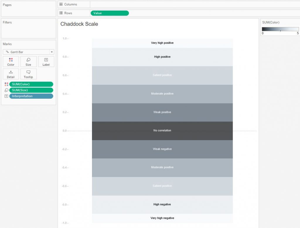
Let’s make a pointer that will show the value of the Pearson coefficient on the scale:
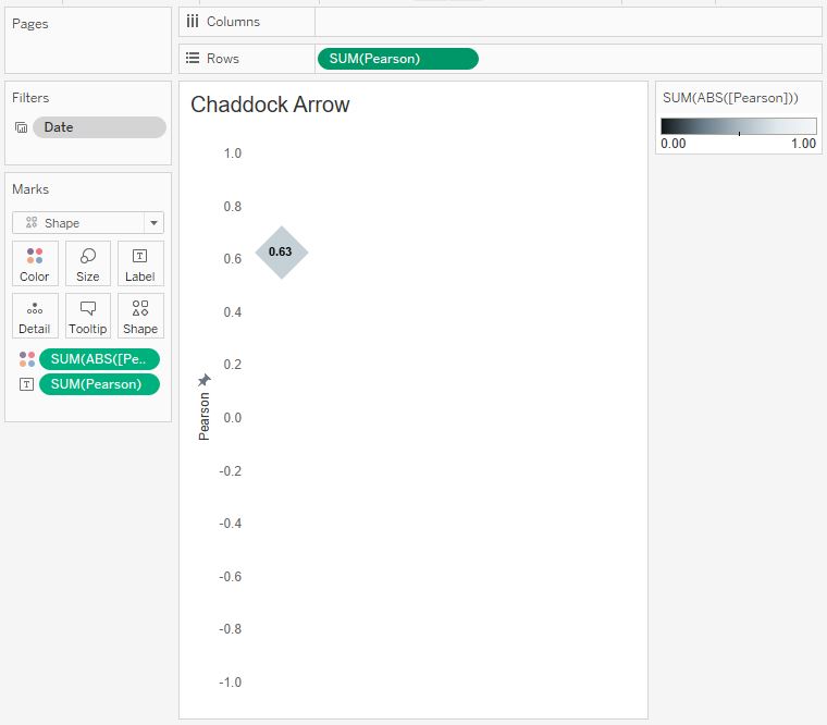
After that, we will place both sheets in one floating container and add Show / Hide Button in order to hide and show the Chaddock scale:
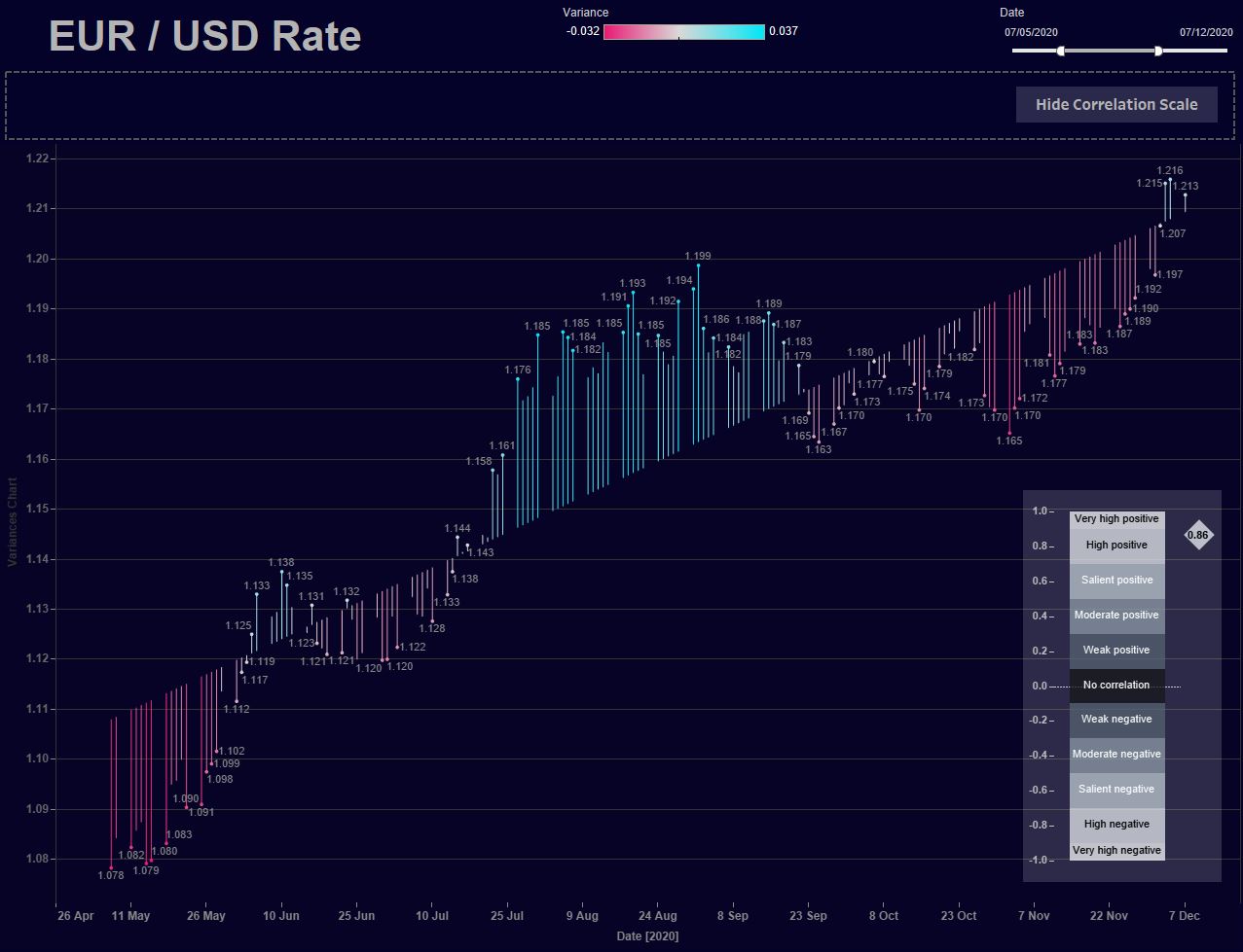
Now, when the date range is changed, the Pearson coefficient will be calculated and the pointer on the scale will move, showing the degree of correlation.
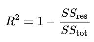
7. Coefficient of Determination R2
The next parameter that we will find using Tableau calculations will be the coefficient of determination R2 (R-Squared). Tableau calculates this parameter natively when plotting a trendline. For our case, for the entire date range, it is equal to:
R-Squared: 0.783561
The determination coefficient reflects the proportion of the variance of the dependent variable (the exchanging rate in our case).
Let’s calculate it using the formula:
where SSres is the residual sum of squares, SStot is the total sum of squares or the sum of the squares of the deviation from the mean. These two values are graphically explained by the following figure, in which the sum of the squares of the errors characterizes the deviation of all points from the trend line, and the total sum of squares reflects the deviation of all points from the total mean:
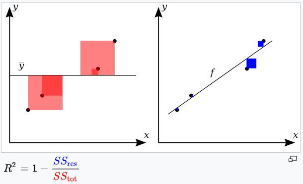
The formulas for these quantities are as follows:
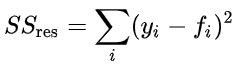
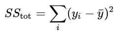
f here is the function of the line trend that we’ve calculated above.
Create following calculations in Tableau:
Residual Sum of Squares
{ FIXED: SUM(([Rate] – [Y Regression])^2)}
Total Sum of Squares
{ FIXED: SUM(([Rate] – [Mean Y])^2)}
The calculation for R-Squared R2:
1 – [Residual Sum of Squares] / [Total Sum of Squares]
R2 value can now be displayed in Tableau on any date range:
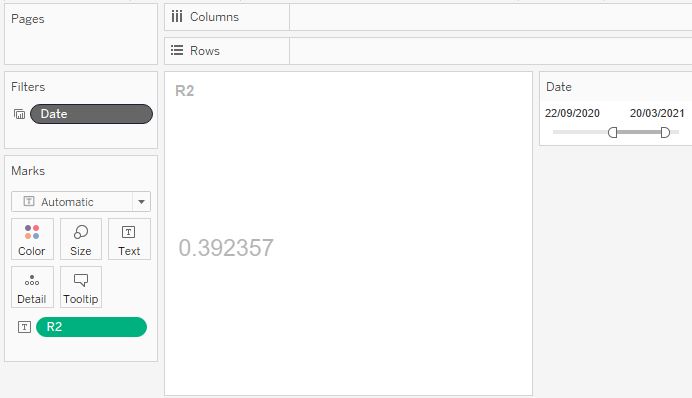
The determination coefficient takes values from 0 to 1.
And most importantly: The coefficient of determination is the Pearson coefficient squared.
8. Final Visualization
In the final visualization, I put all the calculated statistical metrics and the trend function in separate sheets with text on a dashboard . Also made the Chart Type and Text Marks parameters. The first parameter allows you to select the types of displaying the EUR/USD rate chart and the trend line, and the second parameter determines which values will be shown on the chart as text.
The value of such visualization is that by changing the date range you will see changes in trends and statistical parameters, and on the Chaddock scale, you can compare the type of trend and the value of the Pearson coefficient, that is, on the chart itself, you will see the strength of the correlation between the exchange rate and time.
9. Comparison of four methods of calculating the Pearson coefficient
Pearson’s coefficient can be found in at least four ways in Tableau:
- Build trendline, square root of R-Squared
- Calculate Pearson’s coefficient using general mathematical formulas as shown above
- Calculate Pearson’s coefficient via CORR function
- Calculate Pearson’s coefficient using the WINDOW_CORR function
1. First way: build the trend line natively, R-Squared = 0.783561. It was calculated by Tableau according to its internal logic. Taking the square root of this number, we get 0.885193.
Here it should be borne in mind that with a negative correlation using this method, we will not receive a minus sign.
2. The second way was described above, it is based on mathematical formulas. This is Pearson computation, I brought it into the tooltip in the screenshot below. The coefficient is 0.885190.
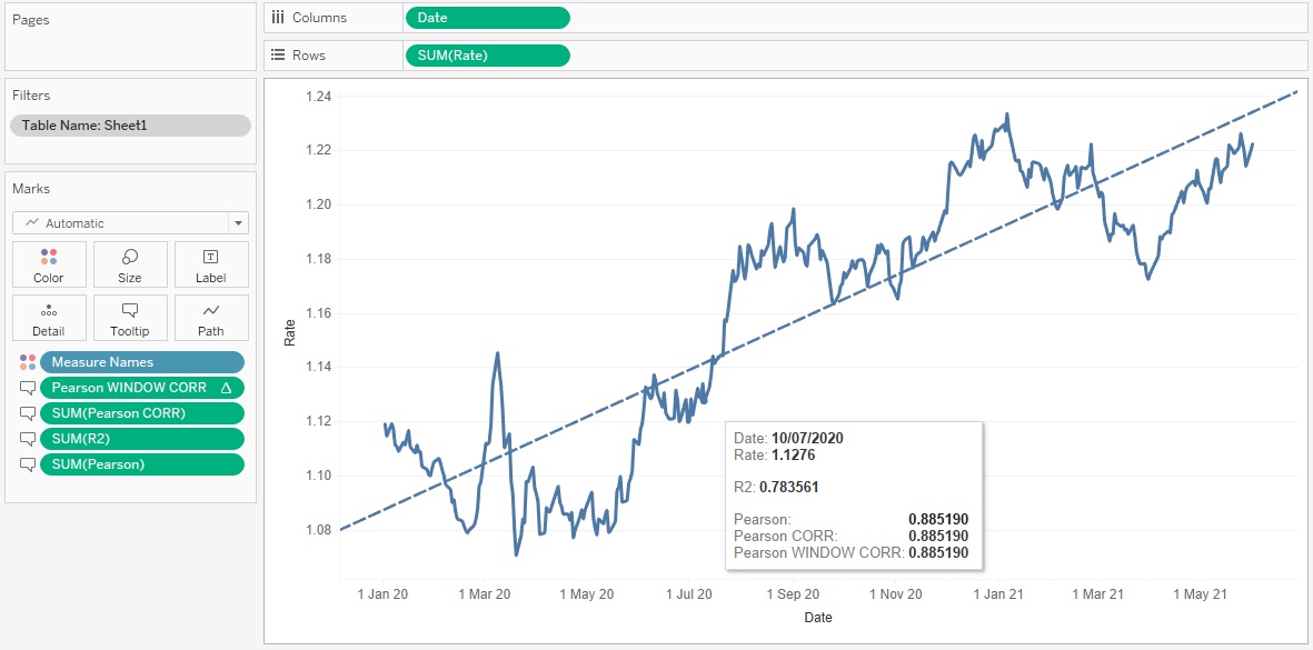
3. The third way was also mentioned in the article. It uses the CORR function to calculate the Pearson coefficient:
{FIXED: CORR([X], [Rate])}
The calculation is also included in the tooltip as Pearson CORR, its value is 0.885190
4. The fourth way of calculating the coefficient is based on the table calculation WINDOW_CORR, which goes through all the sample points and returns the Pearson correlation coefficient:
WINDOW_CORR(SUM([X]), SUM([Rate]))
This calculation is included in the tooltip as Pearson WINDOW_CORR, its value is 0.885190
As a result, all 4 calculations converged. The error in the 6th decimal place of the first method is explained by the fact that R-Squared still has numbers after the sixth decimal place, which we did not take into account.
Conclusion
In business, it is very important to monitor the trends of changes in various types of metrics over time. One of the methods for quantifying trends is regression analysis, that is, the search for some function that describes the behavior of a metric over time.
In this article, we looked at formulas for calculating basic linear regression metrics, and also showed alternative methods for visualizing time trends. In addition, we visualized the Chaddock scale, on which you can see the strength of the correlation between two variables.
The calculations in the article were based on the Level of Details (FIXED) functions, however, you can use CORR, COVAR, or table calculations (WINDOW_CORR, WINDOW_COVAR), as shown in the last paragraph.
The article did not cover confidence intervals and p-values, but these metrics are also important for regression analysis, and Tableau can build them natively. In some cases, linear regression is not enough to understand trends, so other types are used (for example, exponential or polynomial regression).
Next article about linear regression called “Linear Regression in Tableau. Part 2, Groups“. You can find out how to find the regression lines of data groups, as well as create a tool to study the influence of some variables on others