Disclaimer: Joy Plot in Tableau are not always the best option for analytical and business cases, but you can use them in bespoke visualizations. In any case, you can extend your knowledge about Tableau by creating such types of charts.
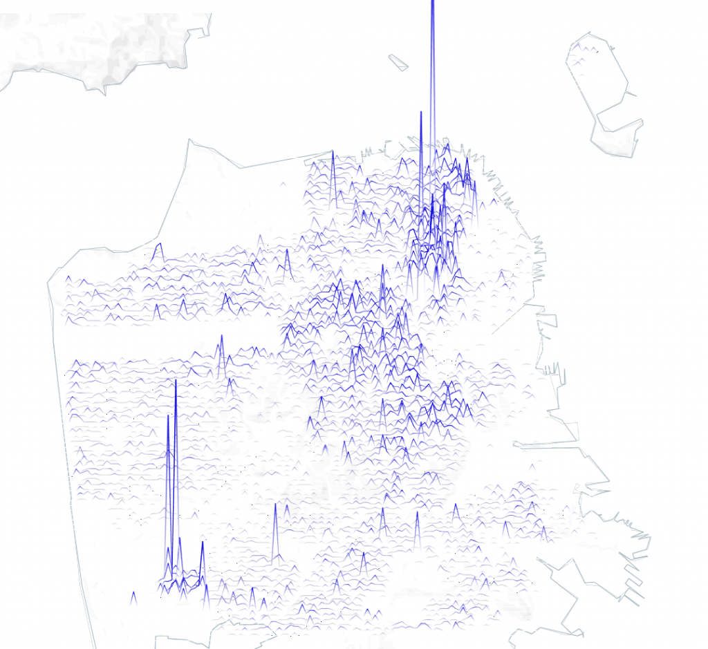
This article is about a type of geodata visualization in which values are encoded by a set of lines. In fact, this is a series of line graphs above each other with a step in latitude, reflecting a change in some metric along the longitude axis. One example is the visualization of evictions in San Francisco:
1. A bit of History
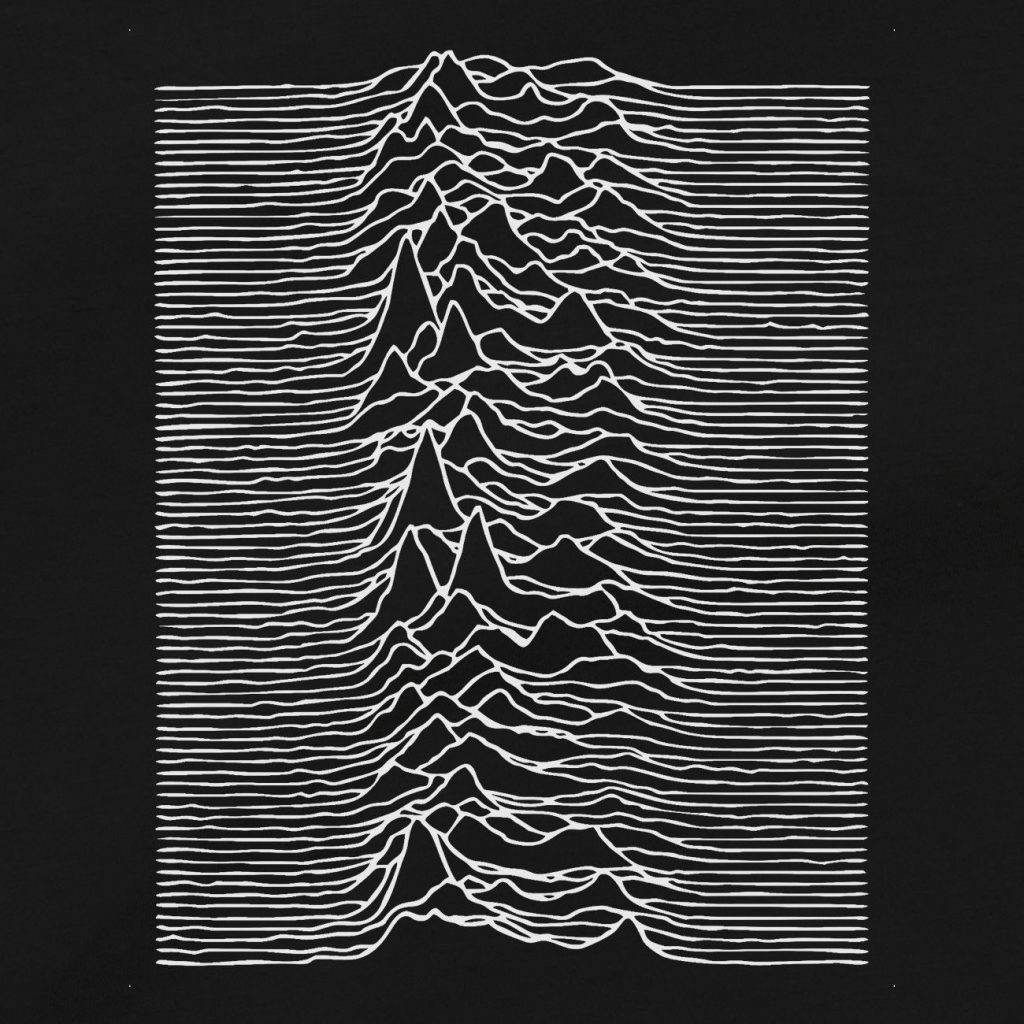
The name of the visualization ‘Joy Plot’ is associated with the cover of the album ‘Unknown Pleaures’ (1979) of the British group ‘Joy Division’. The cover shows a pulsars spectrum of radiation waves without context, and it seems to an ordinary person that this is some kind of mystical landscape. Here, in fact, this visualization, which later became one of the most recognizable.
You can also come across the viz of Population Lines, which refers to the lines on the map that reflect the population at certain points. A few years ago, James Cheshire published an article describing work on this type of visualization. There are also examples on Reddit.
Konstantin Greger cteated in Tableau the Population Lines of Europe and described the process of creation in his blog .
I made a similar viz a half a year ago:
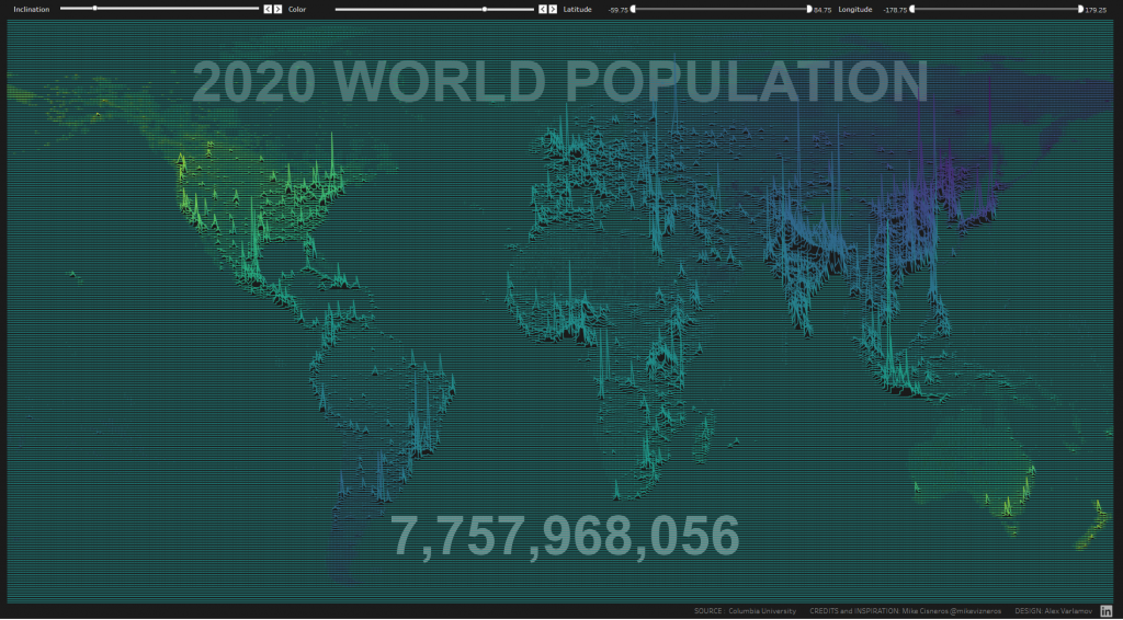
Population Lines is a set of line graphs located one below the other with a certain step in latitude. Each line graph shows the population at one latitude, and throughout the graph, longitude changes. This creates the illusion of a single visualization or single map.
The same type of visualization reflecting the height of the relief at points can be built using QGIS. It is called Dynamic elevation profile lines.
In fact, any geodata can be displayed in this way, for example, on the ‘Evictions in San Francisco; visualization, such lines represent the dynamics of evictions in San Francisco on a map.
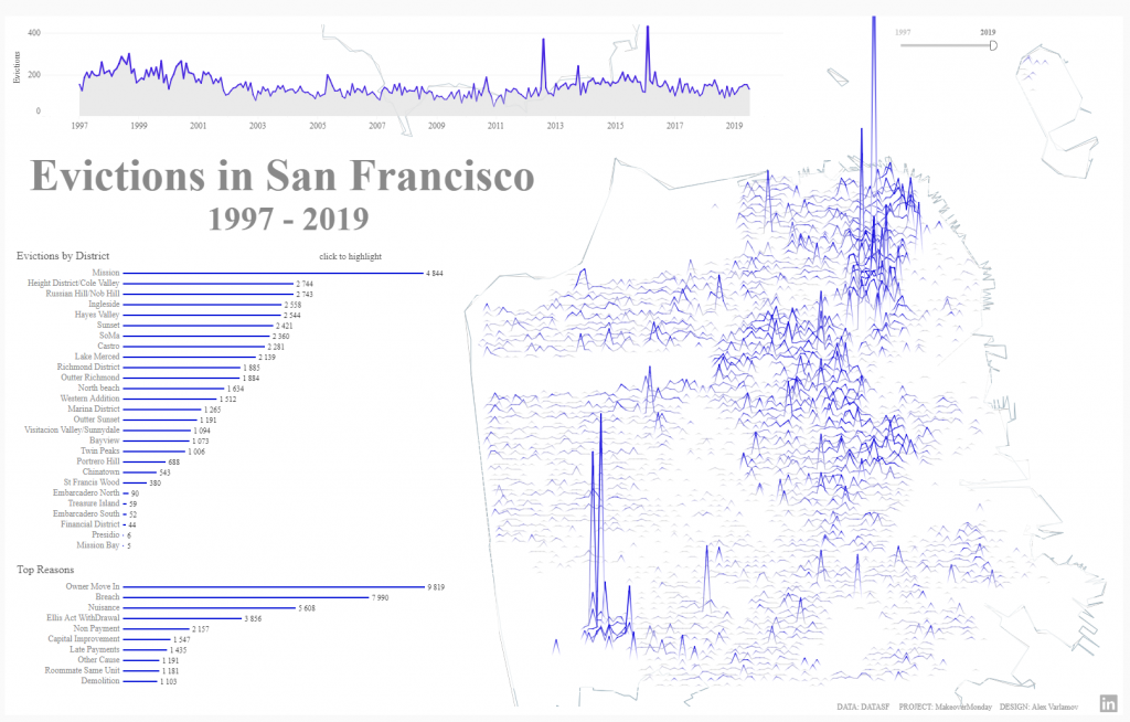
Next, we will consider how to create such visualizations if there is information about any events and their geo locations (latitude and longitude).
2. Rounding geographic coordinates
As an example, let’s get the data on fire incidents in London from london.gov.uk. The data contains information about each incident: the time and date of the incident, the type of incident, its coordinates – latitude and longitude (for some incidents geo-location data is not available), as well as additional data that we will not analyze.
If to build a map in Tableau with places of incidents, then we get the following:
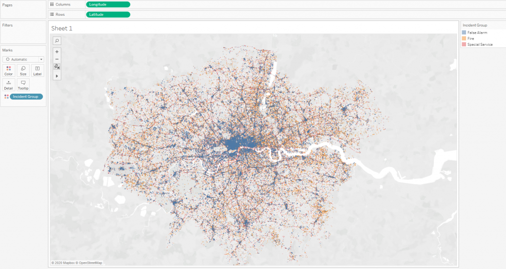
Let’s make two calculations: LatRound and LongRound:
ROUND([Latitude],2)
ROUND([Longitude],2)
In these calculations, the coordinates are rounded to the second sign, and the map will look like this:
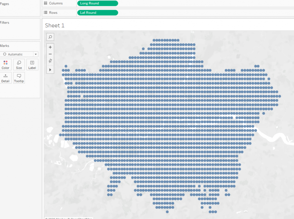
That is, we have divided the map area into a grid with a step of 0.01 in latitude and longitude. If we count the number of incidents at each point, i.e. add the Number of Records field to the mark size, we will get the following picture:
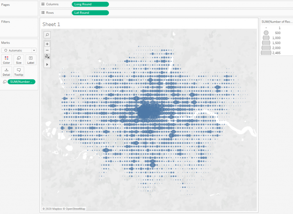
Here you can see the places of fire incidents accumulation.
It should be noted that the rounding trick is used quite often in Tableau visualizations. There is one example Armed Conflicts in Africa by Mark Bradbourne. And another one is ACLED Visualizing Conflict by Mike Cisneros.
You can do more complex calculations to calculate the grid steps when the result of the usual rounding is not satisfied. For our dataset, the step with rounding to the 2nd sign is too large, and with rounding to the 3rd sign it is too small. So I have chosen the steps to get this picture:
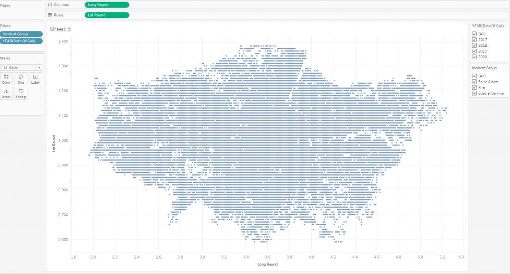
The calculations of these steps are described as follows LatRound and LongRound:
ROUND((-51 + [Latitude])*2,2)
ROUND((1+[Longitude])*4,2)
Here the latitude step is 2 times larger than the longitude step, but the calculations themselves are not the latitude and longitude on the map, since we will not use it from the maps yet. In fact, the figure shows the scatter plot with data in the first quadrant of the coordinate plane.
Please note that in places where there is no data, there are empty spots on the scatter plot. If you draw lines, then these empty places will distort the graph, so you need to fill the emptiness with points without data (incidents). To do this, you need to make a second dataset containing all the coordinates of the incidents plus the coordinates of the points in empty places so that the grid will be uniform.
To do this, determine the minimum and maximum X and Y coordinates and generate a dataset with Lattitude and Longitude with a step corresponding to the step in the data source.
3. Making a grid of geo coordinates
To do this, in MS Excel, you can build a table where in column A will be all longitude values, and in the next columns the latitude values with a step of 0.01 (in our case).
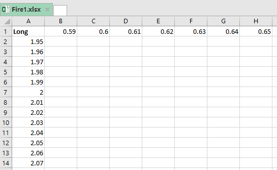
After that, you need to do the Pivot operation in Tableau Prep, so that the data will be in the following form:
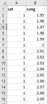
Got 2 columns with latitude and longitude values.
The Pivot operation can also be done inside Tableau Desktop, or you can create the dataset using Python.
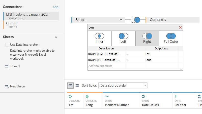
Next, we join a ‘data dataset’ and a ‘dataset with a coordinate grid’ (Output.csv). On the screenshot below, there is a right join, that is, we leave all the grid coordinates. As join clauses, we use rounded values of latitude and longitude.
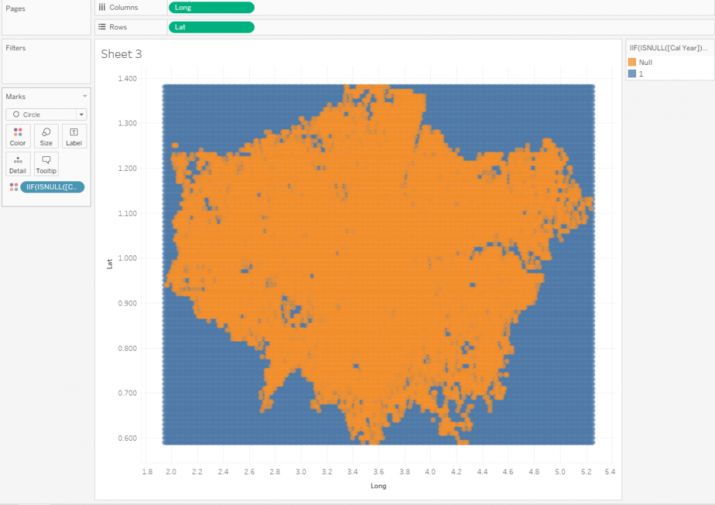
If we now look at the picture that we’ve received, there will be points with data (orange color) and points without data (blue color).
4. Remove extra dots
The next step is to leave all the blue dots inside the orange area in the visualization, and to remove other blue points from the data, since they are not needed in the visualization. The LOD calculations will help us with this, we will do the calculation Null Dot Filter:
[Long]< { FIXED [Lat]: MIN({ FIXED [Lat], [Long]: MIN(IIF(ISNULL([Incident Number])=false,[Long], NULL))})} -0.02
OR
[Long]> { FIXED [Lat]: MAX({ FIXED [Lat], [Long]: MIN(IIF(ISNULL([Incident Number])=false,[Long], NULL))})} +0.02
The calculation breaks the points into 2 groups, where we leave the False group, and remove the True group from the data using the extract filter. The True group has a lot of points and reduces performance, but it makes no sense.
Note: the numbers +0.02 and -0.02 in the calculations are needed to capture the leftmost and rightmost points with a zero value for each line. This is necessary because each line starts from a point without data and ends with a point without data.
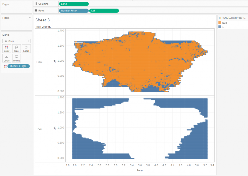
Now we only have ‘useful’ points, with which we will continue to work.
Let’s create the calculation Y
MIN([Lat])+ COUNTD([Incident Number])/[Height]
This calculation raise the y-axis points, according to the number of incidents on the grid. Putting this calculation in Rows, we get the following visualization:
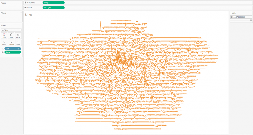
Having worked a little with the colors and the height of the peaks, we get this:
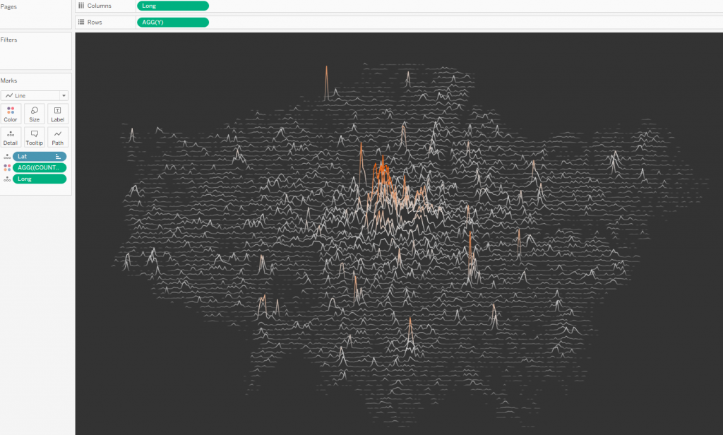
Line colors can be set with any mathematical expression. In my case, this expression is:
COUNTD([Incident Number])^0.4
Switching the type of marks to polygons, we get the following picture:
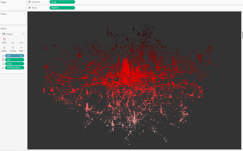
Thus, we got a Joy Plot based on geodata.
Additionally, we can also remove points where there are no incidents, and there are no incidents to the left or right of them. This is done using LOOKUP calculation. Create a Lookup Filter calculation (calculation direction is table across):
LOOKUP(COUNTD([Incident Number]),-1)=0
AND
LOOKUP(COUNTD([Incident Number]),0)=0
AND
LOOKUP(COUNTD([Incident Number]),1)=0
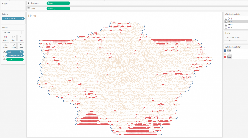
This calculation breaks points into 3 groups:
Null (blue) – edge zero values for each line. Keep them.
False (orange) – the values that we want to see on the visualization, we also keep them.
True (red) – points we can discard.
For this visualization, the total number of tags decreased from 16,000 to 15180 after the discarding.
You can use this technique if you create non-animated visualization without filters.
5. Display Charts on the Map
Now let’s bring the coordinates to the geographic coordinates on the map. To do this, let’s create the calculations Lat Geo and Long Geo:
MIN(51 + [Lat]/2) + COUNTD([Incident Number])/[Height]
-1+[Long]/4
There are conversions inverse to LatRound and LongRound calculations, with the help of which we created a custom grid of geo-coordinates.
Let’s draw the lines on the map:
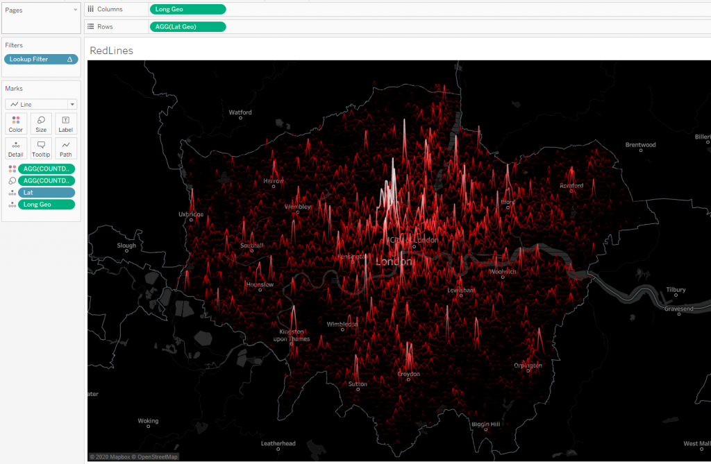
Here, in order to emphasize the peaks on the map, a calculation was added to the size:
COUNTD([Incident Number])^0.2
A number of 0.2 is introduced for the nonlinearity of color lines. By choosing this coefficient, you can make the peaks more expressive.
The joy plot on the map is ready. Now you can add parameters to select the year and type of incident, work on the appearance of the dashboard, and get:
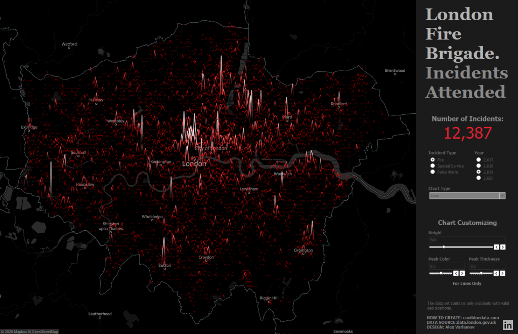
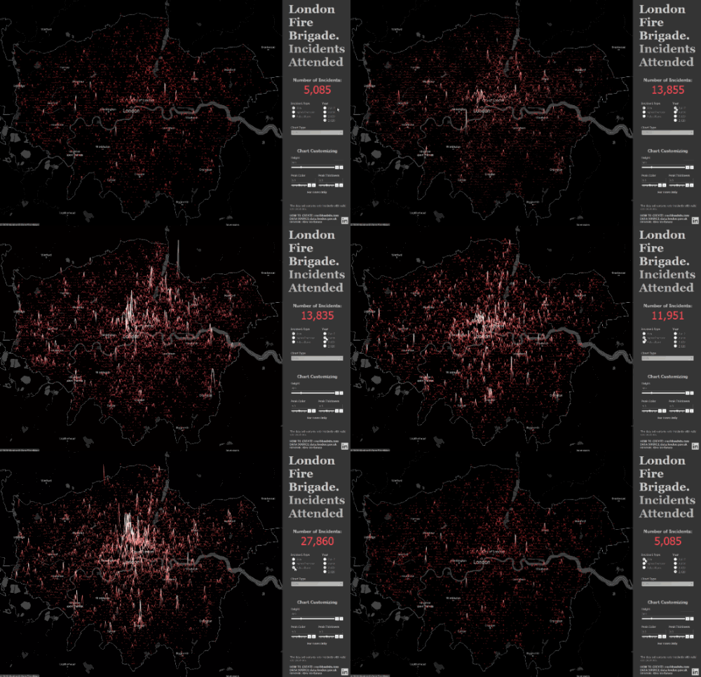
You can switch on the animation, and then when switching the parameters for selecting the year and type of incident, we will see an animated Joy Plot.
This visualization used a standard dark map in Tableau, but you can customize the maps or create your own using the Mapbox Studio tool. I wrote about how to do this in the article “Using Mapbox GL JS custom Maps with Tableau and Power BI“.
Conclusion
The joy plot visualization is not suitable for business dashboards, but they can be found in the works of data journalists and geovisualizations.
When describing the creation of visualization, in this article nested LODs and filters based on tabular calculations were mentioned, which allow filtering out unnecessary points. You can practice such visualizations in order to understand how nested LODs and table calculations work with charts.

