Bathymetry is the measurement of the depth of water in oceans, rivers, or lakes. Bathymetric maps look a lot like topographic maps, which use lines to show the shape and elevation of land features. This article is about creating elevation and bathymetric maps in Tableau.
On topographic maps, the lines connect points of equal elevation. On bathymetric maps, they connect points of equal depth. A circular shape with increasingly smaller circles inside of it can indicate an ocean trench. It can also indicate a seamount, or underwater mountain (according to National Geographic).
Elevation and bathymetric lines on maps have been known for a long time and are widely used in the world. It should be noted that the lines of equivalent heights and depths are called isohypses and isobaths, respectively, but to simplify further we will use ‘elevation lines’, ‘depth lines’ or ‘elevation contours’, ‘depth contours’.
In this article, I want to show you how to create elevation and depth contours in Tableau. The maps that we will be creating are aimed at quickly understanding the relief. The idea of such visualizations came to me after looking at classic topographic maps. The fact is that the lines of depth and elevation can not always be read quickly to understand the terrain.
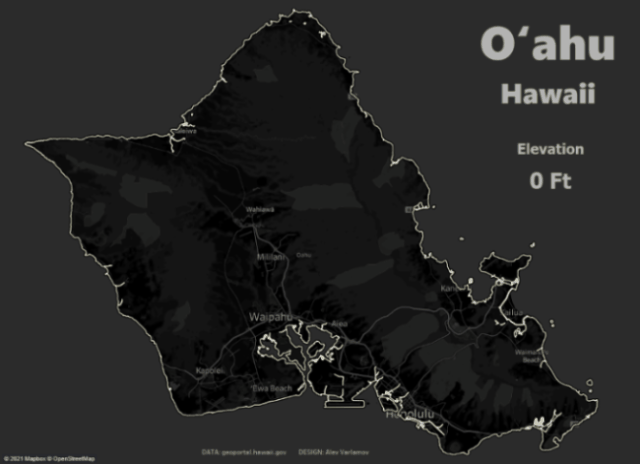
Let’s take a look at O’Ahu island map, Hawaii, 1938
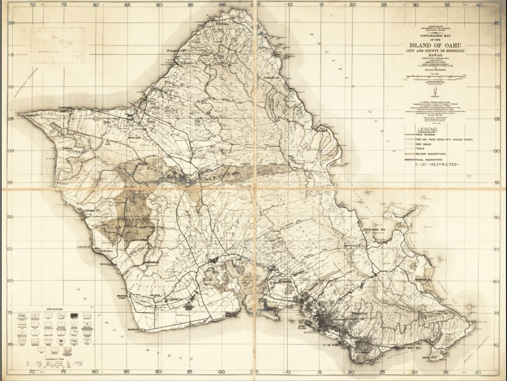
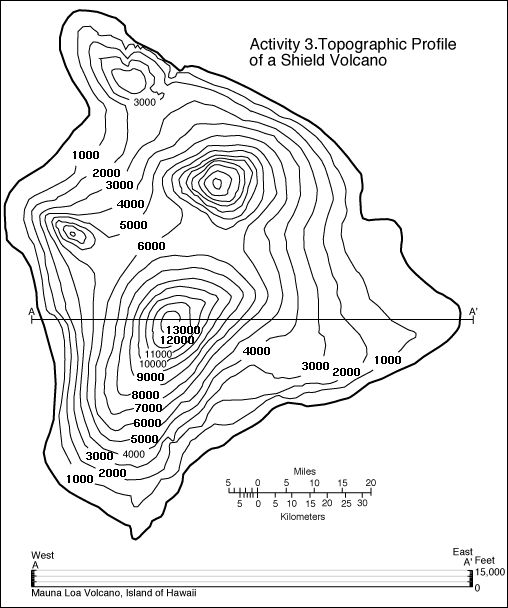
There is a lot of information on the map, including elevation lines. The problem is that it is very difficult to understand the relief of the island on such maps. This can only be done by professionals who constantly work with maps. The common user will understand little. The following map shows the elevation contours of Hawaii Island. This picture is much easier to understand, but you need to check the heights on the contours.
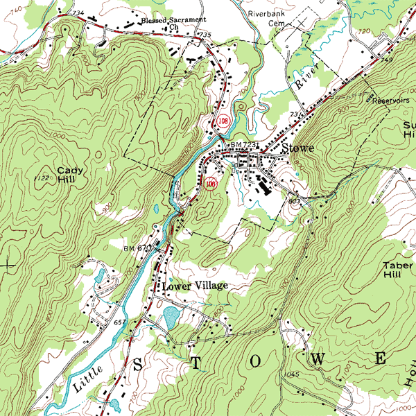
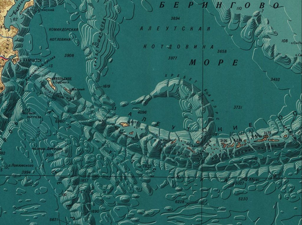
Or take an example of a topographic map from Wikipedia:
At school, it was always difficult for me to understand on such maps where what heights and depths are – these maps are usually overloaded with data and it is rather difficult to read the heights and present a picture of the relief. Now cartographic and visualization tools have made significant strides forward and allow working with layers using various interactive features. It was the problem of understanding such maps 20 years ago and working with maps today that prompted me to write this article. Now with the lines of heights and depths, you can work excitingly and enjoy the process.
1. Elevation Contours
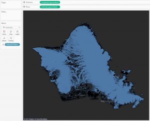
Let’s draw the elevation contours of the Hawaii islands. The hawaii.gov portal has many interesting geographic datasets. Including, there are the contours of the island of O’Ahu with a 20 feet step. Download the contours in the .shp format and connect this file to Tableau. If you drag the Geometry field to the sheet, then the map with lines will be created automatically. I changed the background color of the map to dark gray:
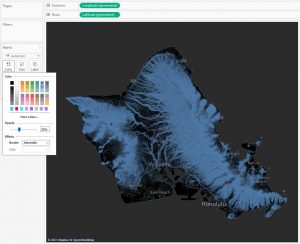
There are many lines on the map, so they are superimposed on each other, and the picture of relief is not visible. You can reduce the opacity of the lines get more clear picture:
A more interesting picture is obtained when putting the Contour field to color. This field has values: 0, 20, 40 …, that is, this is the height. So the color of the outlines changes according to the height:
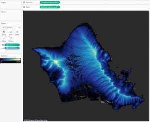
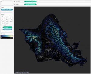
This picture is beautiful in itself. By changing the color, a 3d – relief effect is created. Let’s consider a case when you need to show not all lines, but, for example, you need to remove some of the lines, that is, increase the step of heights. To do this, let’s make the Contour Filter calculation:
[Contour]%500 = 0
This is a boolean field that will match True when the height is divisible by 500 without a remainder. If we use the field as a filter and set only True value, then contours with heights of 0, 500, 1000 … will remain:
We got another picture. You can change the value of 500 and take any step of heights.
Adding animation allows you to see the rise in heights, and for the island of Oahu it looks like water freezing. With animation, the relief is perceived on a completely different level – you can see all the surface irregularities as the heights increase in dynamics.
The visualization on Tableau Public is here. You can zoom in the map.
This animation was well received by Reddit users on the r / dataisbeautiful subreddit. The blog post collected over 15,000 upvotes and 200 comments.
It’s amazing that people compared the animation of elevation lines to frost, ink spreading on paper, plant leaves. This pattern also resembles fractal structures.
And a couple more examples of animatied vizzes made according to this principle. The same map of the island of Oahu, but the heights are shown starting from the highest point:
There are elevation contours of Puerto Rico where the dots mark the settlements. The visualization itself can be found here.

I shared how to create such animations in the article ‘Creating Videos with Tableau and Software Robots‘.
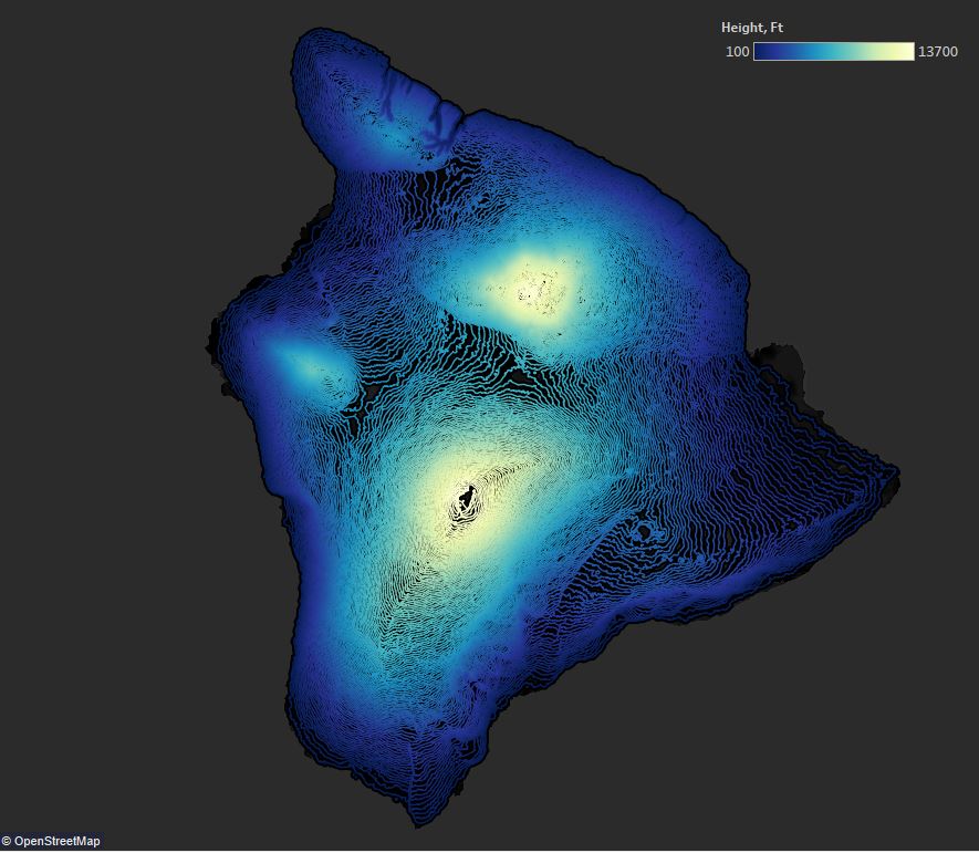
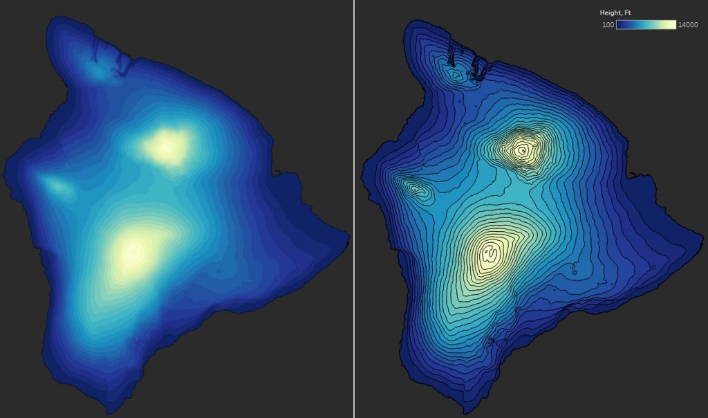
Now let’s look at another island. The topography of Hawaii or Big Island is very different from that of Oahu. This island has 5 volcanoes, including the dormant volcano Mauna Kea (4205 m above sea level). The line spacing is 100 feet.
Until then, we only worked with lines in Tableau, but you can render terrain using polygons. The stanford.edu archives contain a dataset with the contours of all the islands in the Hawaii archipelago. Here, the data is presented as closed loops in 500 feet increments, and Tableau defines the geometry as a Polygon rather than a Linestring. In Tableau, such polygons will look like this:
In Tableau on the marks shelve, you can set the colors of the polygon border. On following picture, there is no border on the left, it is on the right.
2. Bathymetric Lines
Visualizing depth lines in Tableau is no different from drawing height lines. But in this section, we’ll deal with a new Tableau feature that appeared in version 2020.4 and called Multiple marks layer support for maps.
The essence of this feature is that any number of layers can now be added to maps. More details can be found in the article ‘Tableau Map Layers’ by Marc Reid and in the article written by Ivett Covacs ‘What’s New in Tableau 2021.1: Snowflake Geospatial Support with Map Layers’.
Let’s clear how you can create such visualization:
First you need to find the data. Data on all great lakes except for Lake Superior is here. Bathymetric lines of Lake Superior can be found here.
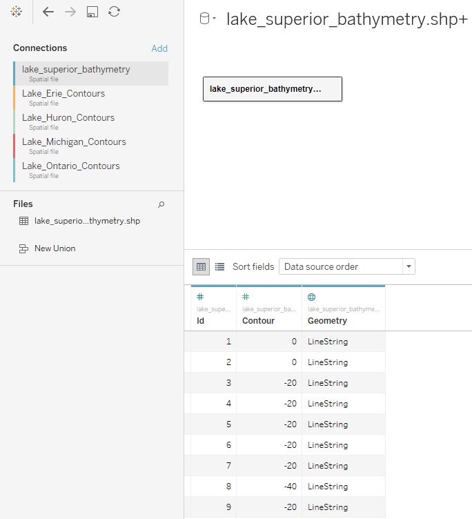
Save all data in the Esri shapefile format on the local machine and unzip it into one folder. Let’s connect first to one .shp file (File – Spatial file in Tableau connection menu).
We get the following data set:
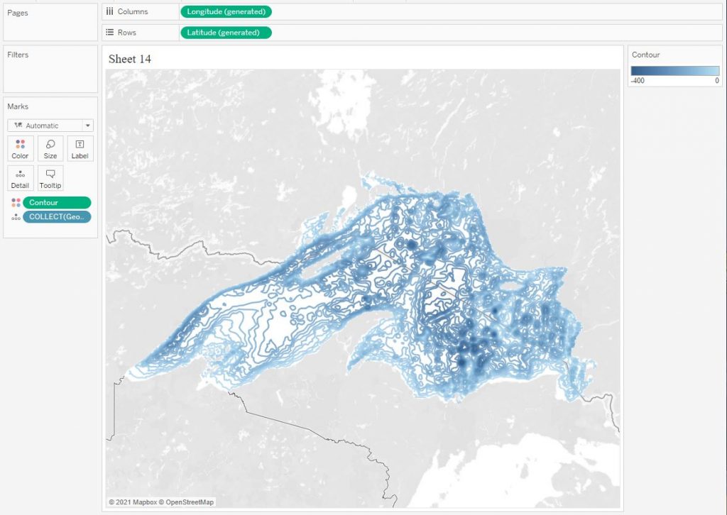
Let’s build the contours, marking the depth with color:
Next, let’s include the rest of the files. Select the depth as the connection field. Note that the files are from different resources, and the names of the fields are different. Therefore, we cast DEPTH to an integer INT (DEPTH) and connect it to the Contour field.
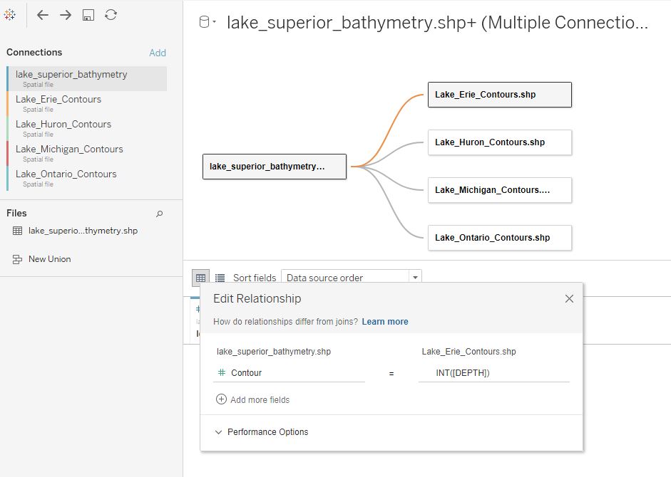
On one sheet, create several layers by simply dragging and dropping Geometry fields onto the sheet:
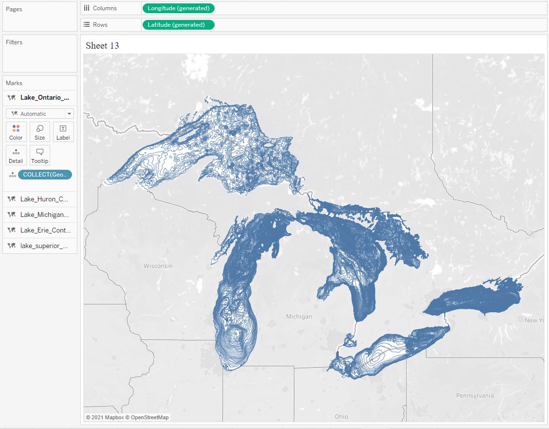
We got 5 layers, each of which can be customized individually if desired:
Please note that we do not use programs like QGis to work with geodata, but we connect everything in Tableau – this saves time significantly.
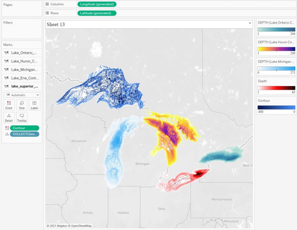
In the initial data of each layer, the depth lines have a different step. For example, for Lake Superior, the step is 20 meters, and for Lake Erie the step is 1 meter. In addition, three lakes have depth lines starting at 1, while others start at zero. That is, we have non-equivalent data, and we need to normalize them to get the correct picture on one sheet. Let’s leave in all layers only lines with a step of 20 meters, that is, 0,20,40 …
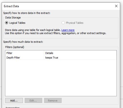
Create a Depth Filter calculation:
[Contour]%20 = 0 OR [Contour] = 1
The number 20 here is the desired depth step. Set only True for this field in the extract filter. Thus, only the depth values of 0,1,20,40… will remain in the extract.
By setting the color range from -400 to 0 for each layer, we get a normalized picture:
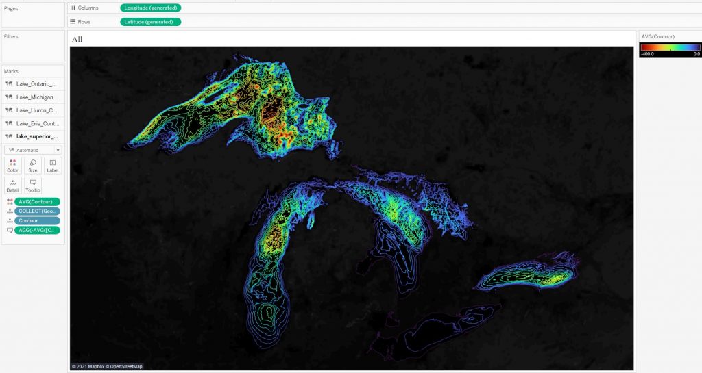
Lake Superior is the deepest and Lake Erie is shallow. Therefore, Lake Erie did not show up well in our picture. For a detailed display of each lake, you can use your own source with one table – this is done in the final visualization.
It should be noted that the color palette in this visualization was chosen not for detailed analysis, but rather in order to show how to play with the unevenness of the bottom. For depth analysis, it is best to use a two-color gradient palette.
3. 3D Effect on Maps
I talked about contours of Tanaka contours in the blog post ‘Contour Plot and Density Estimation in Tableau‘. On maps, the relief unevenness using this method looks like this:
The picture is from here.
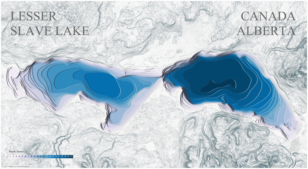
To build something like this in Tableau, you need a dataset with bathymetric contours. Above, we considered the depth lines, and in the datasets, the lines were stored as linestring type. In addition, such lines were not always closed. For the task of adding a 3D effect, we need data with closed contours. You either need to cast Linestrings to Polygons in programs like QGis, which may not be very easy; or find a dataset with ready-made contours. In the internet, there are not many good datasets with contours. For Lesser Slave Lake located in central Alberta, Canada, the dataset in .shp format you can find here. Let’s build the following visualization with a 3D effect:
In Tableau, the initial data looks like this:
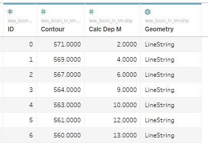
If we plot the contours in Tableau from the original dataset, we get the following picture:
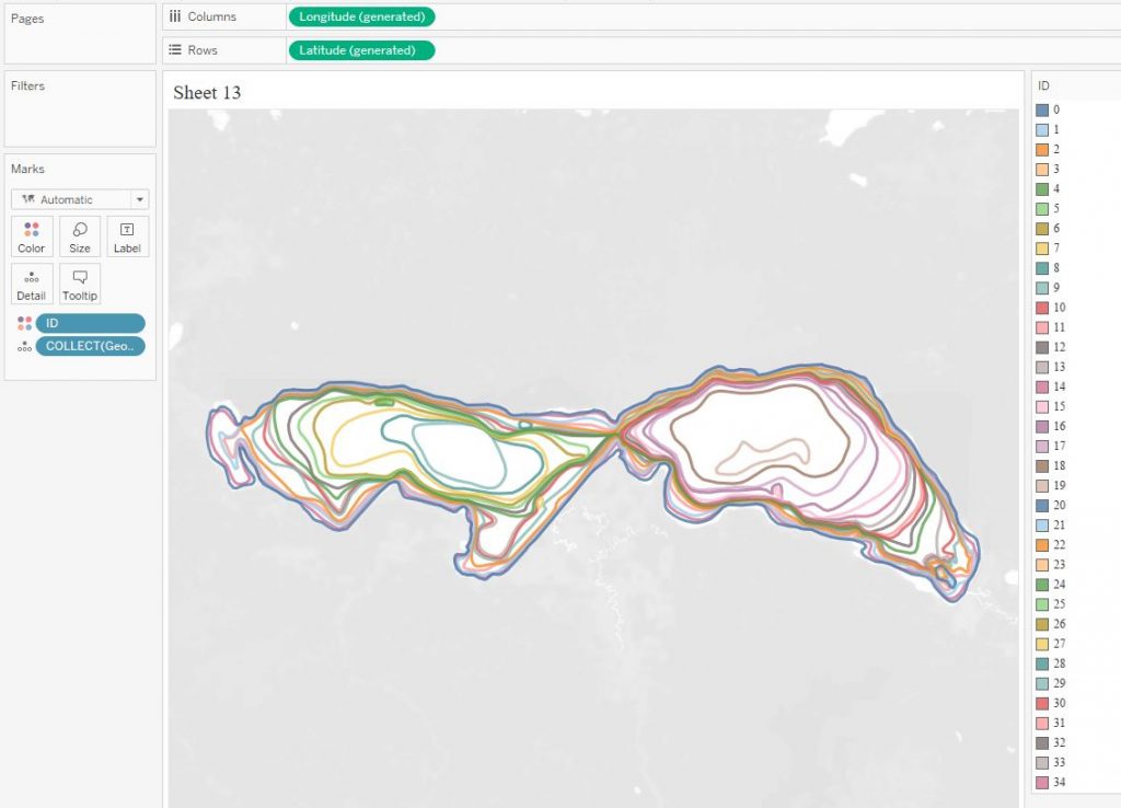
The problem is that the source data is in linestrings format, and the polygons in Tableau cannot be built. To build polygons, you need to determine the order of the points in each contour and add a new field point_order to the data.
In order to convert the .shp format to the .csv format with coordinates X, Y, Z, we will use the approach that Egor Larin told me about. This approach is described on the Tableau forum and was developed by Richard Leeke. I converted the data to .csv using ShapeToTab utility, a link to it is in the description of the approach.
ShapeToTab utility for our dataset returns data in the following form:
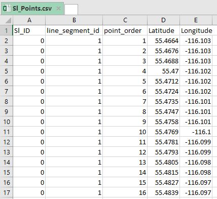
Sl_ID here is the contour identifier, point_order is the order of points in the contour. We will not use line_segment_id field.
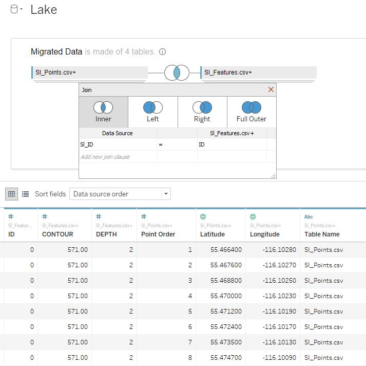
Let’s make a UNION for the resulting Sl_Points.csv file, connecting 3 identical files, and also make an INNER JOIN with the original table, excluding geodata from it:
Next, draw polygons on the map. I wrote in detail about how to do Tanaka Contours in Tableau in the article ‘Contour Plot and Density Estimation in Tableau‘. The same is done here, except that the X and Y fields are latitude and longitude, so the points are displayed on the map. I made the map background in Mapbox Studio.
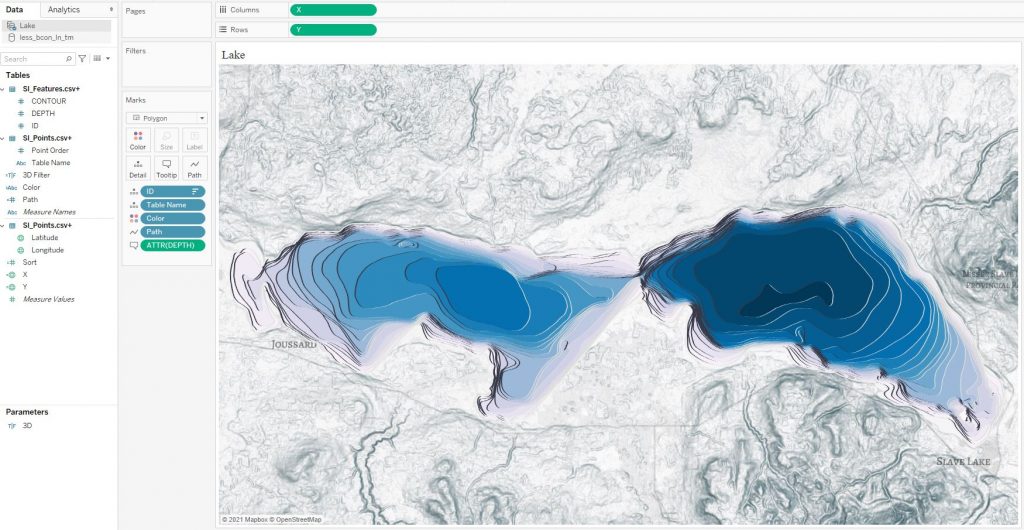
You can make a parameter to turn off shadow layers to get the common 2D depth contours:
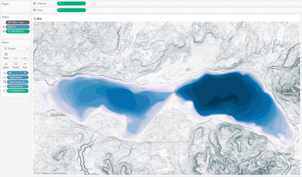
Add legend and interactive, now you can remove polygon layers by depth. An interesting picture will turn out:
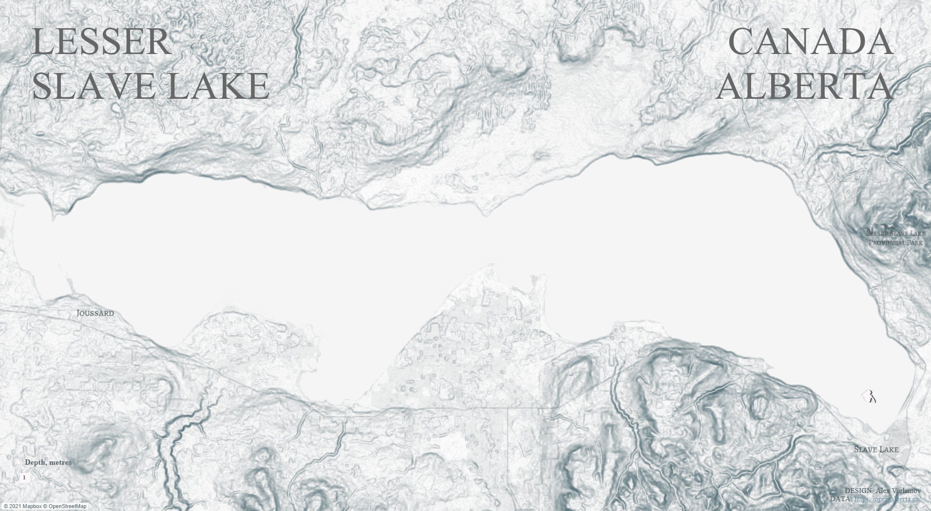
The visualization itself can be found here.
Conclusion
The elevation and bathymetric lines convey the features of the relief well. Classic multi-line maps are sometimes difficult to understand, while modern data visualization tools allow you to look at topography in a different way by interacting with the map, turning off layers and changing colors. In addition, the lines of depths and heights can be represented in the form of curves or polygons, creating animations for a deeper understanding of the relief.