Disclaimer: Streamgraph in Tableau are not always the best option for analytical and business cases, but you can use them in bespoke visualizations. In any case, you can extend your knowledge about Tableau by creating such types of charts.
A streamgraph, or stream graph, is a type of stacked area graph which is displaced around a central axis, resulting in a flowing, organic shape. Areas display changes in the values by category over time. The graph is similar to fluid flow, hence its name.
You can read more about this type of chart here, аnd see examples here.
1. Some facts about Streamgraphs
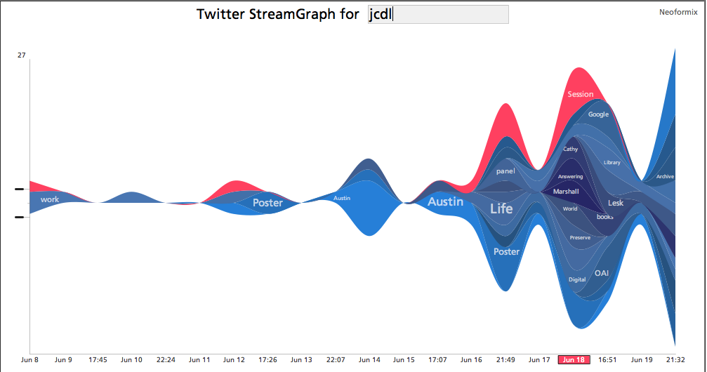
The streamgraph became popular after ‘The New York Times’ work Ebb and Flow at the Box Office. The interactive version of the chart is here. The work was completed more than ten years ago and won the “Malofiej 2009 awards”. You can learn more about streamgraphs in the article Making Sence of Streamgraphs by Andy Kirk.
Here are some examples of this type of chart in Tableau:
Paying the President by Alex Jones
Paying the President by Ludovic Tavernier
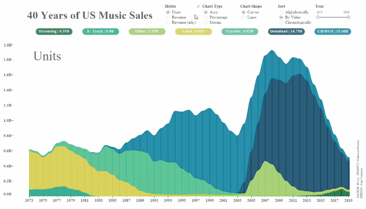
40 Years of Music Industry Sales by Laura Elliot
Several articles have been written about creating streamgraphs in Tableau. One good example is the blog post ‘How to build a Stream Graph in Tableau Software‘ by Ludovic Tavernier about how to prepare data in Excel and make such type of chart in Tableau. The other two visualizations from the list above are also based on prepared data. You can use Alteryx or Python for this.
All the streamgraphs in Tableau above use polygons in the visualizations. However, the polygons in Tableau are not animated, that is, the new Animated Transition feature doesn’t work with polygons, and therefore, these charts are static. The problem solved in this article is the creation of an animated streamgraph. So we will continue to work with what Tableau can animate – this is the Area Chart. This is the only type of marks that is suitable for the task.
Streamgraphs typically visualize value changing during time by category.
For the project #MakeoverMonday 2020, week 21, I made the visualization ’40 Years of US Music Sales’, which is completely interactive: there is the possibility of choosing the type of chart, the displayed metric, the type of category sorting, as well as the ability to select dates. And, at the same time, this version is fully animated.
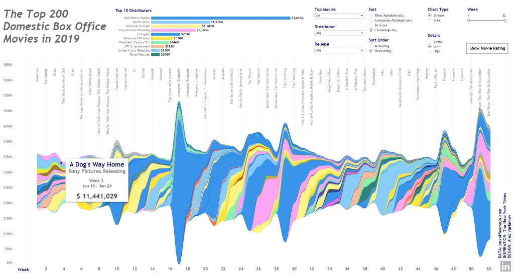
I made another streamgraph based on the movie box office in the USA for 2019. Animation on this viz works only on the second tab, because there are too many dots on the first tab, and Tableau Public cannot quickly animate this chart. But you can download the project, enable animation on Tableau Desktop and see how it works.
Let’s create this type of chart in Tableau.
2. Preparing Data for the Streamgraph
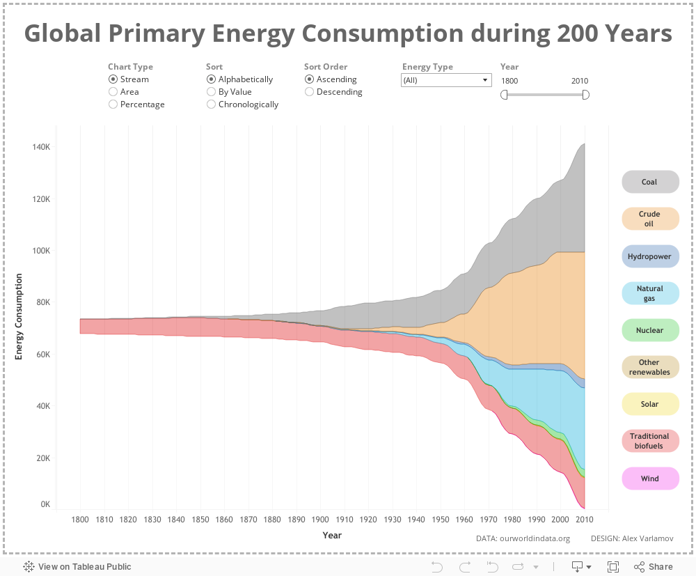
As a data source, let’s get a dataset from ourworldindata.org. The data contains information about world energy consumption from 1800 to 2018. In order to make it easier for Tableau to animate the chart, reduce the amount of data getting 10 year step. As a result, we will have three fields:
Value is the consumed energy in terawatt hours. Type is a type of energy source.
In a streamgrapht, each point on the time axis moves along a smooth curve, so you need to add several points between adjacent date points. There are several options for functions that can describe such transitions, for example, polynomials or logistic functions. In my visualization, for this I used sinusoids (Y=A*sin(BX+C), which in the range from -π / 2 to π / 2 are the S-shaped functions (or sigmoids), but it forms smoother transitions compared to the logistic function
At the data preparation stage, it is necessary to add extra points to connect the nearest points in time with sinusoids for each category .
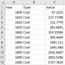
In order to supplement the dataset with transition points, let’s add fields with the names: -1.5708, -1.3464 …. 1.5708
The value -1.5708 is -π / 2, and values in each next cell are equal to the previous value plus π / 14, where 14 is the number of parts that we divide the sine wave. Thus, we get 15 new columns.
Note: the number of steps can be chosen whatever you want, but the larger it is, the more additional points will be on the visualization, and the transitions between the values will be smoother. The animation in this case will be calculating longer. Therefore, you need to choose a balance between performance and quality of the chart.
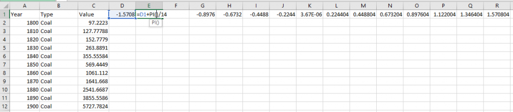
The first point of the sine wave or the column ‘-1.5708’ completely repeats the column ‘Value’, i.e. D = C. The following columns will be calculated using the formula:
=$C2+(VLOOKUP($B2,$B3:$C$1215,2,FALSE)-$C2)*(SIN(E$1)+1)/2 for the cell E2.
The meaning of this formula is to use VLOOKUP to find the neighboring value for each category and build a transition between these values. For example, for the year 1800 of the Coal category in the range $B3: $C$1215, the next year is 1810 searched in order, the ‘Value’ for this row is taken and multiplied by the sine function. The number 1215 is the last row in the dataset. If we stretch formulas to all columns and rows, we will get transition point coordinates for all values.
Now the data is ready, let’s work with the data in Tableau.
The resulting file with all the calculations in the .xlsx format can be downloaded here.
3. Creating the Streamgraph in Tableau
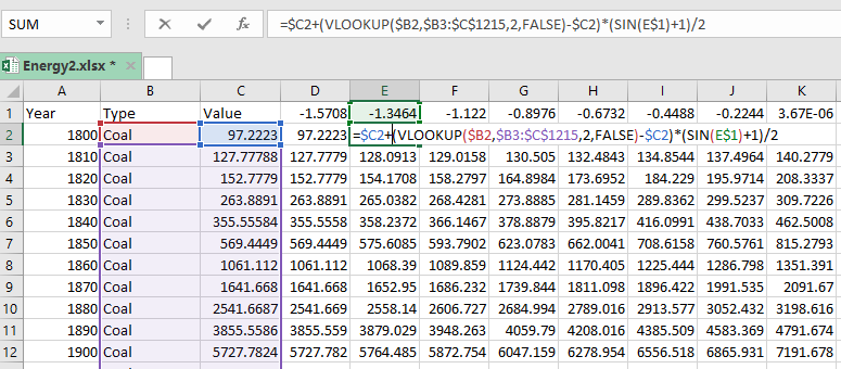
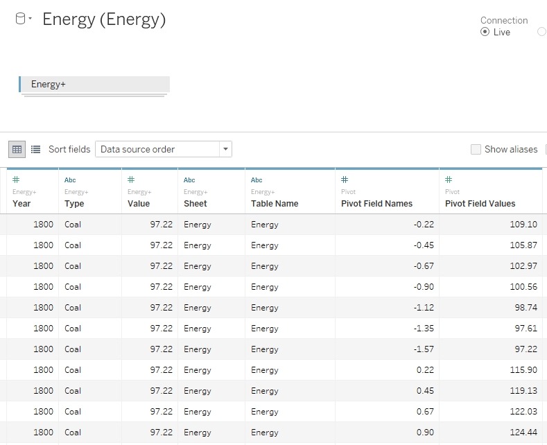
Let’s connect the data set to Tableau and make Pivot for all columns like -1.5708, -1.3464 …. 1.5708:
The next step is to make UNION with the same table and get the fields: Table Name, Pivot Field Names, Pivot Field Values:
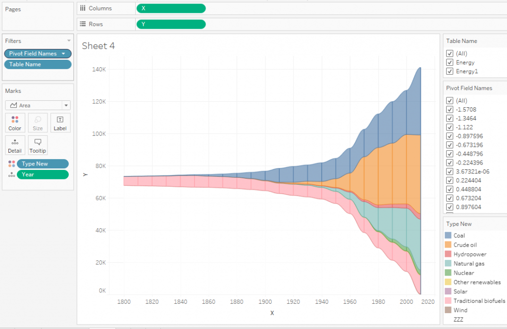
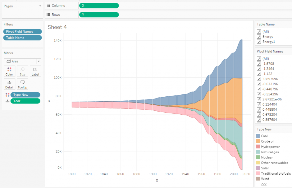
In order to build a chart based on the initial data, we do the following:

That is, we’ve removed all transition points and left only the value of Pivot Field Names = -1.5708 or, in other words, the starting points of the original dataset and filtered the additional table from Table Name in the UNION. It turned out the common Area Chart. The same chart would have turned out if we had built it according to the initial data (without adding extra points).
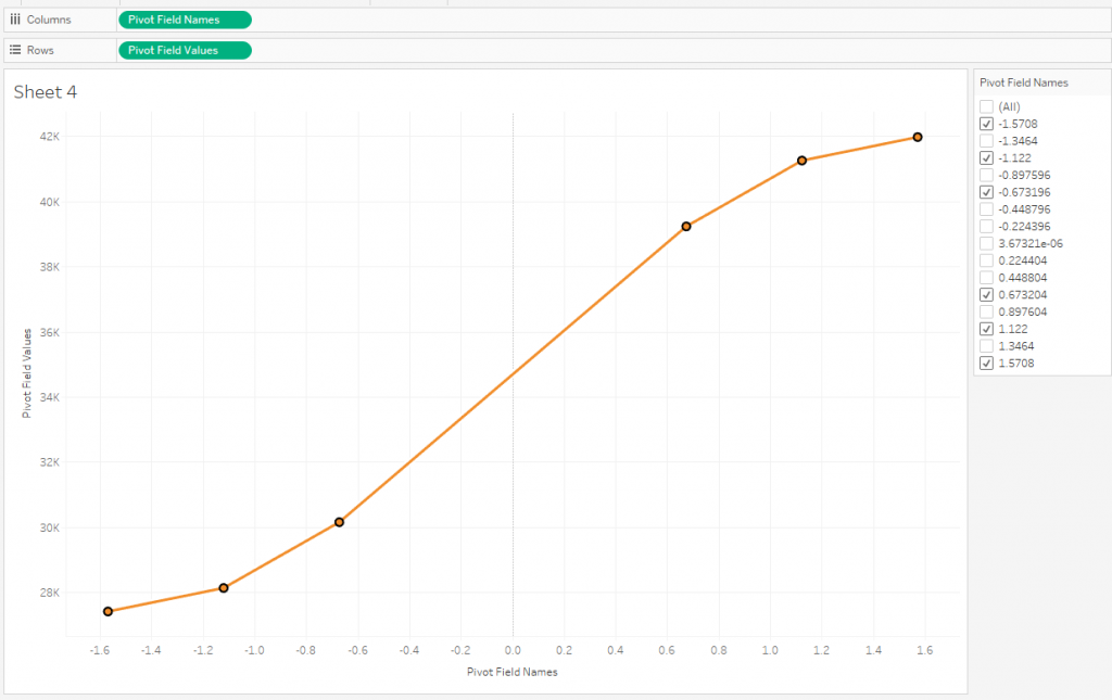
Now let’s see how look the transition dots.
For each transition inbetween dates, we’ve added additional dots to the dataset that connect two adjacent dates in a sine wave:
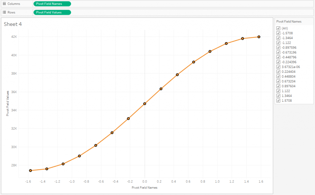
Let’s place all these points on the X axis
Make a calculation X:
10*([Pivot Field Names]+1.57)/(1.57*2) + [Year]
This calculation arranges all points along the X axis. The coefficient 10 here is responsible for the 10-year shift of each next decade, because the step in the original dataset is 10 years. The numbers 1.57 (this is π / 2) move each sine wave to the origin, that is, we get a local zero for each year. If we put the sum of Pivot Field Values in Rows and add all the points to the chart, we get the following:
This is an Area Chart with smooth transitions.
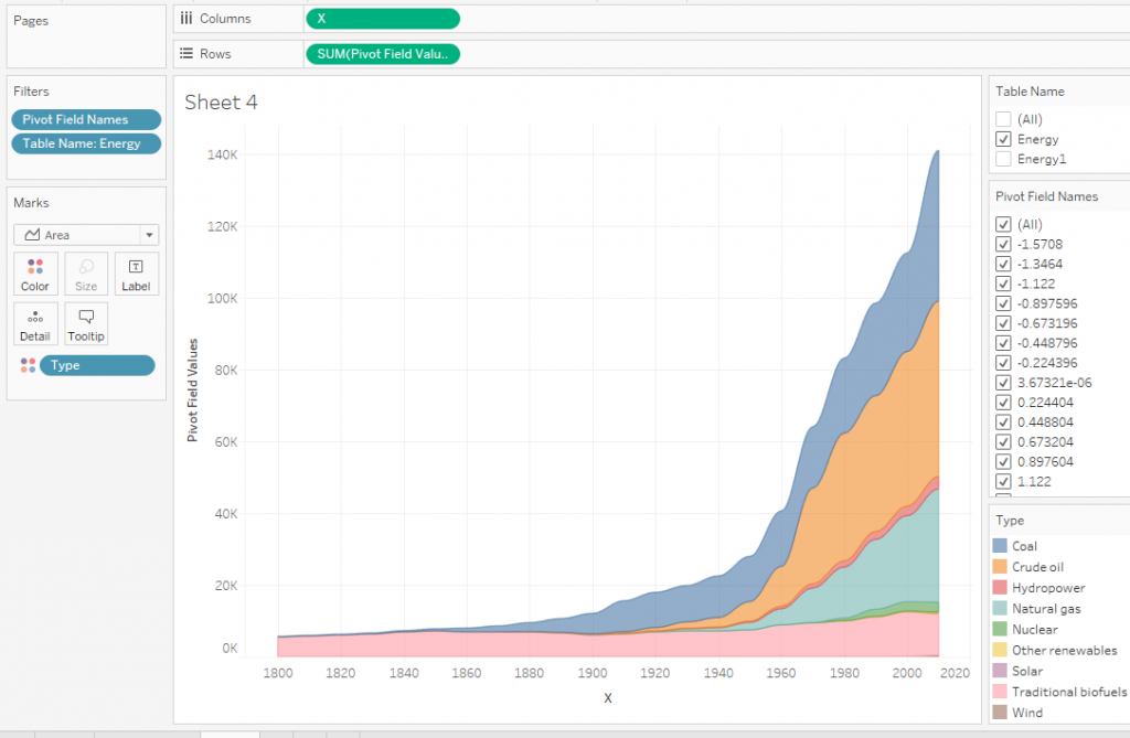
If you look closely at this picture and think about how you can make a flow chart, you can come to the conclusion that at the bottom you need to put another area that will raise all the points to half the range of the Y axis. For this ‘fake’ area, we just needed UNION, but in fact this is another table with the same data.
Let’s make a new calculation Type New:
IIF([Table Name]=’Energy1′, ‘ZZZ’, [Type])
This calculation divides the dataset into 2 equal parts: the fake ZZZ part and the data that we will display.
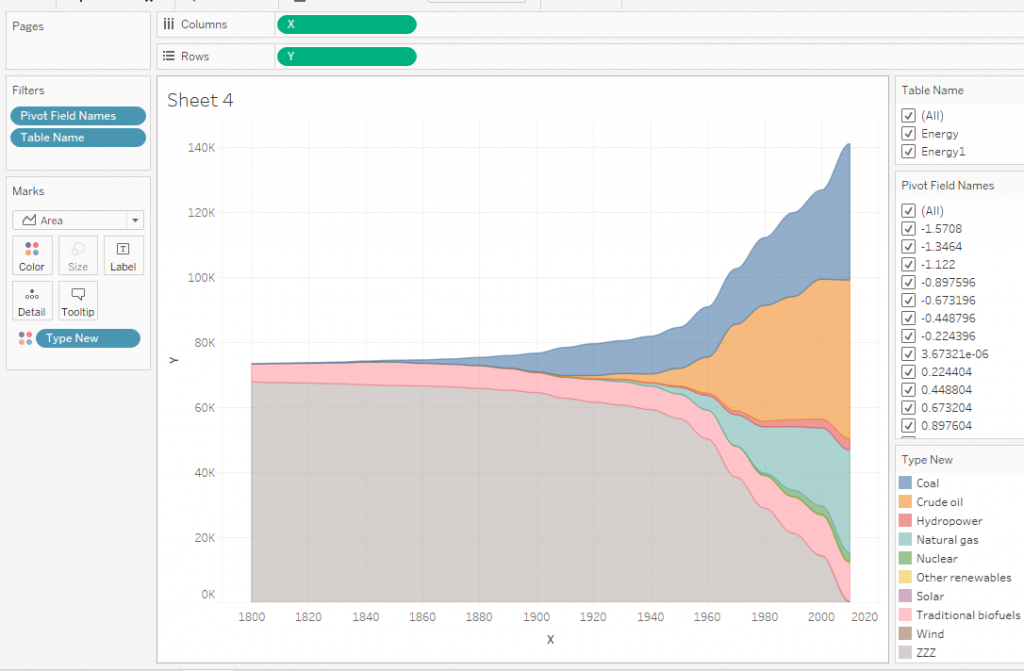
The next calculation Y:
IF [Type New]=’ZZZ’ THEN 0.25*(
{ FIXED : MAX( { FIXED [Year], [Pivot Field Names]: SUM([Pivot Field Values])})} –
{ FIXED [Year], [Pivot Field Names]: SUM([Pivot Field Values])})
ELSE [Pivot Field Values]
END
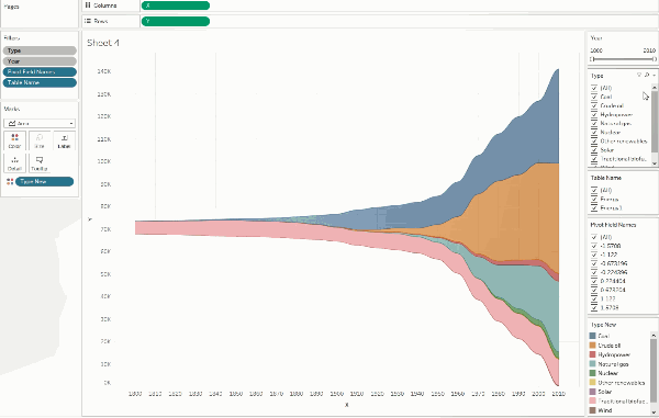
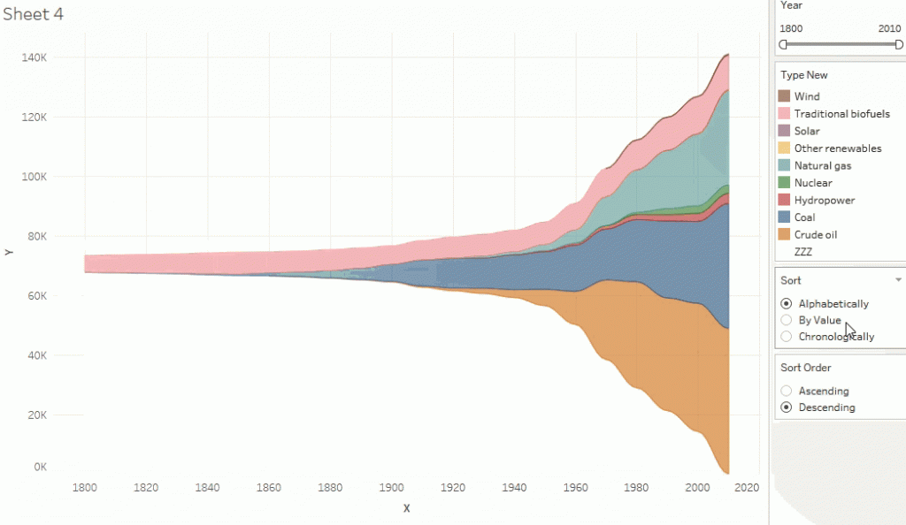
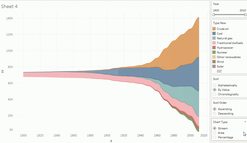
This calculation finds the upper data limit of the values along the Y axis and at each point shifts the ‘fake’ area upwards, which, in turn, raises all other areas. Changing the granulation to Type New on the mark shelve we get a streamgraph:
Fill the ZZZ area with white. You can also add a year to the marks shelve and get the following chart:
When you add Year pill to the granulation, the entire chart divides into parts, and the overlap of these parts creates the illusion of vertical grid lines. The width of overlapping areas is set in the calculation X by a constant of 1.57. If it is changed to 1.7, then we get an intermittent chart:
Turning the animation on and adding Type and Year to the context filters, you can see how the animated chart works:
4. Removing Extra Points
There are many zero values in the dataset, for example, for nuclear power from 1800 to 1960.
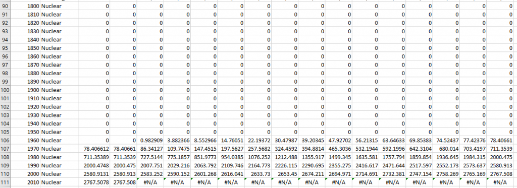
These numbers do not make sense (because there was no nuclear power in 1800th), but add points to the graph.
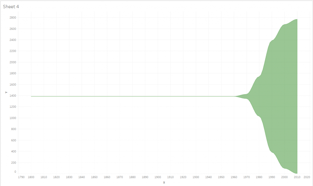
Zero points are not needed in this streamgraph, so you can delete them in directly in the data set or make a calculated field in Tableau and filter them at the extract level. In our case, the calculated field Zero point filter:
[Year] <= { FIXED [Type]: MAX ({ FIXED [Type], [Year]: MAX(IIF([Value]=0 AND [Pivot Field Values] = 0, [Year], NULL))})}-10
It divides the values into True and False parts.
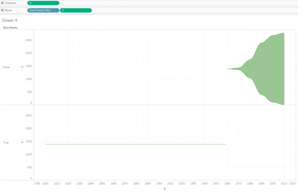
False here are points with zero values, they can be filtered using the Zero Point Filter calculation as an extract filter.
With this technique, we will reduce the total number of points by almost half, this will positively affect the performance of the visualization.
In our example, there were zero values, but there are datasets where there are no zero values, and on streamgraphs, visualizing growth from zero at the starting point and decay to zero at the end point is important. In this case, for each category, you should add extra points with zero values one step earlier before the first year with a nonzero metric value and one step after the last year with a nonzero value.
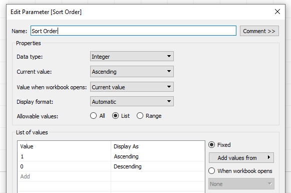
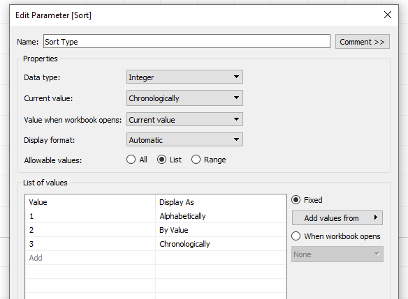
5. Sorting
By default, areas on the chart are sorted alphabetically. The name ‘ZZZ’ for the ‘fake’ area is associated with the alphabetical order and this name allows it to stay below. You can change the sort order and use calculated fields for this.
Next, we will make sorting for the types of energy resources:
- In alphabet order
- By value
- In chronological order
We also provide the ability to sort in ascending and descending order. To do this, let’s make 2 integer parameters: Sort Order and Sort Type:
Then add a new calculation Sort Field:
IIF([Sort Order]=0,
CASE [Sort]
WHEN 1 THEN IIF(MAX([Type New])=’ZZZ’,0, MAX(ASCII([Type])))
WHEN 2 THEN IIF(MAX([Type New])=’ZZZ’,0,1/ MAX({ FIXED [Type]: SUM([Value])}))
WHEN 3 THEN IIF(MAX([Type New])=’ZZZ’,0, MIN([Year]))
END
,
CASE [Sort]
WHEN 1 THEN IIF(MAX([Type New])=’ZZZ’,0, 1/MAX(ASCII([Type])))
WHEN 2 THEN IIF(MAX([Type New])=’ZZZ’,0, MAX({ FIXED [Type]: SUM([Value])}))
WHEN 3 THEN IIF(MAX([Type New])=’ZZZ’,0, 1/ MIN([Year]))
END)
We will sort the categories by the Sort Field:
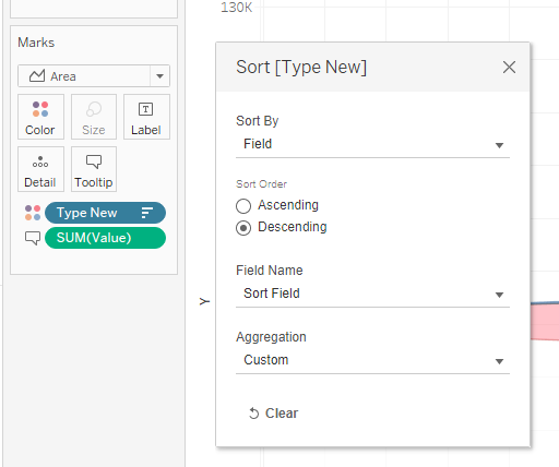
After that, the sorting options will work correctly:
Similarly, you can describe the sorting of categories using any calculations.
6. Chart Transforming
The streamgraph is a special case of the Area Chart, so it can be transformed into a well-known Area Chart with absolute values or with percentage values.
Let’s create a parameter Chart Type:
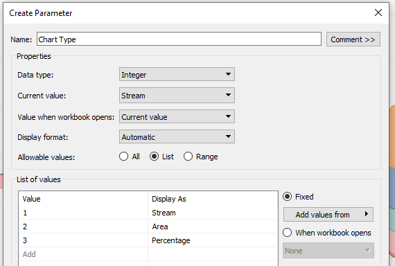
Make new calculation YY:
CASE [Chart Type]
WHEN 1 THEN AVG([Y])
WHEN 2 THEN AVG([Pivot Field Values])
WHEN 3 THEN SUM([Pivot Field Values]) / TOTAL(SUM([Pivot Field Values]))
END
This calculation will be calculating values along the ordinate axis when switching chart types. Replace the Y calculation on the Rows shelf with the YY calculation and add a new Chart Type Filter calculation to the filters:
IIF([Chart Type]= 2 and [Table Name]=’Energy1′ OR [Chart Type]= 3 and [Table Name]=‘Energy1’ , FALSE, TRUE)
As a result, we get the following chart:
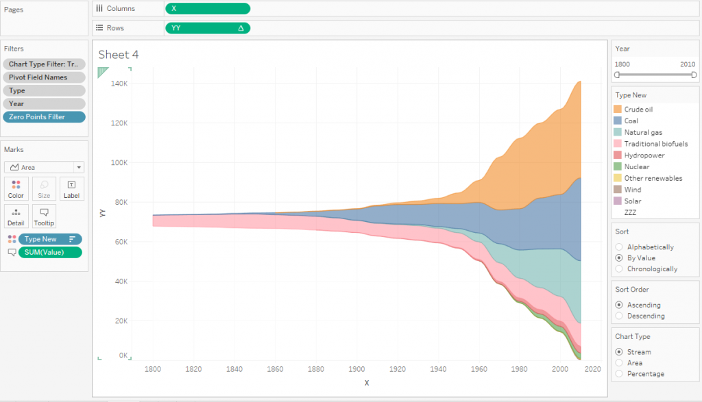
Switching between two types of charts looks like this:
Now the chart is completely ready.
7. Performance of the animated Charts
The performance of the chart animation depends on the number of marks on the chart. If there are a lot of elements (above 10000), then the animation will take a long time to calculate. To avoid this, it is necessary to reduce the number of points on the chart. In this case, you must try not to lose in quality.
In our example, 15 points were used initially for each sinusoid:

You can reduce the number of points to eight by filtering of Pivot Field Names:

The picture above shows that the two points in the middle of the sine wave actually lie on a straight line (almost), they can also be discarded:
You can also remove the last point on the graph (it will go to the beginning of the next sinusoid), reducing the total number to five.
That is, the number of points can be reduced by 3 times, while the quality will not deteriorate very much.
The essence of such optimization is to find the optimal balance between the quality and performance of the animation.
8. Final Viz
The white ‘fake’ area does not have any information, so you need to remove its tooltips. To do this, the calculations like this are created:
IIF([Type New]=’ZZZ’,”,’Year ‘+STR([Year]))
Such calculations are placed in tooltips, while for the ‘fake’ area there is nothing to show, and when hovering over it, tooltips will not appear.
For streamgraph, there is still the problem of overlapping the coordinate grid with a white fake region, so for the colors of the graph it is better to get saturated dark colors and reduce the transparency of the regions up to 20-30%. You can also completely remove the grid.
It remains to add filters and parameters on the dashboard and work a little on its appearance:
Conclusion
Streamgraph looks quite interesting and attractive, but it is not recommended to use it in business dashboards. With its help it is possible to display the data of events extended in time, while it is desirable that the values of the event metrics smoothly increase and smoothly decrease – in this case, a sense of flow appears.