
This article describes a fairly simple method for building pixel maps. To create a pixel map, you need to convert geospatial data (continent shapes, countries) into pixels, which means dividing the map into identical polygons with assigned polygon sizes. I have an example of such a map on Tableau Public. In this example, you can…
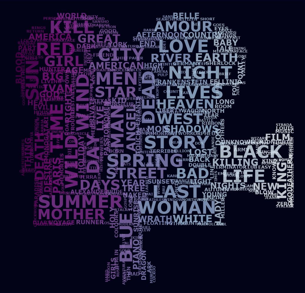
Custom Word Clouds with Python and Tableau
A Word Cloud is a visualization that contains words from a set of data, with the font size directly proportional to the frequency of the word in the set. In this article I’m explaining how to create word cloudt in Python and Tableau.
Linear Regression in Tableau. Part 2, Groups
Regression analysis is often used to study the relationship between two variables, such as budget and profit. In this article I will talk about how to find the regression lines of data groups, as well as create a tool to study the influence of some variables on others
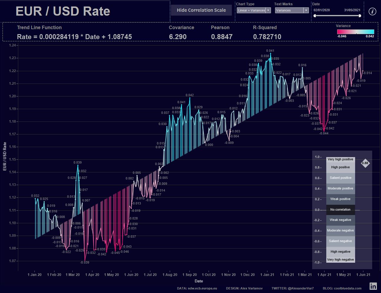
Linear Regression in Tableau, Part 1. Time Series
A linear regression model is used to describe the dependence of some dependent variable Y on variable X. Such models are often used to describe trends in quantities. Trends are tendencies of changes in quantities in mathematics, they can be described by linear, logarithmic, power and other equations. In addition, trends are also called charts that show the change in a certain value over time. This article will focus on linear trends.
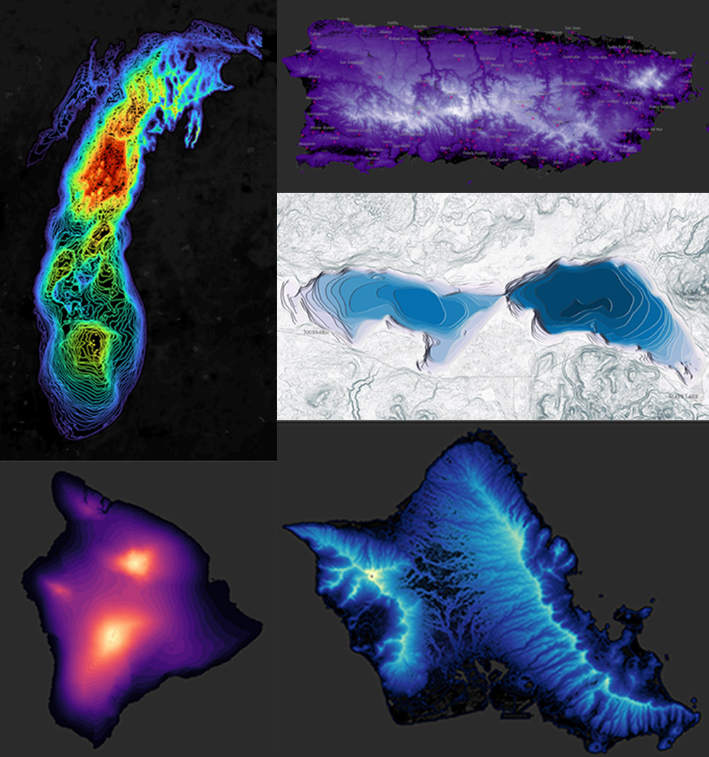
Elevation & Bathymetric Lines on Maps in Tableau
Topoghraphic and bathymetric maps have been known for a long time and are widely used in the world. On topographic maps, the lines connect points of equal elevation. On bathymetric maps, they connect points of equal depth. In this article I'll show how modern data visualization tools help build such interactive maps.
Optimal Transport Problem with Python and Tableau
The optimal transport problem or the Monge-Kantorovich transportation problem is a linear programming problem about the optimal transportation plan from departure points to destination points, with minimal transportation costs. Solving transport problems has a huge role in economics. In this article I will show how to solve such problems using an example and describe how you can visualize the results of a solution.
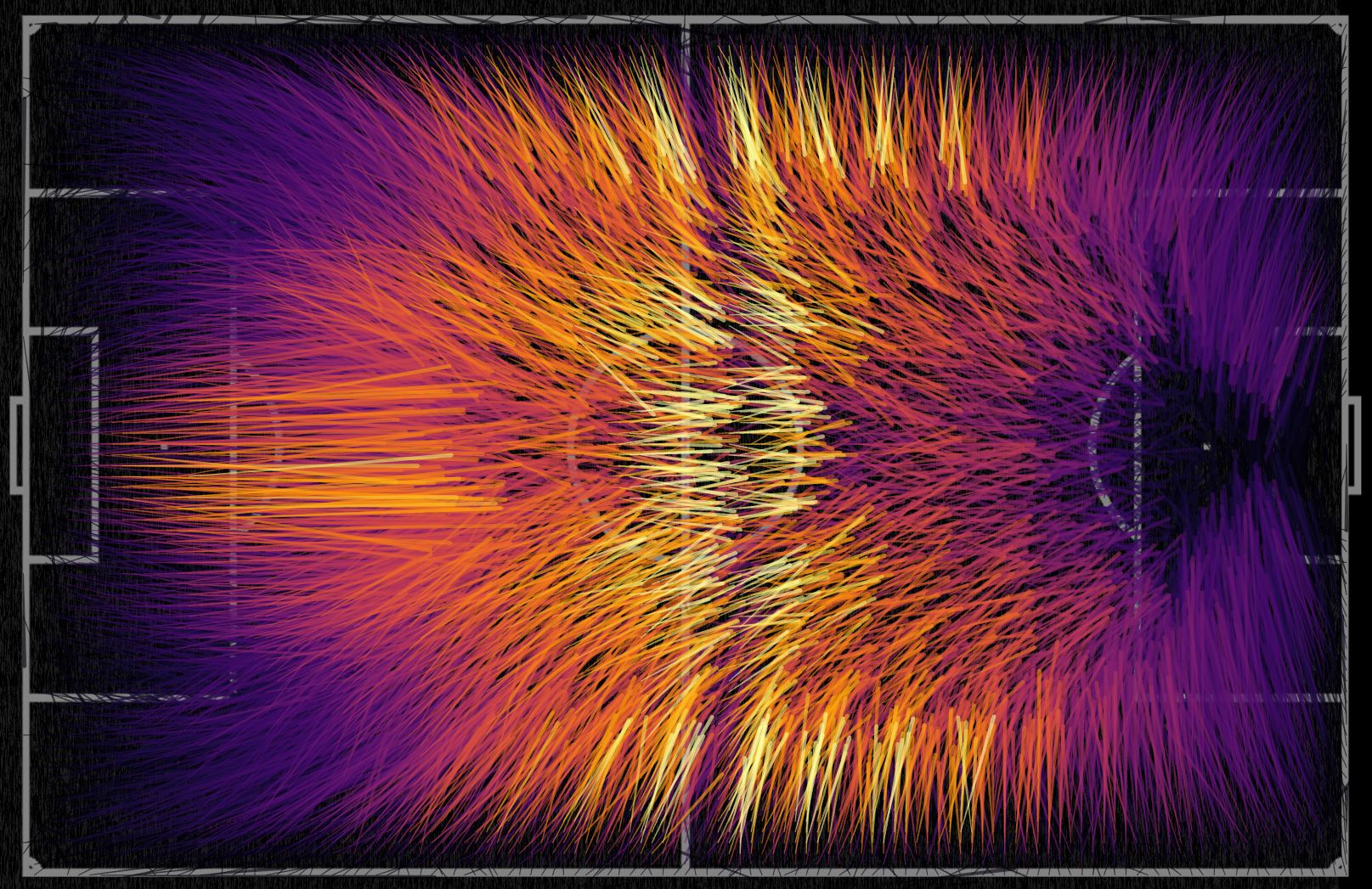
Ordering Chaos
Sometimes it seems to us that the processes that surround us are chaotic, but this is far from always the case, and in random events one can find certain patterns of process behavior, collecting data from this process and analyzing it.
In this blog post I'd like to talk about how you can see certain patterns in events that at first glance seem chaotic.
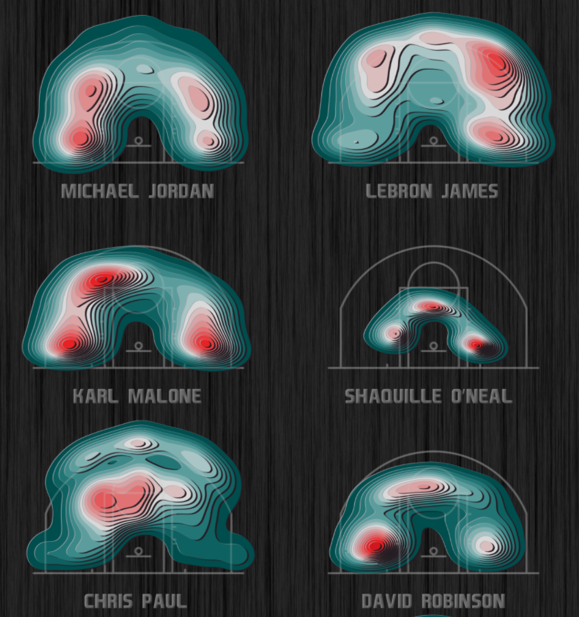
Contour Plot and Density Estimation in Tableau
The Contour Plot visualization and its special case Tanaka Contours meet in sports analysis and geo-analysis. Contours or levels in visualizations describe the same values, allowing you to represent, for example, elevation levels on maps. This article shows how you can create visualizations in Tableau that show changes in event density or event probability.
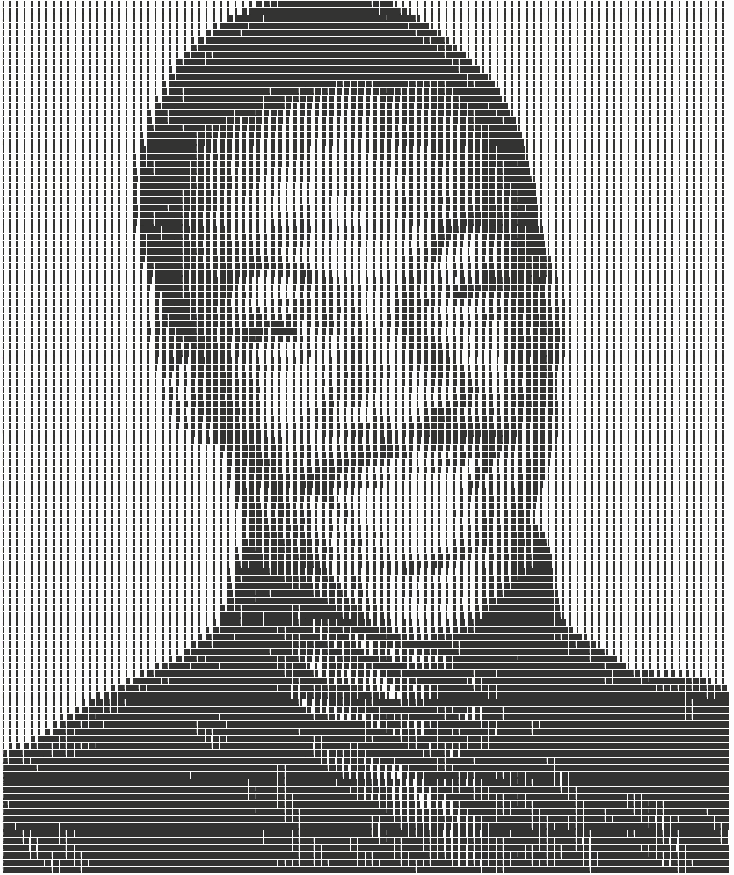
Bar Chart Portraits in Tableau
The blog post describes the principles of displaying images in Tableau using bar charts
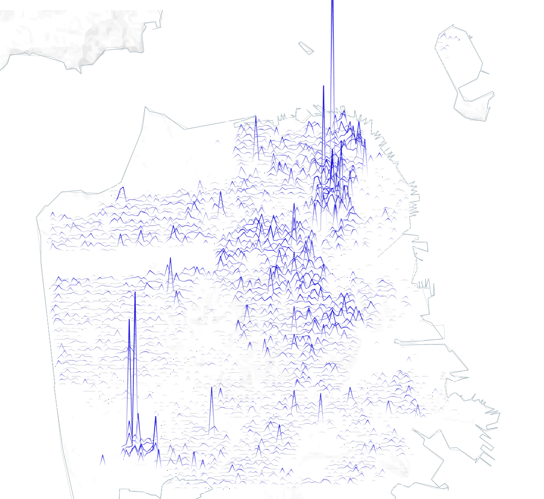
Joy Plot on the Map in Tableau
Disclaimer: Joy Plot in Tableau are not always the best option for analytical and business cases, but you can use them in bespoke visualizations. In any case, you can extend your knowledge about Tableau by creating such types of charts. This article is about a type of geodata visualization in which values are encoded by…