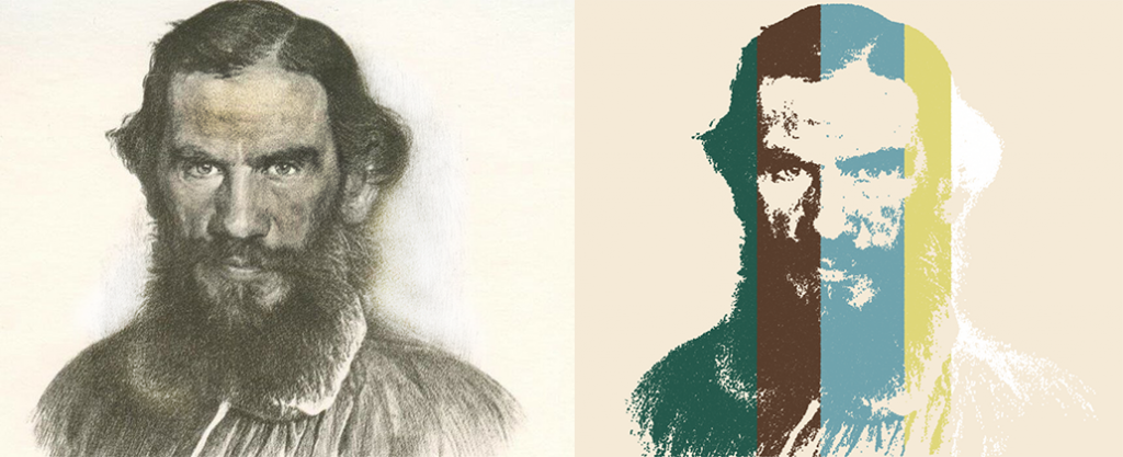
What is the Data Driven pictures? Here and furher in this article I mean the Data Driven pictures are pictures where a pixel or a part of a picture contains data. Let’s look at the next animation. This is a vizualization in Tableau ‘War and Peace by Leo Tolstoy’ (in Russian which is original novel language) where a dot visualizes a word from the novel and the colors sympolize a number of novel’s book. There are 460k marks approx in the viz, the portrait of Leo Tolstoy and other charts contain all words from his novel.

Note: The visualization above has a half a million marks, it’s extremrly hard for Tableau Public to draw it.
This visualization is heavy and in Russian, that’s why we will look at another viz to understand how to make the data driven pictures.
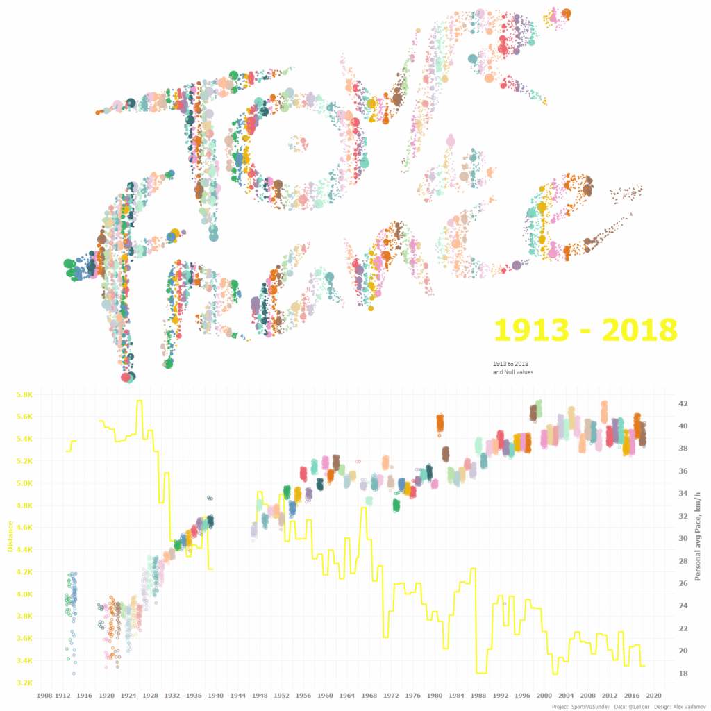
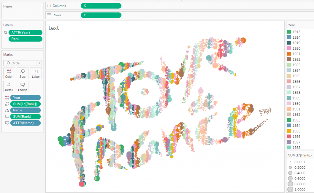
The #SportsVizSunday project (see a viz below) in July 2019 was devoted to Tour De France. There was a dataset containing data about all riders from 1913 to 2018. I created a Tour De France logo which is made from dots where each dots reflects a racer in a season. The sizes of the dots mean places that the riders took it a season and colors of the dots determine a year or a season.
1. How to make dot images in Python
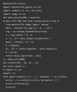
Now I am gonna show you how to create any text or picture with a number of dots you need. I find a link to a python code shared by@noookooon in twitter. The code by Jake Vanderplas creates words with dots.
The original code does not contain export to a file and works with text only. By default, the code uses a picture ‘Hello.png’, the picture is creating by a code part. I’ve added export to CSV, changed it slightly to download any PNG picture and removed colors from it.
To run this code, you need Python 3 with matplotlib, numpy and seaborn libraries. To work with a specific image, you need to upload it to the python directory on your computer.
The number of points in the final picture is determined by the default number (1000) in the lines:
def make_pic(N=1000, rseed=42):
X = make_pic(1000)
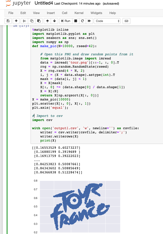
but you can input another one. Running the code you will have X and Y coordinates of each dot in your csv file. I would recommend connecting tableau with the csv file immediately and put X and Y as dimensions in Column and Row shelves. So you can enjoy the result. Of course, you will see the result in python but in my opinion, is not so convenient using Jupyter Notebook (I use it) because is not so clean for big number of dots.
Let’s try to a PNG image to the points. Let’s take the official Tour de France logo.
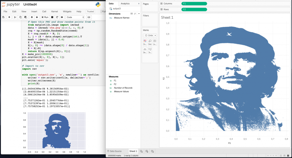
See below how the code works in Jupyter Notebook. Also the code forms a CSV file with coordinates:
When you work with colorful non-contrast pictures, you will find the end result insufficient. In this case, adjust contrast threshold, decreasing ‘1’ in string:
mask = (data[i, j] < 1)
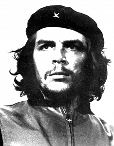
See another example below. Here is a portrait of Che Guevara made with 1 million dots.
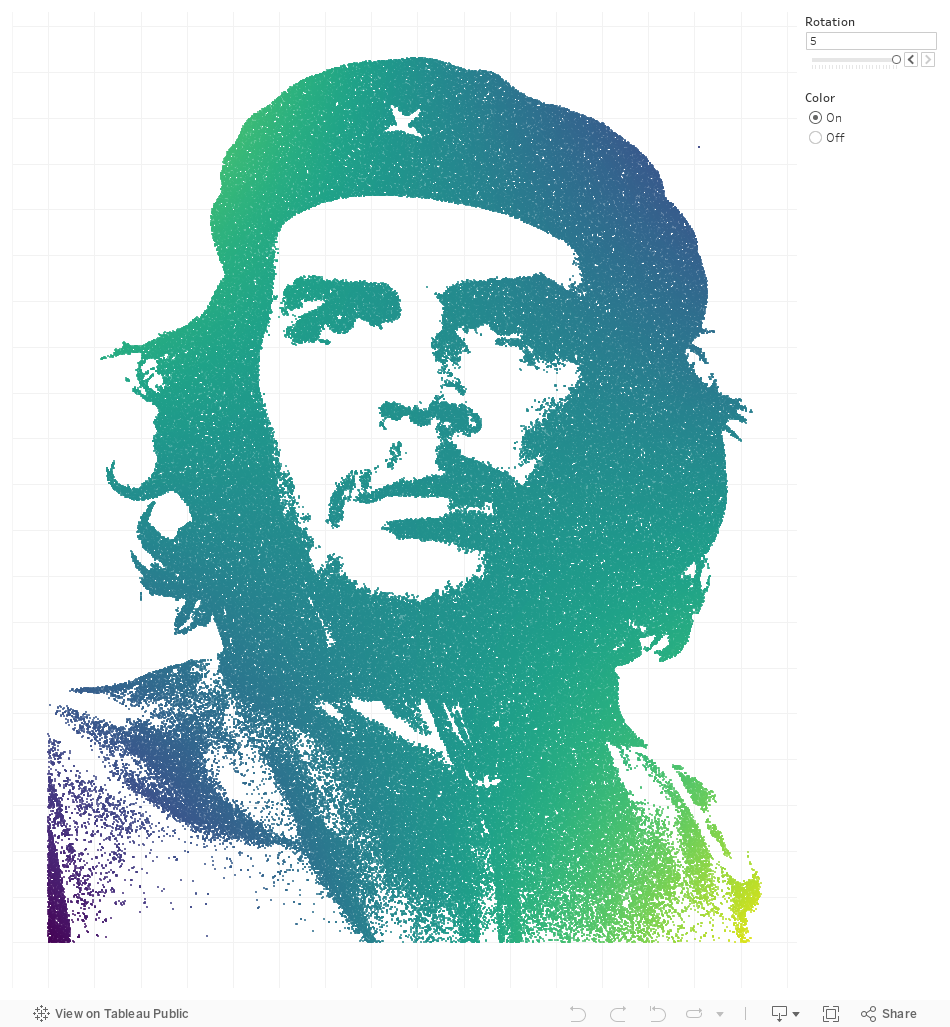
There are dot portraits in Jupyter Notebook and Tableau:
Abd the final viz:
2. Joining Dots and Data
We have learned how to create point portraits with a given number of points, now we need to combine these points with data. Look at the number of rows in the data set (or Number of Records in Tableau). If the number of points is equal to the number of rows, then you can combine (join) the data by primary keys. To do this, you can simply number the lines in the CSV file with coordinates and the data file by adding ID columns to MS EXCEL (the easiest option). By connecting these datasets through JOINs in Tableau, we get a strict correspondence of one data row to one pair of coordinates (X; Y).
Now we have a merged dataset to work with.
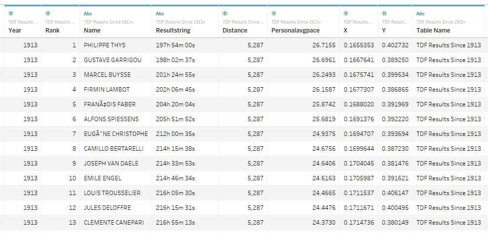
Tour de France Results data combined with logo coordinates (X, Y)
So, we have a dataset in which each point with coordinates X and Y has its own meaning. In our case, each dot represents one rider per season. You can encode data with the dimensions, shapes, and colors of the labels on the visualization. In the visualization below, the color represents the season / year, and the size of the circles represents the rider's position in each season's race.
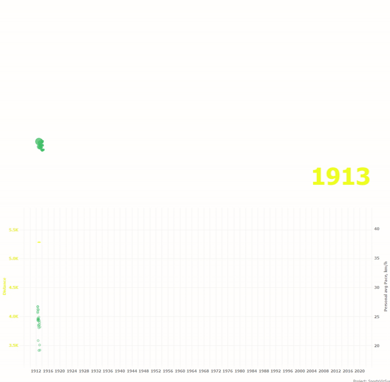
The animation below shows how the distance of the year and the average speed for each rider has changed over a hundred years.
I used the same technique in the War and Peace visualization I mentioned above. Compare original and spot portraits.
Conclusion
The technique described in the article allows you to "write" data into images. It may sound strange and incomprehensible, but I like the idea that each point in the image has its own meaning or role, being a data atom, and we can control the movement of such points, creating interesting visualizations.