
The optimal transport problem or the Monge-Kantorovich transportation problem is a linear programming problem about the optimal transportation plan from departure points to destination points, with minimal transportation costs. Solving transport problems has a huge role in economics. In this article I will show how to solve such problems using an example and describe how you can visualize the results of a solution.
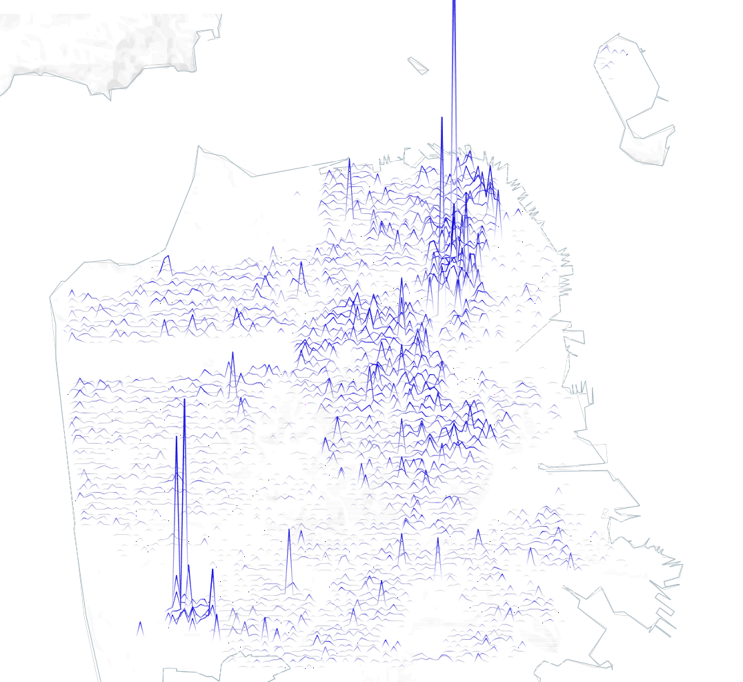
Joy Plot on the Map in Tableau
Disclaimer: Joy Plot in Tableau are not always the best option for analytical and business cases, but you can use them in bespoke visualizations. In any case, you can extend your knowledge about Tableau by creating such types of charts. This article is about a type of geodata visualization in which values are encoded by…
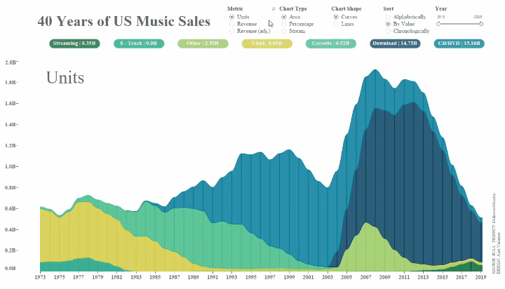
Animated Streamgraph in Tableau
A streamgraph, or stream graph, is a type of stacked area graph which is displaced around a central axis, resulting in a flowing, organic shape. Areas display changes in the values by category over time. This article describes creating of this type of chart in Tableau.
Creating Video with Tableau and Software Robots
Tableau is an analytics tool, and hardly anyone seriously associates it with video creation. In this article, I will talk about how to use Tableau and Software Robots to create images and combine the images as frames into video files using other tools.
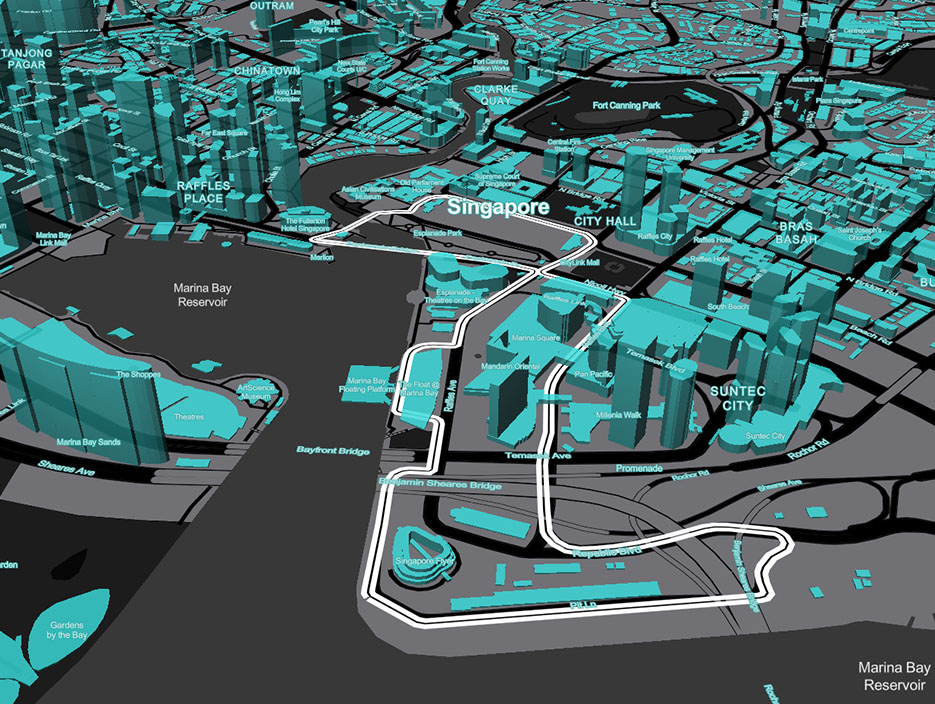
3D Models in Tableau
The blog post describes approaches to creating three-dimensional models in Tableau. 3D Models are not a common way of using Tableau, but they can be a great way to explore Tableau’s capabilities and deepen your knowledge of the platform

Parametric Portraits in Tableau
Math is beautiful!
The goal of the article is to show to Tableau users that math it is not only boring numbers and it is possible to describe anything by math equations and draw it.
It’s hard to imagine the dataset for the visualization of portraits contains only 2 values: 0 and 500. The portrait’s curves draw by using parametric equations for X and Y axes.
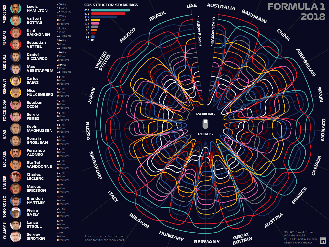
Radial Bump Charts in Tableau
In this article I am going to show how to create radial bump charts in Tableau. I think you have seen some types of Bump Charts. Usually the charts show different metrics by rank during the time.
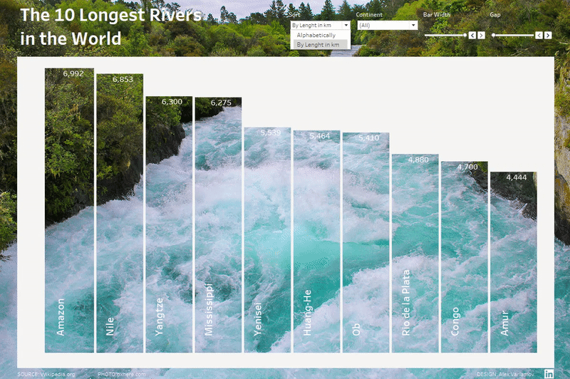
Creating transparent Bar Charts in Tableau
The blog post describes how to create transparent bar charts using the Transparent Sheets feature.
Using Mapbox GL JS custom Maps with Tableau and PowerBI
The Mapbox tools are amazing things that can empower spacious data analysis and visual analytics. Tableau and PowerBI are efficient analytics software for complex analytics challenges and astounding data visualizations. Connecting monsters in geomapping and BI we can create powerful tools for the spacious analysis.